
Introduction
The best retail store interiors do more than look good online. They guide where customers walk, clarify what you sell, express your brand, and make shopping feel effortless instead of confusing.
That matters more than most retailers realize. A PLOS One field study found that removing obstructive mid-aisle fixtures improved aisle sales, even though it meant displaying fewer products. Clear circulation beat cramming in more merchandise.
Good interior design also affects your bottom line in less obvious ways: product visibility, customer comfort, staff movement, browsing time, and chances to cross-sell or consult. A cluttered floor plan slows everyone down, including your team.
This guide breaks down five high-performing design directions: grid, loop, free-flow, experiential, and modular. We'll cover which fits your footprint, merchandise, and customer journey, and show how each translates into exam lanes, dispensing areas, and frame displays for optical practices specifically.
Key Takeaways
- Strong retail interiors pair visual appeal with intuitive navigation and clear merchandising
- Match grid, loop, free-flow, experiential, or modular layouts to store type and shopping behavior
- Align lighting, signage, fixtures, and materials to one brand story
- Flexible fixtures and real customer feedback make it easier to adjust a design over time
- Optical practices need to plan for both the clinical journey and the retail journey
Overview of Retail Store Interior Design
Retail store interior design is the coordinated planning of floor layout, circulation, fixtures, displays, lighting, materials, signage, technology, and branded touchpoints. Each element has to reinforce the others.
A well-planned interior supports two things at once: customer experience and business performance. It makes products easier to discover, reduces confusion, improves staff movement, and creates natural moments for browsing, comparison, consultation, and purchase.
There's no single "best" layout. The right choice depends on:
- Product category and inventory density
- Desired browsing behavior (quick trips versus leisurely discovery)
- Store size and footprint
- Target customer and brand personality
- The balance you want between speed and exploration
The strongest contemporary designs blend proven layout principles with newer approaches: multisensory storytelling, local identity, adaptive reuse, digital interaction, and modular merchandising. Optical retailers benefit especially from this mix, since a dispensary has to work as both a medical space and a boutique.
Best Retail Store Interior Designs
Before comparing layouts, it helps to agree on what "best" actually means. A design earns a spot on this list if it delivers:
- A clear customer journey from entrance to checkout or consultation
- Strong product presentation that doesn't depend on sheer volume
- Coherent branding across fixtures, signage, and materials
- Practical operations for staff and inventory
- Room to adapt as merchandise or traffic patterns change
Photogenic isn't on that list. Plenty of award-winning interiors photograph beautifully and still confuse shoppers or slow down staff.

Grid or Straight-Path Retail Design
Parallel aisles and repeated shelving create one of the most legible layouts in retail. Customers scan categories quickly, find what they need, and move on. That's why grocery stores, pharmacies, and convenience stores lean on it so heavily.
Strengths:
- Efficient use of floor space
- Easy product categorization
- Fast, predictable shopping trips
Trade-offs:
- Can feel repetitive without varied lighting or focal displays
- Limited visibility beyond the current aisle
- Less suited to browsing-driven or discovery-led shopping
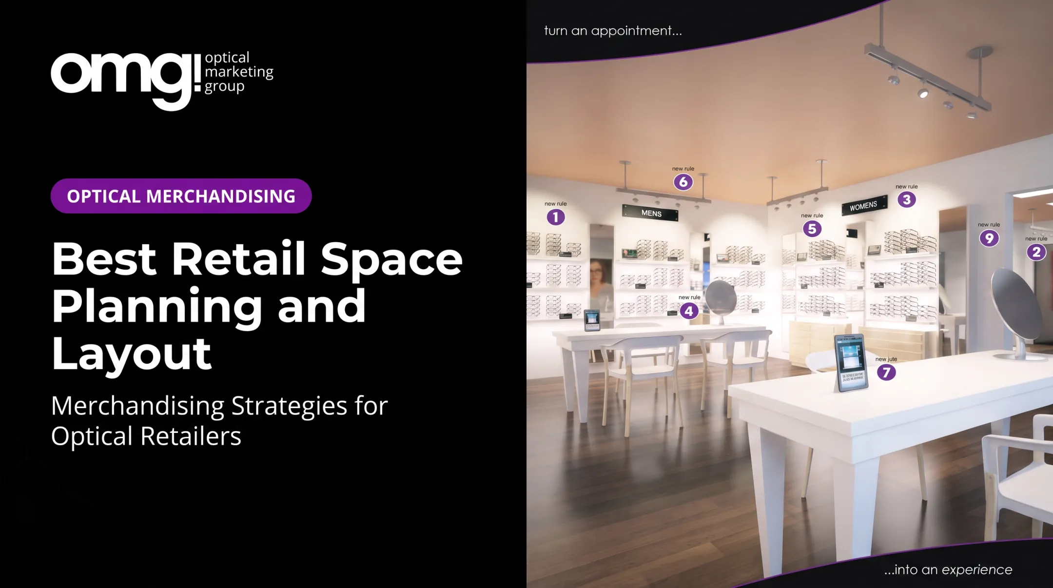
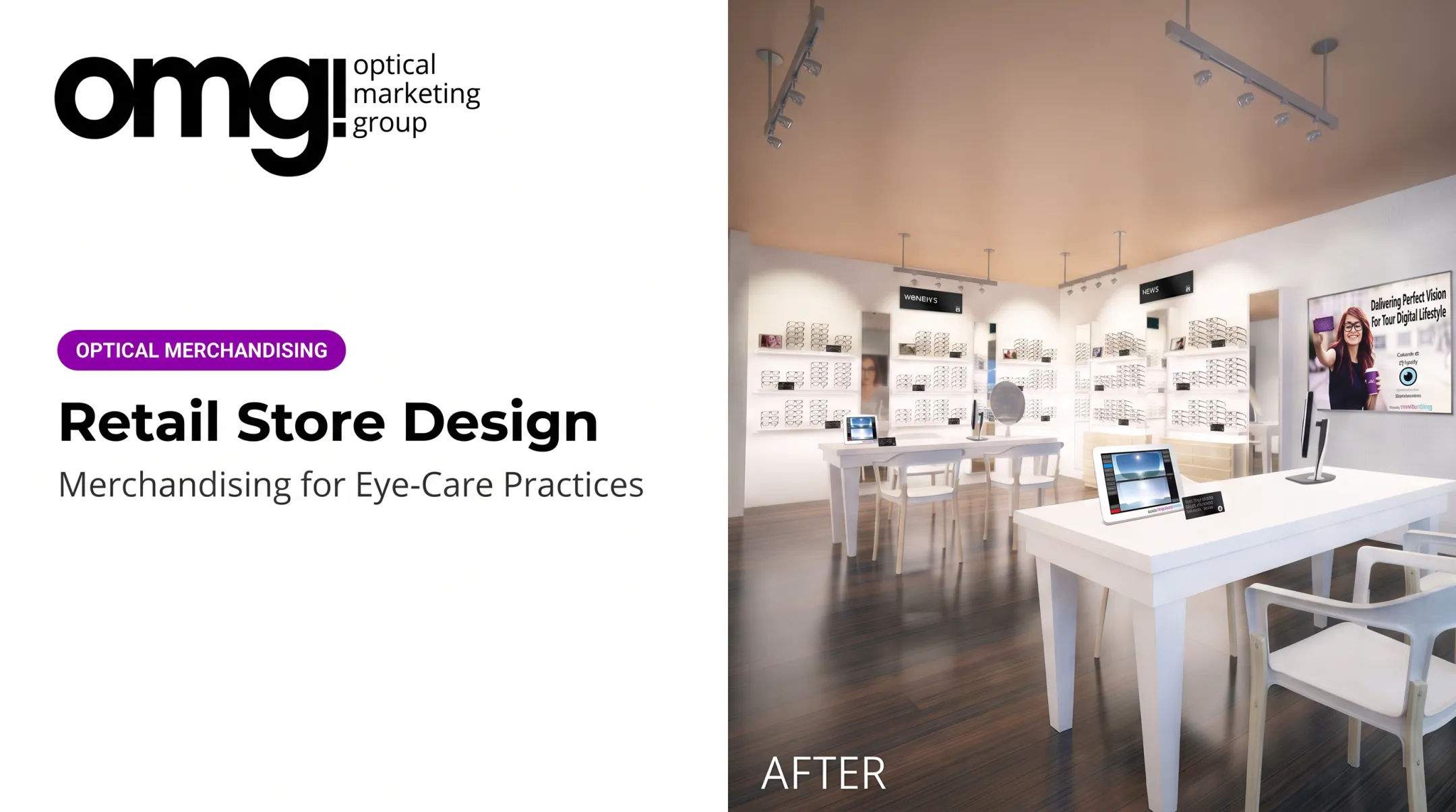
In an optical setting, a grid-style approach works well for organizing frame categories: men's, women's, kids', sunwear, and brand-specific sections arranged in clean, parallel runs.
The Eye Designs Sacramento refresh used this logic. Prominent "WOMENS" signage and brand markers for Ray-Ban, Adidas, Calvin Klein, and Lafont helped patients orient themselves without staff assistance.
Keep aisles wide enough for wheelchairs, strollers, and two people passing comfortably. A grid only works if circulation stays open. Narrow it too much, and the "efficient" layout starts feeling like an obstacle course.
Loop or Racetrack Retail Design
A loop (or racetrack) guides customers through a sequence of zones before returning them toward checkout. It's a deliberate path, built for exposure and storytelling rather than pure speed.
A good loop includes:
- A strong entrance moment: the first thing a customer sees sets the tone
- A focal display near the front that signals what the store is about
- Directional cues: lighting, flooring changes, or signage that nudge movement forward
- Category transitions that feel natural, not abrupt
- A visible checkout or consultation point so customers never feel trapped
Penn State Extension's retail layout guidance recommends using color, fixture variation, and signage to pull shoppers through a space without blocking sightlines toward the back. That balance matters: a loop should feel like discovery, not a maze.
This approach works best where browsing is part of the experience. It's a poor fit for fast-trip retail or very small floor plans, where a forced path just frustrates customers in a hurry.
For optical practices, a loop can map the full patient journey: welcome and frame browsing, then consultation, dispensing, fitting, and checkout. A well-planned path accounts for exam lanes, pretest, visual fields, and the optical lab while keeping staff sightlines open across the floor.

Free-Flow or Boutique Retail Design
Free-flow layouts skip fixed aisles entirely. Freestanding fixtures, curated displays, and seating are arranged in an open, non-linear pattern that invites relaxed browsing. It's the layout of choice for premium, highly edited brands.
The challenge is keeping an open floor plan from feeling empty or confusing. That takes:
- Clear sightlines across the space
- Varied display heights to create visual rhythm
- Material contrast to separate zones without walls
- Strong focal points instead of many competing ones
Accessibility matters here at least as much as in a grid layout, since there's no fixed path to fall back on.
ADA design standards generally require a 36-inch minimum clear width on accessible routes, with narrower 32-inch sections allowed only in short stretches. Open layouts need to be checked against this, not assumed to pass.
Free-flow also means lower display density. You're showing fewer products per square foot, which only works if each one is positioned to sell on its own merits.
An optical boutique can use free-flow zoning to separate eyewear collections, sunwear, lifestyle accessories, and private consultation areas without the space feeling clinical. A modular display system that showcases frames in floor-to-ceiling windows, for example, lets a collection breathe instead of crowding a wall.
Experiential and Storytelling-Led Retail Design
Some stores become destinations by expressing a brand narrative through architecture, materials, sound, scent, or local detail. Think of a flagship that leans into its neighborhood's history, or a heritage boutique built around a founder's story.
Aesop's Third Avenue store in New York pairs existing concrete, steel, and glass with lacquered-wood fixtures that echo the surrounding industrial architecture. Gather, also in New York, builds its interior around family history, using a calming palette and a glass vestibule to signal welcome before customers step inside.
The catch: experiential elements need to serve the product and customer journey, not distract from it. Every architectural flourish should connect to a customer need or a brand message. Scent and music mean nothing if customers can't find the register.
Optical retailers can use the same principle to communicate lens technology, frame craftsmanship, or local identity while keeping clinical services easy to find.
Practices putting this into action include:
- The Eye Store: warm wood floors and ceilings, illuminated eyewear displays, consultation tables, and branded Coach, Gucci, and Ted Baker sections
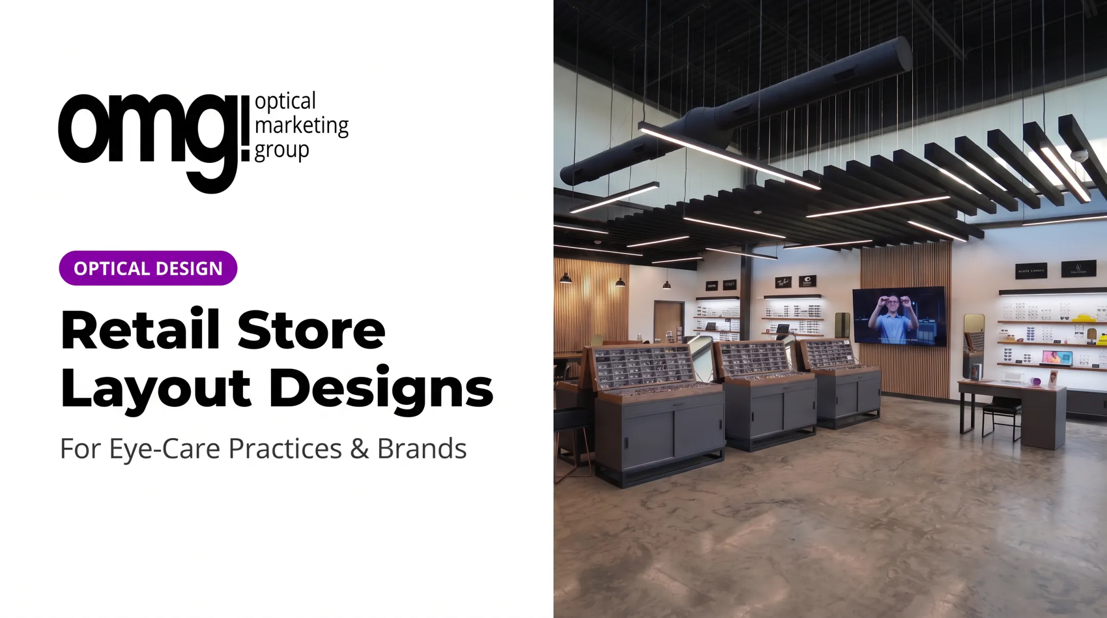
- Urban Optics: a horseshoe layout with live-edge wood, rustic brick, and a 98-inch video wall that draws patients in before they sit down
Modular, Flexible, and Omnichannel Retail Design
Modular shelving, movable partitions, interchangeable graphics, and adjustable lighting let a store change without a full renovation. That flexibility matters more every season, as campaigns and inventory shift faster than most construction timelines can keep up with.
Flexible systems support:
- Seasonal campaigns and new product launches
- Multiple brands sharing one floor plan
- Pop-up experiences and temporary shop-in-shop zones
- Consistent rollouts across multiple locations
Technology extends that flexibility: digital product information, QR-enabled discovery, appointment touchpoints, and managed digital signage. Used well, it simplifies the experience instead of interrupting it.
A quick flexibility checklist:
- How easily can fixtures be reconfigured without tools or a contractor?
- Are materials durable enough for frequent handling?
- Is power and data access built into the fixture, not bolted on later?
- Who manages digital content, and how often can it change?
- Is there enough storage for seasonal swaps?
- Does every piece stay consistent with the brand system?
At OMG! Optical Marketing Group, that flexibility is built into products like the Del Mar Modular Display System. It is configurable with 2 to 4 poles, 6 to 18 brackets, and up to 6 signage channels, so a dispensary can scale a frame wall up or down as inventory changes.

The Contentlinq platform pairs retail-ready displays with cloud-managed content, letting a practice swap playlists or lens demonstrations without touching a single fixture.
How We Chose the Best Retail Store Interior Designs
Our evaluation looked past visual novelty. Criteria included:
- Customer journey and product visibility
- Navigation, comfort, and accessibility
- Brand storytelling
- Staff workflow and maintenance
- Long-term adaptability
A design shouldn't make this list just because it's photogenic, trend-led, or attached to a famous brand name. The real question is whether the concept fits the retailer's merchandise, customer expectations, budget, footprint, and sales process.
Validate any design choice with real evidence where possible:
- Customer feedback and direct observation
- Traffic patterns and heat maps
- Conversion or basket data
- Staff input on workflow friction
- Before-and-after performance comparisons
For optical practices, this evaluation gets more complex because a dispensary has to work as both a retail space and a clinical one.
A specialist partner such as OMG! Optical Marketing Group can connect space planning, custom fixtures, branded signage, graphics, merchandising, and installation into one coordinated process rather than a string of disconnected vendor decisions.
OMG! runs this process across six phases, from initial discovery through construction drawings and installation. Project budgets typically range from $62,000 to $155,000+ depending on scope and square footage.
Conclusion
The best retail store interior design is the one that makes your brand easier to understand, your merchandise easier to explore, and the customer journey more comfortable and purposeful. Style should support those outcomes, not drive the plan.
Start with customer and operational goals before picking a layout. Then test lighting, signage, fixtures, display density, and circulation against those goals, not against a trend report.
For US optical and eyecare practices planning a redesign, relocation, refresh, or expansion, OMG! Optical Marketing Group's Patient Experience Assessment and online Project Planner are useful starting points for mapping where your current space is helping, and where it's getting in the way.
Frequently Asked Questions
What is the best layout for a retail store?
It depends on your store size, merchandise, and desired shopping speed. Grids suit high-volume, fast-trip retail; loops and free-flow layouts suit browsing-driven stores; many retailers mix formats by zone.
What are the key retail design trends for 2026?
Current trends include flexible, reconfigurable fixtures, experiential storytelling, digital integration like responsive screens, sensory design, sustainable materials, and accessibility-focused layouts.
What is the 70/30 rule in interior design?
It's a commonly used guideline balancing a dominant visual treatment (roughly 70%) with supporting accents (roughly 30%). There's no fixed retail standard behind it, so treat it as a starting point, not a rule.
How do I make my retail store look more inviting?
Create a welcoming entrance with clear sightlines, comfortable circulation, and cohesive lighting. Keep displays uncluttered and signage readable, and give customers an opening zone to orient themselves before browsing begins.
How does lighting affect retail store design?
Ambient, accent, task, and display lighting shape mood, product visibility, wayfinding, and perceived quality. Lighting choices should match the merchandise; fine jewelry and eyewear need different treatment than grocery shelving.
What should an optical practice consider when designing a retail space?
Plan for the transition between clinical and retail zones, frame visibility, consultation privacy, staff sightlines, accessible circulation, branded merchandising, and lighting quality, with enough flexibility to adapt as products change.