
Yet fewer than 5% of optical retailers have proper signage throughout their facility, according to internal industry research, leaving patients unsure where to find brands, departments, or help. That gap matters because nearly 90% of purchase decisions happen in-store, and shoppers still prefer buying glasses in person.
Good retail signage and visual merchandising work together: communication, space planning, and product presentation guiding discovery without pressure. This guide covers signage types, design principles, optical-specific applications, and a step-by-step process for building a system that actually works for US eyecare practices.
Key Takeaways
- Signage supports curb appeal, wayfinding, frame discovery, lens education, and a calmer patient experience
- Match each sign to one job, audience, and location instead of repeating the same message everywhere
- Keep copy readable, concise, on-brand, and coordinated with lighting and traffic flow
- Treat signage as a living system that needs updates, staff training, and regular review
What Are Retail Signage and Visual Merchandising?
Visual merchandising is the coordinated use of layout, fixtures, lighting, color, graphics, and product arrangement to make a space easier to browse. Retail signage is the communication layer on top of it: the elements that attract attention, label areas, guide movement, and explain products.
Neither works alone. A window graphic might pull someone through the door, but if the dispensary inside feels disorganized, the promise falls flat. OMG!'s Total Vision / Zeiss installation shows this pairing in practice, combining custom wall graphics, signage, lighting, and organized frame merchandising into one cohesive presentation rather than separate add-ons.
Signage generally falls into five functional categories:
- Promotional - time-sensitive offers, like a multi-pair savings sign or contact lens guarantee
- Informational - exam types, insurance details, or what to expect at an appointment
- Wayfinding - directing patients from reception to dispensing to checkout
- Brand-building - logos, taglines, and visual identity that reinforce trust
- Digital - screens or displays showing rotating content, video, or lens education
A single practice typically needs all five, but rarely on the same sign. Mixing promotional language into a wayfinding sign, for instance, usually confuses more than it helps.
The Main Types of Optical Retail Signage and Where to Use Them
Each signage type has a specific job. Treating them interchangeably is one of the fastest ways to create visual clutter.
Exterior and Window Signage
This is the first impression, and it has to work from a distance. Large-format graphics, window clings, and brand labeling should be legible to someone walking or driving by, not just someone standing at the glass.
One storefront refresh example from the optical industry featured the practice name alongside recognizable brand labels (Gucci, Tom Ford, Oakley, Etnia Barcelona), a clear "Walk-Ins Welcome" message, and a QR code linking to appointment scheduling. Nothing about it required decoding.
Keep product, not office clutter, visible on the back wall through the window. Refresh displays on a regular schedule so the storefront doesn't go stale.
Interior Wayfinding and Category Signage
Once inside, patients need to know where they're going without asking. Common fixtures include:
- Acrylic door and department signs
- Standoffs
- Ceiling-hanging kits
They mark exam rooms, dispensing areas, and checkout without interrupting the browsing experience.
Product, Educational, and Promotional Signage
These signs support staff conversations instead of replacing them:
- Frame collection descriptions
- Lens benefit explanations
- Simple care guidance
Promotional signage (multi-pair discounts, contact lens savings plans) works best when it's truthful, time-bound, and visually secondary to the brand presentation around it.
Digital Signage
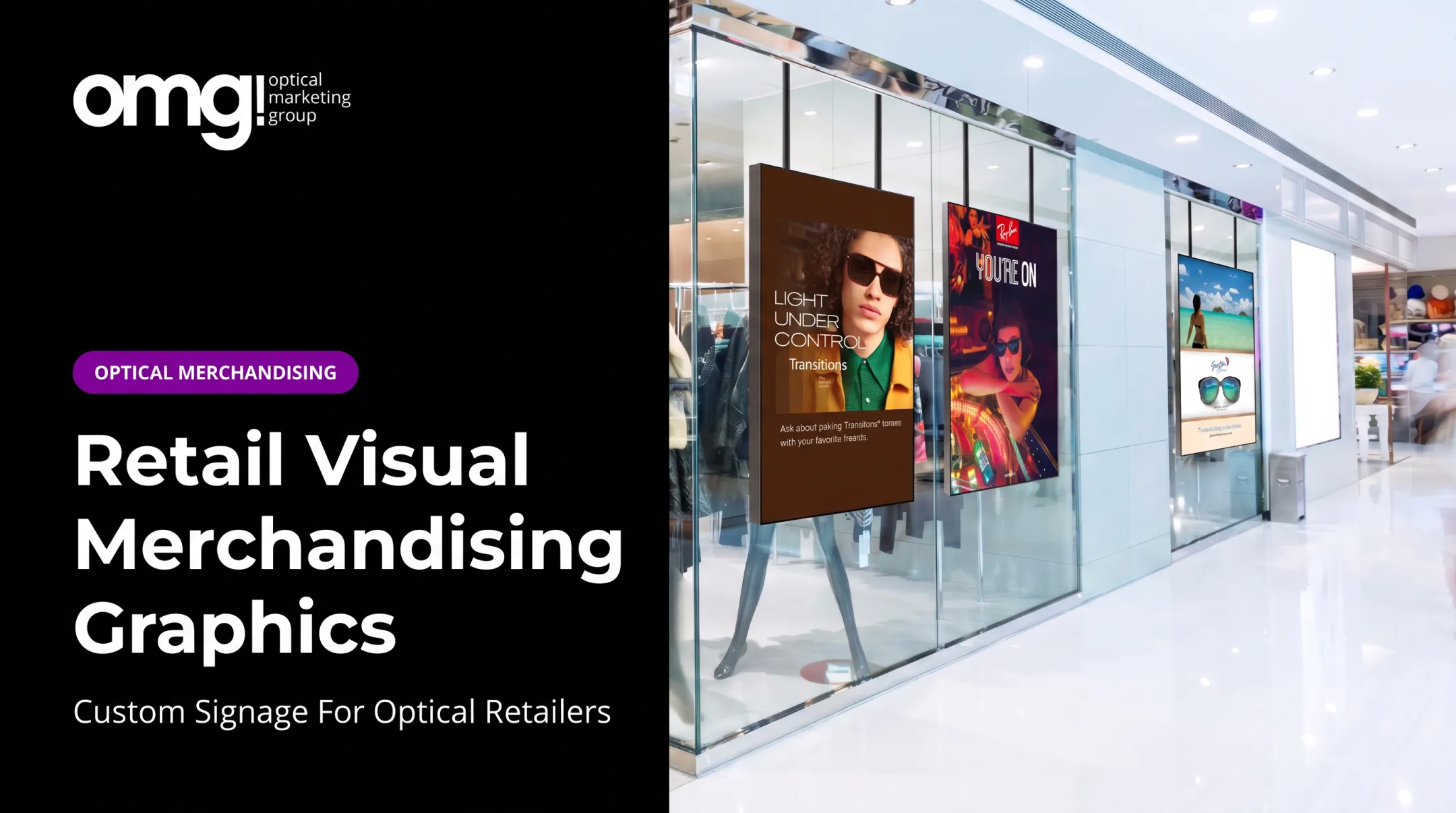
Digital screens handle what static signs can't: changing content, video storytelling, and interactive brand education. A 15-inch interactive retail screen, for example, can let patients explore lens and frame brands on their own before an optician even approaches.
OMG! offers this through Contentlinq as one example of a managed hardware-and-subscription model, pairing window-facing displays with cloud-based content updates. It's a useful option for practices that want rotating content, not a requirement for every dispensary.
How to Build a Signage and Visual Merchandising Strategy
Start with the goal, not the sign. Are you trying to improve browsing flow, highlight a lens technology, or refresh a dated dispensary? Every signage decision downstream depends on that answer.
Map the Patient Journey
Walk through arrival, waiting, pre-test, dispensing, and checkout. At each stage, ask what the patient needs to notice, understand, or do. A sign near the entrance has a different job than one at the dispensing table.
Build a Visual Hierarchy
Primary messages need the strongest position, scale, and lighting. Secondary information stays available but doesn't compete for attention. If every sign shouts, none of them get heard.
Apply Proven Merchandising Frameworks
A few retail principles translate well into optical spaces:
- The 5 Rights of merchandising - stock the right frames, in the right quantities, at the right price, in the right place for your patient base.
- The rule of three - grouping items, like three frames on a riser, creates visual interest and easier scanning; optical displays often favor slight asymmetry over rigid trios.
- The four Ps of marketing - product, price, place, promotion - a handy lens for deciding what a sign should emphasize.
None of these are rigid formulas. They're starting points for simplifying a display, not rules to force onto every fixture.
Finally, separate your message types: brand storytelling, navigation, education, promotion, and calls to action shouldn't blur together on one sign. One objective per sign, wherever possible.
Design Principles for Signage That Patients Can Understand
A sign that looks good but can't be read at a glance has failed. Readability starts with testing from the actual position patients will encounter it: standing at the door, seated at a dispensing table, walking past a window.
Readability and Plain Language
Type size, contrast, and line length all matter more than design flourishes. The Access Board's ADA guidance notes that interior directional and informational signs still carry visual-legibility requirements. Tactile Braille only applies to permanent room identification.
Replace lens jargon with benefit statements. "Blue light filtering" means more to a patient than a coating name. Keep it concise: a sign is not the place for a full product spec sheet.
Balance, Restraint, and Accessibility
Negative space is a design tool. Crowding every surface with messaging has the opposite effect. OMG!'s Patient Experience Assessment rates optical clutter on a 1-to-5 scale because "clean, simple, and curated" beats busy.
Accessibility considerations to build in:
- Sufficient contrast between text and background
- Clear, unobstructed pathways to and around signage
- No reliance on color alone to communicate categories
- Multilingual signage where the patient base calls for it
Calls to Action That Fit the Context
"Ask about our lens options" invites a conversation. Aggressive sales language shuts conversations down. Keep prompts conversational: explore, try, ask, discover.
Applying Visual Merchandising to an Optical Practice
Frame displays, lighting, signage, and staff flow function as one system, not separate projects bolted together. Design them that way from the start.
Creating Discovery Zones
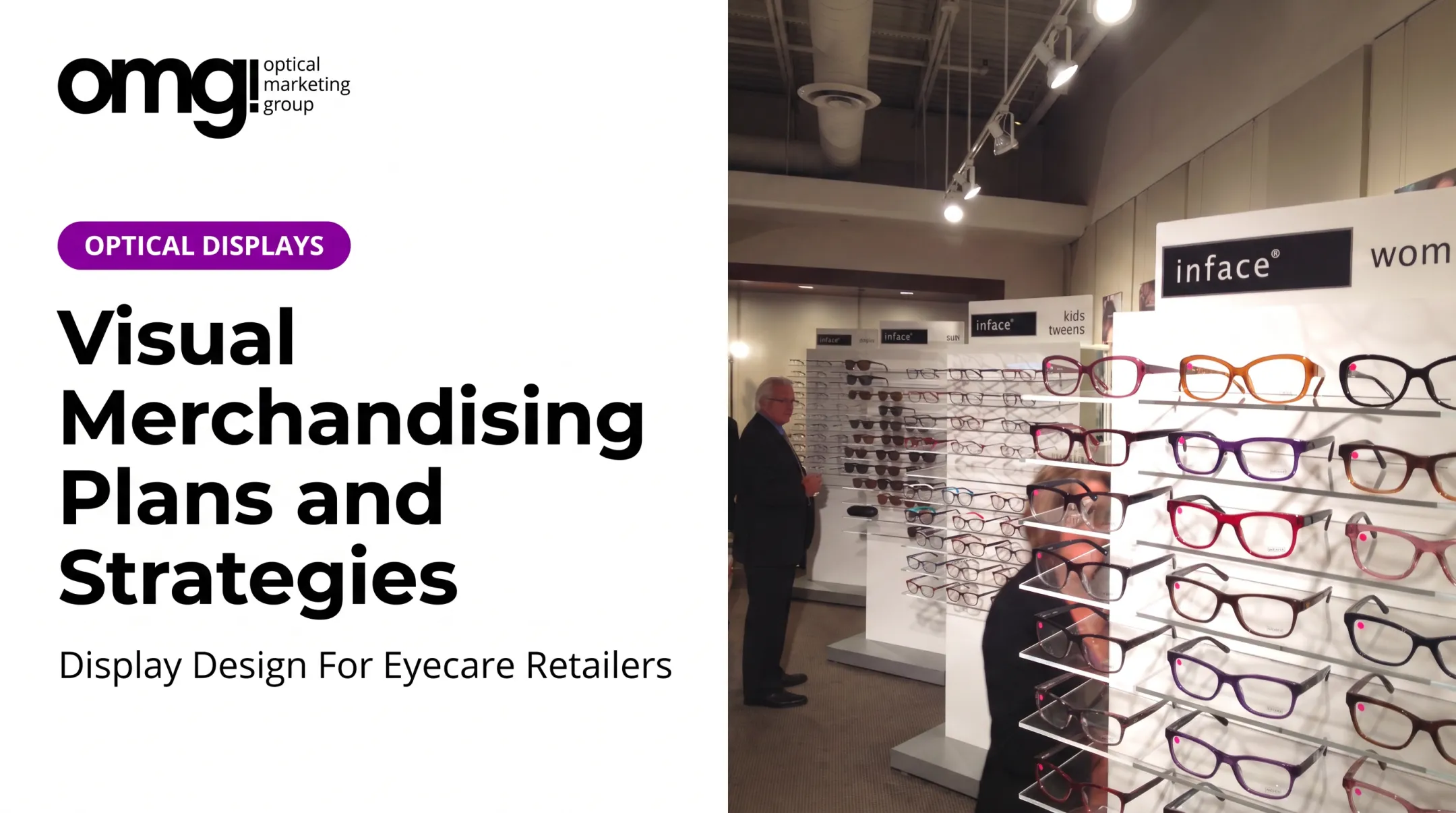
Modular systems can define zones for sunwear, premium collections, kids' frames, and sports eyewear without fragmenting the space. Vertical pole systems in windows, for instance, let light through while still displaying product, keeping the storefront open rather than walled off.
Educational Storytelling, Without the Lecture
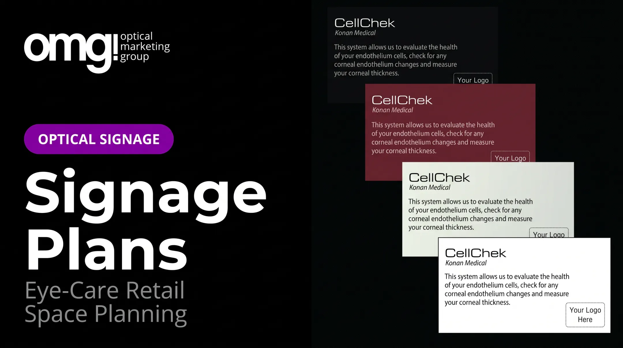
Short, benefit-led messages, paired with a diagram or a brief demo, usually outperform dense technical copy. Staff explanation still matters most for nuanced lens decisions; signage should set up that conversation, not replace it.
Clinical Credibility Meets Retail Appeal
Ophthalmology and medical practices face a particular balance: the space needs retail polish without feeling like a sales floor bolted onto a clinic. Calm, consistent presentation supports confidence rather than skepticism.
Lighting and Sightlines
Dark corners, glare, and blocked displays undercut even well-designed signage. LED lighting that highlights eyewear detail does double duty, both as merchandising and as a subtle cue that this space takes product presentation seriously.
OMG! Optical Marketing Group builds that system into practice design work. The company integrates layout planning, custom fixtures, branded graphics, signage, and digital displays through a six-phase design-to-delivery process, with installation support built in rather than handed off separately.
Design Director Mehmet Gundogar has led this integrated work for independent practices and multi-location chains across the US and Canada since 2022. He coordinates interior, architectural, and graphic design teams around one cohesive result.
Client feedback shows the practical payoff:
- Jeff Fultz of Kirman Eye noted that OMG! signage and displays drew patients toward recognized brands and supported stronger multiple-pair purchases
- Dr. Calvin Dalton of Dalton Family Eyecare reported multiple-pair prescription eyewear became more appealing after a signage and display update
A Practical Process for Planning, Launching, and Improving Signage
Signage projects fail more often from skipped planning than from bad design. A structured process catches problems before they're bolted to a wall.
- Audit the current environment. Photograph sightlines, list every existing sign and its purpose, and flag confusing routes or ignored displays. Ask staff and patients where they get stuck.
- Build a signage plan. Document the objective, audience, message, location, format, viewing distance, and update frequency for each sign, plus who owns approval.
- Coordinate design with construction realities. Lighting plans, fixture dimensions, and accessibility requirements all need to be locked before artwork gets finalized.
- Set up content governance. Multi-location rollouts need version control, campaign dates, and a clear process for pulling expired promotions down.
- Train staff on key signs. They should be able to reinforce the message naturally and notice when patients are still confused despite the signage.
- Measure what matters. Track patient feedback, time spent browsing, frame-category engagement, and multiple-pair conversations rather than guessing at impact.

A 2025 case from an independent practice, reported by Review of Optometric Business, found a 12% increase in average optical revenue per patient following a combination of inventory review, better demographic-fit assortment, and a less overwhelming sales floor. Signage wasn't the only factor, but a cleaner, better-organized floor was part of the shift.
For practices not ready for a full buildout, a shorter refresh cycle can update look, lighting, and layout without a major construction project. OMG!'s version typically runs three to four weeks.
Frequently Asked Questions
What are the 5 R's of visual merchandising?
The five rights framework covers right merchandise, right quantity, right time, right price, and right place. For an optical display, that means stocking frames your patient base actually wants, in the right amount, priced appropriately, and placed where patients will see them.
What is the rule of three in visual merchandising?
Grouping products or visual elements in sets of three creates balance and makes displays easier to scan. Optical displays often adapt this to odd-numbered or slightly asymmetrical groupings, since the goal is visual interest, not a rigid formula.
What are the four P's of visual merchandising?
The four P's (product, price, place, and promotion) come from marketing, not visual merchandising. Applied to an optical dispensary, they help decide what a display should emphasize: the frame itself, its price point, where it sits in the store, and how it's promoted.
Does digital signage make sense for every optical practice?
Not necessarily. It suits practices that want rotating content or video storytelling. A well-executed static sign can outperform an underused screen, so match the format to the content need first.
How often should optical signage be updated?
Promotional signage should come down the moment an offer expires. Brand and wayfinding signage can last longer, but a general refresh every one to two years keeps the space from feeling dated.