
Introduction
Patients form an opinion about your practice before anyone says hello. The storefront, the frame displays, the lighting near the mirrors, and the path from the door to the dispensing table all speak first.
That matters more than most practices realize. Nearly 90% of purchase decisions happen in-store, which means the physical environment carries as much weight as the exam itself.
Visual merchandising builds a clear, welcoming bridge between clinical care and optical discovery, so patients feel guided rather than sold to.
This article covers the elements that make that bridge work: layout and flow, display fixtures, lighting, color and branding, signage and storytelling, and digital tools that support (not replace) your staff.
Key Takeaways
- Visual merchandising blends environment, product presentation, and patient movement into one browsing experience
- Strong optical spaces balance brand personality with clinical trust, easy navigation, and accessible frame exploration
- Layout, lighting, fixtures, and signage should work as one system, not compete for attention
- Measure changes against real outcomes: capture rate, frame discovery, staff efficiency, and multiple-pair conversations
What Is Visual Merchandising and Why Does It Matter in Optical?
Visual merchandising is the planned presentation of products and space (layout, displays, lighting, color, signage, fixtures, and storytelling) working together to shape how patients see and shop your eyewear collection.
It's different from practice design. Design builds the permanent shell: walls, flooring, architecture. Merchandising decides what happens inside that shell : how frames are grouped, what signage says, where the light falls.
Done well, visual merchandising supports:
- A more inviting, less clinical-feeling patient experience
- Easier, self-guided frame browsing
- Stronger brand recognition across every touchpoint
- Smoother traffic flow with fewer bottlenecks
- Better visibility for priority collections and higher-margin frames
The gap here is wider than most practices assume. By some industry estimates, less than 5% of optical retailers have proper signage throughout their facility, leaving patients unsure where to look or who carries which brand. That's a merchandising problem, not a clinical one , and it's fixable without a full remodel.
Key Visual Merchandising Elements
Each element below plays a distinct role. None of them work in isolation.
Layout, Traffic Flow, and Zoning
The route from entrance to reception, exam rooms, frame displays, dispensing tables, and checkout determines what patients notice and where they linger.
Zoning separates functions without fragmenting the space:
- Browsing zones for self-guided frame discovery
- Consultation areas for one-on-one optician time
- Try-on stations with mirrors and seating
- Transaction points that feel distinct from the clinical lane
Clear sightlines and accessible pathways matter as much as the displays themselves. A beautifully merchandised wall means nothing if patients walk past it too quickly to notice.
A well-mapped patient journey might look like this: arrival and orientation at the entrance, frame discovery along a browsing wall, a guided selection conversation at a dispensing table, then a smooth handoff to checkout. Each stage should feel like a natural next step, not a scavenger hunt.

Display Space, Fixtures, and Product Placement
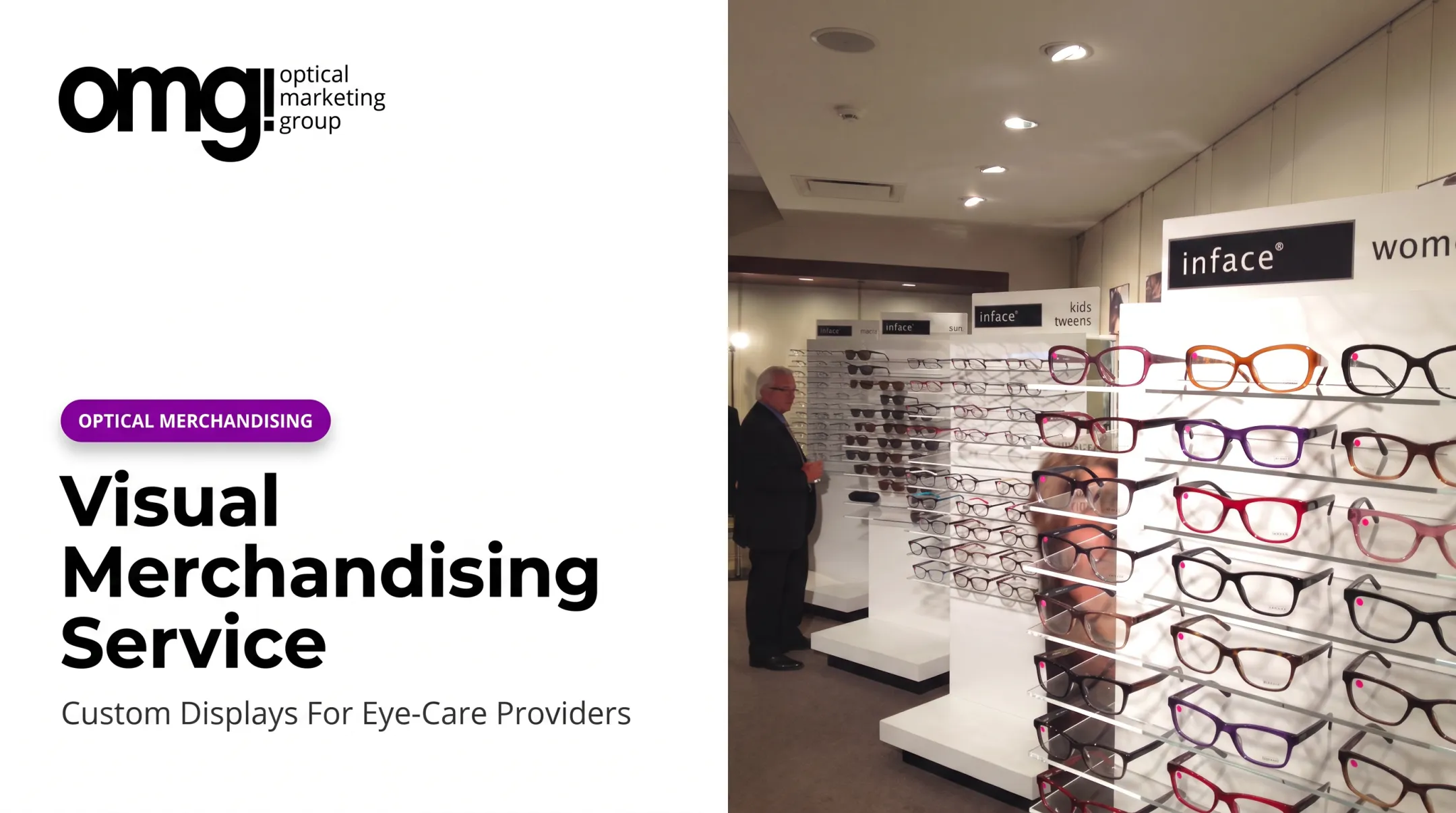
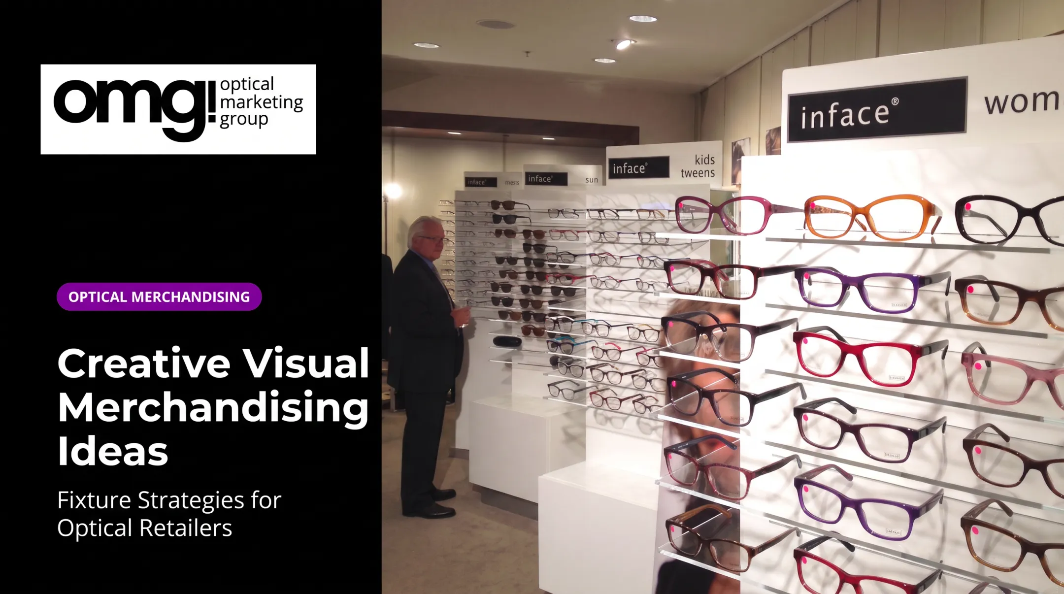
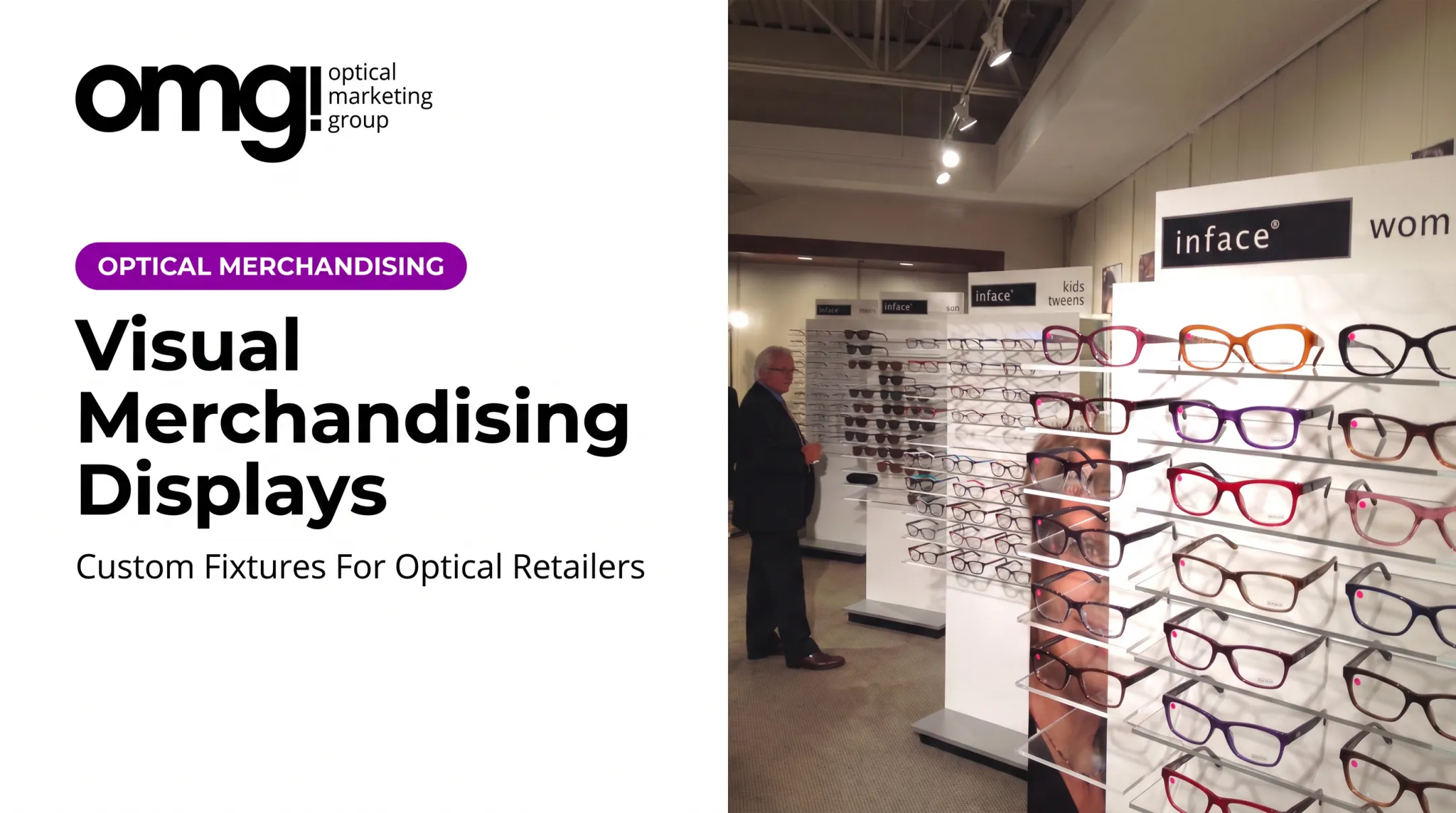
Frame boards, wall displays, tables, shelving, and mirrors give structure to the entire optical. They determine how easily patients can see, reach, compare, and try on eyewear.
Visual hierarchy matters here. Hero displays should spotlight priority collections, while supporting assortments stay organized and uncluttered. Eyecare Business's merchandising guide notes that fitting tables and freestanding displays shouldn't block frame boards — they should direct traffic toward the merchandise instead.
Group frames by whatever makes sense to the shopper:
- Brand or designer collection
- Lifestyle (active, professional, fashion-forward)
- Material or price range
- Patient need (progressive-friendly, kids, sun)
Avoid categories that only make sense internally. If a patient can't guess what a grouping means at a glance, it's not working. Fixture scale, spacing, and negative space all signal quality — overcrowded shelves read as discount, while generous spacing reads as considered.
Lighting
Lighting does more work than most practices give it credit for. Different functions require different approaches:
| Lighting Type | Role | Optical Application |
|---|---|---|
| Ambient | General illumination throughout a space | Overall dispensary brightness |
| Accent | Directional emphasis on an object | Featured frame boards or collections |
| Task | Focused light for visual work | Dispensing and adjustment surfaces |
| Display | Fixture-specific lighting | Shelves, counters, mirrors |
This distinction comes from the IES's lighting definitions, which separate these functions precisely because mixing them up creates either flat, boring displays or harsh, uncomfortable ones.
Brighter isn't automatically better. The goal is controlled visibility — enough contrast to highlight frame detail without glare on lenses or mirrors. One industry benchmark allocates at least 30% of a build-out budget to lighting, which signals how much weight it carries in perceived quality.
Electrical and accessibility requirements vary by jurisdiction. Confirm applicable codes with a licensed electrician and your local building authority before finalizing fixture placement.
Color, Materials, and Brand Identity
Wall colors, fixture finishes, flooring, and display backgrounds set the tone before a patient reads a single sign. A restrained palette keeps eyewear as the visual focal point; accent colors can flag specific collections or seasonal promotions without overwhelming the space.
Material choices should match your positioning:
- Warm wood tones suggest approachable, family-friendly care
- Glass and metal finishes lean modern and premium
- Soft textiles and muted palettes support a wellness-oriented feel
Consistency matters more than any single choice. The same palette and materials should carry from exterior signage through reception, optical displays, printed materials, and your website. A patient scrolling your site should recognize the practice the moment they walk in.
Signage, Education, and Storytelling
Signage should answer a patient's next question at the exact moment they have it, without crowding the display or replacing a helpful conversation with staff.
That covers a lot of ground:
- Exterior and window signage
- Wayfinding between departments
- Category labels and frame-brand messaging
- Lens education and pricing communication
Storytelling connects frames to lifestyles, design details, or lens benefits — turning a shelf of similar-looking glasses into a reason to choose one over another. Keep typography readable at a comfortable viewing distance, messages short, and terminology consistent. Pull outdated promotions down promptly; stale signage undercuts trust faster than no signage at all.
Digital and Interactive Visual Communication
Screens and interactive displays can support frame discovery and lens education, but only when they're integrated into the environment rather than bolted on for decoration.
Useful digital content tends to share a few traits:
- Concise and visually clear, not text-heavy
- Brand-consistent with the rest of the practice
- Genuinely informative, such as a face-shape guide or lens comparison
Placement, brightness, and sound all affect whether a screen helps or distracts. A window-facing display needs different brightness than a quiet in-office tablet. Content should also update easily, since a frozen or outdated screen reads worse than no screen.
OMG! Optical Marketing Group works with practices on exactly this kind of integration — branded signage, digital displays, graphics, and custom fixtures designed as one coordinated system rather than separate purchases.
How to Apply These Elements in an Optical Practice
Knowing the elements is one thing. Sequencing them into real changes is another.
Start With the Patient Journey
Map what patients see and understand from the exterior approach through check-in, clinical care, frame browsing, and departure. Note where they hesitate: unsure where to start browsing, how frames are grouped, or how to flag down help.
Use that map to prioritize fixes. A display that looks slightly dated but functions well matters less than a bottleneck that confuses every visitor.
Balance Clinical Trust With Retail Discovery
Clean lines, organized displays, and professional materials make browsing feel intentional without tipping into "discount outlet" territory. Keep retail cues tied to care: use signage to explain lens options and comfort benefits, not just price.
Avoid visual clutter, aggressive promotional language, or displays that block clinical sightlines. If something conflicts with how your practice positions itself, it doesn't belong, no matter how good the deal looks.
Make Frame Browsing Easy and Inclusive
Reach ranges, clear labeling, mirrors, and seating all affect whether patients and their companions can comfortably compare eyewear. The Access Board's accessible routes guidelines call for continuous clear pathways of at least 36 inches in most circulation areas, a detail worth checking before finalizing fixture placement.
Consider different patient groups directly:
- Children need lower, sturdier displays
- Older adults benefit from brighter task lighting near mirrors
- Patients with mobility limitations need wider, obstruction-free aisles
Grouping frames by meaningful need supports self-guided discovery while still giving opticians a natural moment to step in.
Create a Connected Brand Experience
The exterior, reception, frame displays, and digital communications should feel like one system, not disconnected pieces. Pick a small number of repeatable cues (a color palette, a material family, a signature display feature) and carry them everywhere.
That consistency pays off across remodels, seasonal updates, and new locations, because patients recognize the brand even when the layout changes.
Connect Design Decisions to Business and Operational Goals
Every merchandising change should tie to something measurable: browsing time, visibility of a priority collection, fewer navigation questions, or stronger multiple-pair conversations. As OMG! founder Bill Gerber notes, an excellent space, pre-appointment browsing, and an effective staff handoff are consistent factors behind strong capture rates.
Compare before-and-after indicators like optical capture, frame-category performance, and patient feedback rather than guessing at results. OMG!'s Patient Experience Assessment and Project Planner are built specifically to help practices identify which priorities matter most before spending on fixtures or signage.
Practical Visual Merchandising Checklist for an Optical Practice
Walk your own space with fresh eyes using this checklist:
- Exterior and first impression – Storefront signage, windows, lighting, and curb appeal should make your optical offering obvious from the sidewalk.
- Interior and patient flow – Walk the space as a patient would. Check sightlines, congestion points, seating, accessibility, and whether the next step is ever unclear.
- Displays and maintenance – Inspect frame spacing, fixture condition, product availability, mirror placement, lighting accuracy, and signage freshness.
- Performance review – Gather staff and patient feedback, review frame-category data, and revisit the space after patients have had time to adjust to any changes.
Not every fix requires the same scope. Match the solution to the actual problem, not the loudest complaint:

- Congestion often needs only a light refresh
- A slow-moving priority collection may need better signage or a custom fixture
- A practice that has outgrown its layout may need a full redesign
Conclusion: Turn Visual Merchandising Into a Better Optical Experience
Visual merchandising works as a system:
- Layout creates flow
- Fixtures make products accessible
- Lighting directs attention
- Color builds identity
- Signage gives patients context at the right moment
Walk through your own practice from a patient's first glance at the door to the moment they leave with a new pair of glasses. Prioritize the changes that make care, browsing, and decision-making feel like one connected experience, not separate stops along the way.
OMG! Optical Marketing Group works with independent practices, multi-location chains, and eyewear brands across the United States on exactly this kind of integrated design, merchandising, fixtures, graphics, and signage.
Frequently Asked Questions
What are the main elements of visual merchandising?
Layout and traffic flow, displays and fixtures, lighting, color and branding, signage and storytelling, and digital communication. Each element supports the others rather than standing alone.
What is visual merchandising in an optical practice?
It's the intentional arrangement of eyewear, space, displays, lighting, signage, and patient flow to create a welcoming, easy-to-navigate optical experience. It bridges clinical care with retail discovery.
How can visual merchandising improve an optical practice?
Thoughtful merchandising can support better patient experience, easier frame discovery, stronger staff efficiency, and more consistent brand presentation. It can also support higher optical capture and multiple-pair conversations, though results vary by practice.
What type of lighting is best for an optical display?
A mix of ambient, accent, and task lighting works best — ambient for general comfort, accent for featured frames, and task lighting for dispensing surfaces. Have an electrician confirm applicable local requirements before installation.
How should frames be organized in an optical dispensary?
Group frames by meaningful categories such as brand, lifestyle, collection, or patient need, supported by clear signage and comfortable spacing. Mirrors and seating nearby make comparison and try-on easier.
How often should an optical practice update its visual merchandising?
It depends on brand strategy, inventory changes, seasonal campaigns, and wear on fixtures. Routine maintenance should happen continuously, with larger refreshes guided by patient feedback and performance data.