
Introduction
Walk into most optical dispensaries and you'll see the same thing: rows of frame boards, dim lighting, and no clear path for patients to explore. Many practices treat the optical area as storage rather than retail space, and patients notice.
That first impression shapes whether patients browse—or wait passively for their exam. 86% of recent eyewear purchasers bought their glasses in person in Q1 2024, according to The Vision Council's consumer research. Physical browsing still drives the sale.
A thoughtful display does more than hold inventory. It invites patients to browse before their exam, helps staff guide them toward relevant frames, and reinforces what your practice stands for.
This article covers creative display ideas—from lighting and storytelling to digital interaction and seasonal rotation—built specifically for U.S. optical shops.
Key Takeaways
- Pair visual appeal with easy access, clear paths, and brand story that drives try-ons.
- Keep frames easy to touch, compare, try on, and return without breaking the display.
- Use lighting, signage, color, and materials to reinforce identity—not add clutter.
- Judge success by staff feedback, patient engagement, and browsing patterns—not looks alone.
Overview of Optical Shop Displays in the U.S. Eyecare Retail Market
An optical shop display is the coordinated use of fixtures, frame presentation, lighting, graphics, signage, and digital content that supports eyewear discovery. The impact comes from how those pieces work as one system.
Here's the challenge unique to eyecare: a dispensary has to balance clinical credibility with retail warmth. Too sterile, and frames feel like medical equipment. Too flashy, and the practice loses the trust patients expect from a healthcare provider.
Done well, merchandising supports outcomes that go beyond looks:
- Smoother traffic flow between reception, pre-test, and dispensary
- Earlier frame browsing before the exam even starts
- Easier staff consultations with clear product zones
- Stronger brand presentation that patients remember
- More natural openings for multiple-pair conversations
Bill Gerber, founder of OMG! Optical Marketing Group, points to three factors behind high optical capture rates: an excellent space, pre-appointment browsing, and an effective handoff between clinical and retail staff.

Key display zones to plan around:
- Storefront and window
- Entry area
- Primary frame walls
- Tabletop or island fixtures
- Sunglass areas
- Lens education zones
- Checkout or dispensing counters
The ideas below aren't one-size-fits-all. Adapt them to your footprint, patient demographics, frame assortment, and budget.
Top Creative Optical Shop Display Ideas
Each idea below meets four criteria: it's visually distinctive, practical for eyewear handling, compatible with patient flow, and able to support discovery without overwhelming the space.
Frame a Storytelling Wall
Organizing frames by story rather than by brand or alphabet gives patients a reason to explore. Group them by color, material, lifestyle, face shape, professional use, outdoor activity, or design heritage instead of presenting every frame as an undifferentiated product.
Pair the section with short, discovery-driven signage. One line explaining "Lightweight Titanium for All-Day Comfort" does more work than a brand name alone.
The same frame collection can tell different stories depending on context:
- A fashion-led boutique might group frames by seasonal color trend
- A family practice might organize by age group and activity
- A medical optical might highlight lens technology alongside frame material
Brand-story signage, like the compact 6" x 3" cards some suppliers use to explain craftsmanship and materials, makes this approach easy to execute at the fixture level.
Create a Hero Frame or New-Arrival Feature
One highly visible feature can introduce new arrivals, limited collections, or a priority brand without making the whole dispensary feel like a sales floor.
A unit like Bryan's Massive Frame Display works well here. It holds 24 frames in a 70" wide steel-and-glass case with remote-controlled dimmable LED backlighting.
Practical requirements matter here:
- Clear sight lines from the entrance
- Enough spacing so frames don't look crowded
- Secure fixtures that still allow easy handling
- A nearby mirror for immediate try-on
- An open path for patients to approach without obstruction
Change the hero feature whenever the product story changes. Once it sits untouched for months, it becomes background décor instead of a draw.
Use Layered Shelving and Dimensional Fixtures
Flat frame boards treat every pair the same. Layered shelving doesn't. Combining wall-mounted shelves, recessed bays, risers, and angled supports at varied heights creates depth that makes individual frames easier to notice.
Controlled negative space matters as much as the fixtures themselves. A wall packed with repeated silhouettes reads as clutter, even if every frame is beautiful on its own.
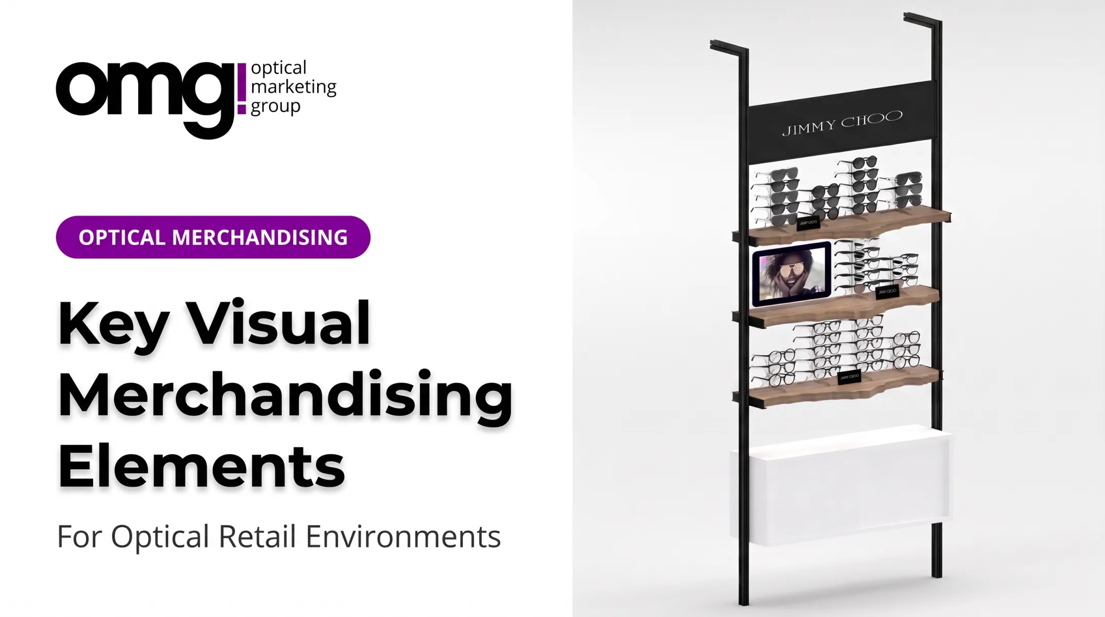
Fixtures like the Cliff Lit Shelving Display, available in 36" to 72" widths, illustrate this principle: open shelving, strategic risers, and integrated backlighting frame each piece as a featured product rather than one item in a crowd.
Choose durable, easy-to-clean materials, and make sure fixture depth doesn't block staff movement or patient access.
Design a Color- or Material-Led Frame Zone
Grouping eyewear by a curated color family, finish, or material creates stronger visual impact than strict alphabetical or brand-only organization. It also helps patients compare options more intuitively.
Color blocking works best when:
- Bold colors sit against neutral backgrounds, not competing patterns
- Lighting is consistent across the zone so colors read accurately
- Enough space surrounds the frames to avoid visual noise
- Staff can still navigate the section logically for consultations
Finish options matter too. Fixtures offering a range of laminate or powder-coat finishes, from wood grain to metallic silver, let practices match a color zone to their brand palette rather than working around whatever a generic display provides.
Add Integrated Lighting and Mirror Moments
Lighting reveals what a frame actually looks like. Targeted, glare-controlled lighting shows finishes and lens treatments accurately and supports a realistic try-on experience.
Four lighting types serve different purposes:
- Ambient lighting sets the overall mood of the dispensary
- Accent lighting draws attention to a specific feature or hero display
- Under-shelf lighting eliminates shadows on frames below eye level
- Illuminated display features, like backlit cases, make products pop without extra fixtures
Position mirrors at natural decision points, not tucked in a corner.
Check lighting from the patient's actual viewpoint, standing where they'll stand. That quick check catches shadows, reflections, or unflattering color casts before they become a daily annoyance.
Build a Window or Entry Display That Invites Discovery
The storefront communicates your practice's personality before a patient ever reaches the dispensary. A small, carefully selected set of frames paired with a clear visual message does more than a window crammed full of product.
Rotate the window concept around:
- Seasonal collections
- Local events or community ties
- New services, like updated lens technology
- Frame stories or educational themes
Keep sight lines uncluttered. Readable messaging and an accessible entry route matter just as much as the frames themselves, and the display shouldn't block views into the practice from outside.
Combine Physical Displays With Digital Storytelling
Screens can supplement physical merchandising with content that a static display can't deliver on its own: frame stories, designer information, lens education, or appointment prompts.
The key is restraint. Digital content should support the physical display, not compete with it. That means short messages, strong visuals, readable typography, and a content schedule someone actually manages.
OMG! Optical Marketing Group's Contentlinq platform is one example of how a design partner integrates hardware, content, and physical merchandising into a single system. That can include interactive tablets with lens demos and face-shape guides, plus larger touch displays with built-in analytics.
Whatever platform a practice chooses, the screen should earn its spot, not just fill wall space.
Create an Interactive Try-On or Discovery Area
A dedicated zone where patients can browse, compare, and discuss frames, without blocking the main circulation path, changes how people interact with your dispensary.
Practical elements make this work:
- Comfortable seating near the frame selection
- Organized categories patients can navigate independently
- Cleaning supplies within easy reach
- Adjustable lighting for accurate try-on
- Clear staff sightlines so help is always visible
- Flat surfaces for safely setting frames down
Simple interactive prompts, "Compare Materials," "Find Your Fit," "Explore Sunwear," encourage discovery without making the moment feel like a sales script. A tray-based browsing setup with velvet-lined compartments works well here, since it protects frames from scratches while patients handle multiple pairs side by side.
Rotate Displays Around Seasons, Collections, and Patient Needs
Planned rotation keeps the dispensary visually current and gives returning patients a reason to look again. One optical trade recommendation suggests changing a showcase theme monthly, alternating between new arrivals, sport eyewear, and children's frames, rather than leaving the same board untouched for a season.
Rotate a feature section rather than rebuilding the whole optical area. Modular fixtures, interchangeable graphics, and reusable signage make this manageable.
Themes that stay relevant beyond holidays:
- Back-to-school and workplace eyewear
- Outdoor and sport performance frames
- Travel-ready and lightweight materials
- New lens technologies
Track which themes generate questions, try-ons, or staff conversations before deciding what earns a repeat appearance.
How We Chose the Best Display Ideas
These ideas weren't selected for how they photograph. Each one was evaluated against practical, optical-specific criteria:
- Patient flow and sightlines
- Frame visibility and ease of browsing
- Try-on comfort
- Cleaning and maintenance demands
- Durability of materials
- Accessibility
- Brand consistency
- Flexibility for future product changes
Common mistakes to avoid:
- Overcrowding every shelf until nothing stands out
- Using inconsistent signage that confuses rather than guides
- Placing displays where they interrupt foot traffic
- Relying on decorative lighting that distorts frame color
- Organizing product in a way patients can't follow without help
Before installing new fixtures, research relevant accessibility, electrical, and fire-safety requirements for your jurisdiction. These vary by project, and skipping this step creates costly rework later.
Once a display is live, measure it through staff observations, patient comments, browsing patterns, frame handling, and optical business indicators—not just how it looks in photos.

Practices planning a new space, relocation, or refresh can use OMG!'s Patient Experience Assessment or Project Planner to connect display concepts with space planning, fixtures, graphics, and installation.
Conclusion
A creative optical display does one job well: it makes eyewear easier to notice, understand, compare, and try on, while making the whole visit feel more welcoming.
Start with one priority zone. That might be the entry, a single frame wall, or a hero display near reception. Refine that concept using staff feedback and patient behavior before expanding the approach throughout the dispensary.
If you're ready to plan a full optical environment, OMG! Optical Marketing Group has spent over a decade helping independent practices and multi-location retailers. Projects cover space design, custom fixtures, graphics, signage, and digital display support so dispensaries become places patients actually want to browse.
Frequently Asked Questions
What are some effective ways to display eyeglasses?
Organize frames into clear zones by color, lifestyle, or material, with strong lighting and mirrors nearby. Add short storytelling signage and leave enough negative space for easy browsing and comparison.
How to increase sales in an optical shop?
Better visibility, guided discovery, and regular display testing all support sales growth, though results vary by practice. Focus on relevant product zoning and staff engagement rather than expecting a display alone to drive a specific increase.
How to make glasses look attractive?
Flattering, glare-controlled lighting paired with uncluttered spacing makes the biggest difference. Coordinate colors, keep fixtures clean, and use mirrors and themed displays that highlight frame details rather than burying them among dozens of similar styles.
What are the fashion trends for glasses in 2026?
GlassesUSA.com's 2026 trends report highlights stone-set details, chrome finishes, milky neutral tones, and quiet luxury silhouettes. Feature these as rotating accents within a storytelling display rather than a permanent section, so the space doesn't feel dated once trends shift.
How should an optical shop arrange its displays?
Plan a logical flow from storefront to dispensary, with intuitive product categories and accessible try-on zones along the way. Keep staff sightlines clear and separate browsing areas from clinical circulation paths.
How often should an optical shop change its frame displays?
Base rotation on product launches, seasonal shifts, and patient response rather than a fixed calendar. Many practices review and refresh a feature section monthly, while leaving core frame walls in place longer.