
Introduction
Before a patient ever sits in your exam chair, they've already judged your practice. That judgment happens at the window.
Your storefront glass is the first impression for everyone walking, driving, or waiting at the light outside your door. Historical signage research from the Sign Research Foundation found that about a third of shoppers said they'd entered an unfamiliar store simply because the signage looked appealing.
That's self-reported behavior, not a lab-measured conversion rate, but it lines up with what optical practices see firsthand. City Optometry in San Francisco reported that new window graphics made people stop, stare, and walk in, some admitting they hadn't even realized the office existed.
The challenge is balance. Your window needs to grab attention from passing traffic without turning into visual clutter that hides what's inside.
This article covers frame-focused displays, lifestyle storytelling, seasonal campaigns, privacy-conscious films, and digital elements, plus how to choose and execute the right one for your practice.
Key Takeaways
- Build each window around one message, one visual priority, and one reason to step inside.
- Match your graphic concept to your brand, window structure, patient base, and desired visibility.
- Typography, contrast, lighting, scale, and viewing distance are core design decisions, not afterthoughts.
- Window graphics should connect visually to your dispensary, signage, and overall patient experience.
Window Display Graphic Ideas for Optical Practices
These concepts work for independent optometry practices, ophthalmology offices with optical dispensaries, optical boutiques, and eyewear brands. Each one solves a different problem, so pick based on your goals rather than trying to do everything at once.
Frame-Focused Hero Display
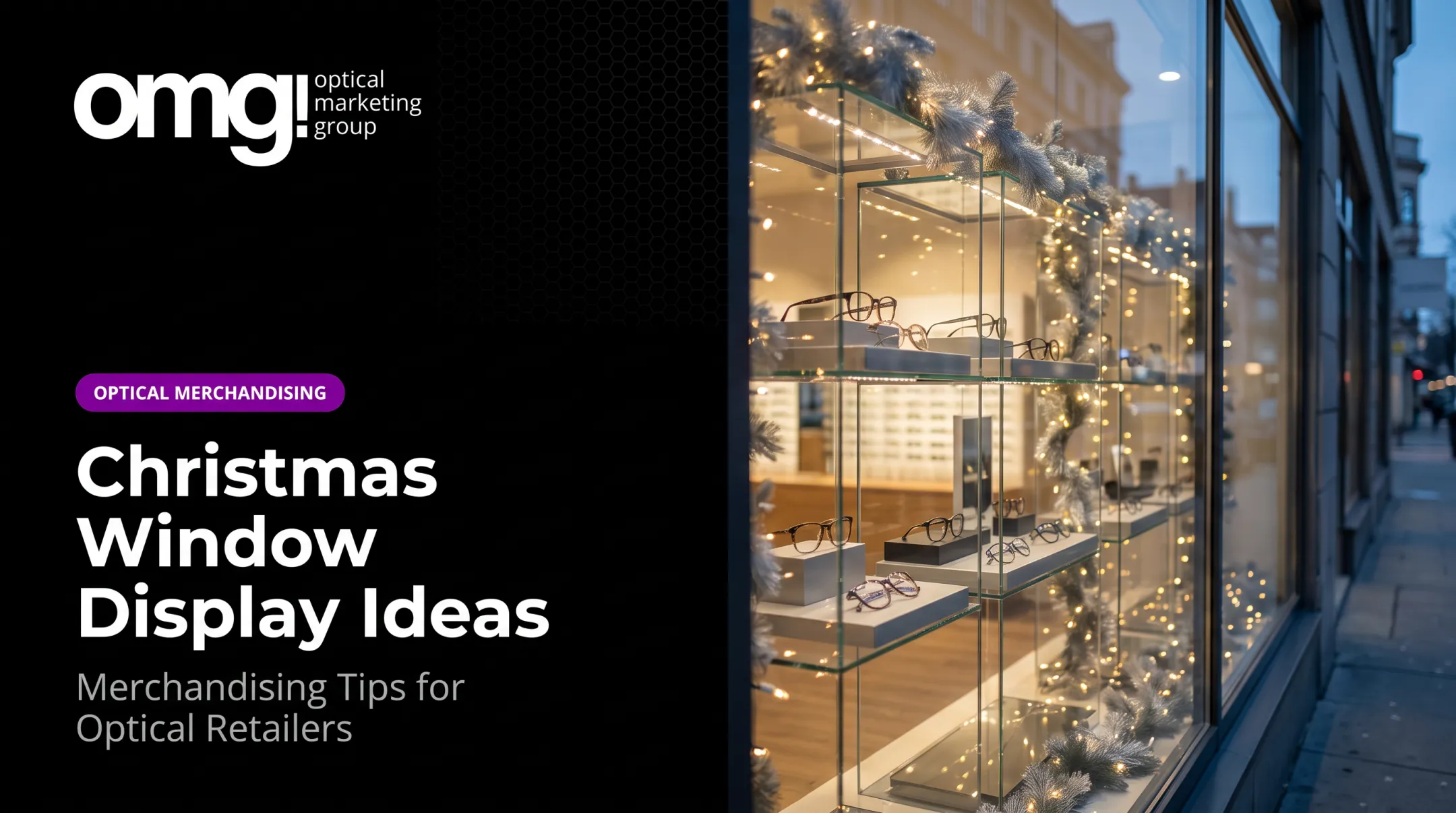
Make one pair, or one tightly curated collection, the star. An enlarged product photo against a clean background, paired with a short line like a collection name or a single style benefit, reads instantly from the sidewalk.
The catch: resist the urge to show ten frames at once. Rotate the hero based on new arrivals, seasonal lines, or priority brands so the display never feels static.
"See Yourself" Lifestyle Story
Photography or illustration of real people wearing eyewear in everyday moments helps passersby picture themselves in the frames. This works especially well for practices serving broad or multigenerational patient bases.
Choose imagery that reflects who actually walks through your door. Avoid the overly staged, generic stock-photo look. It reads as inauthentic and undercuts trust fast.
Brand Storytelling and Optical Expertise
Turn the glass into a statement of who you are: brand colors, a signature shape, a founder's story, or a point of view on eyewear. OMG!'s work with practices has shown this kind of personalized signage, paired with brand storytelling and clear category identification, does more to build recognition than generic promotional copy.
The balance to strike: credibility without coldness. A medical-grade eyecare brand still needs to feel like an invitation, not a billboard.
Seasonal Eye-Care or Eyewear Campaign
Sunglasses season, back-to-school eyewear, and winter glare protection all give you built-in reasons to refresh your window. National Sunglasses Day falls on June 27, and The Vision Council's 2023 report ties sun protection messaging to year-round awareness rather than a single peak week.
Design seasonal elements as swappable layers, panels, or clings so your permanent branding stays intact between campaigns. One Northeast practice found its back-to-school window traffic concentrated between early August and mid-September, a useful planning cue even though timing will vary by region.
Transparent Discovery Display
Instead of covering the whole window, use border graphics, corner accents, or top-heavy placement so people can still see your dispensary through the glass. This works well when your interior merchandising is strong enough to sell itself.
One condition: whatever's visible through the glass needs to look organized. A cluttered frame wall behind a clean graphic defeats the purpose.
Educational or Interactive Window
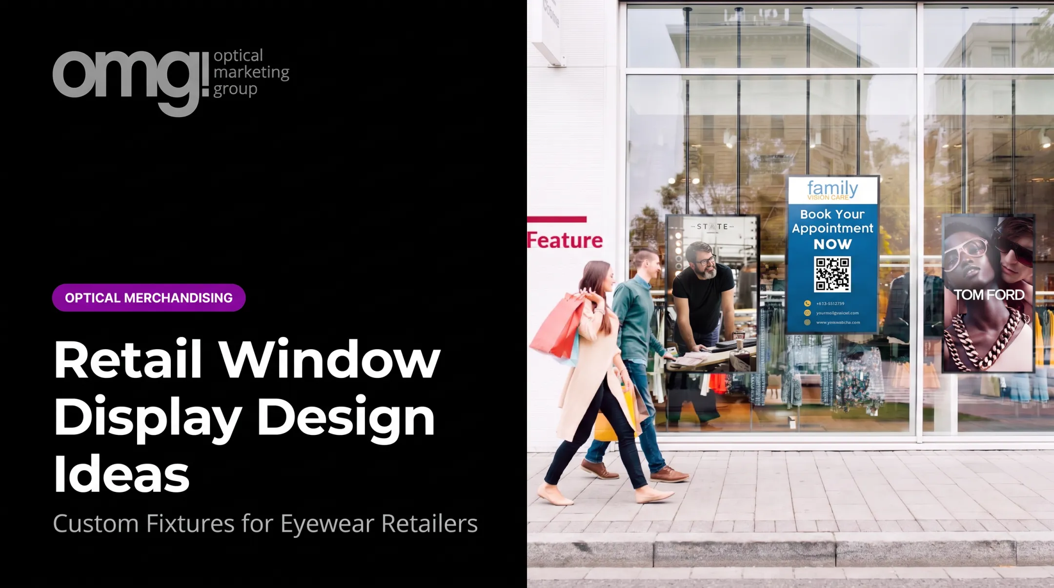
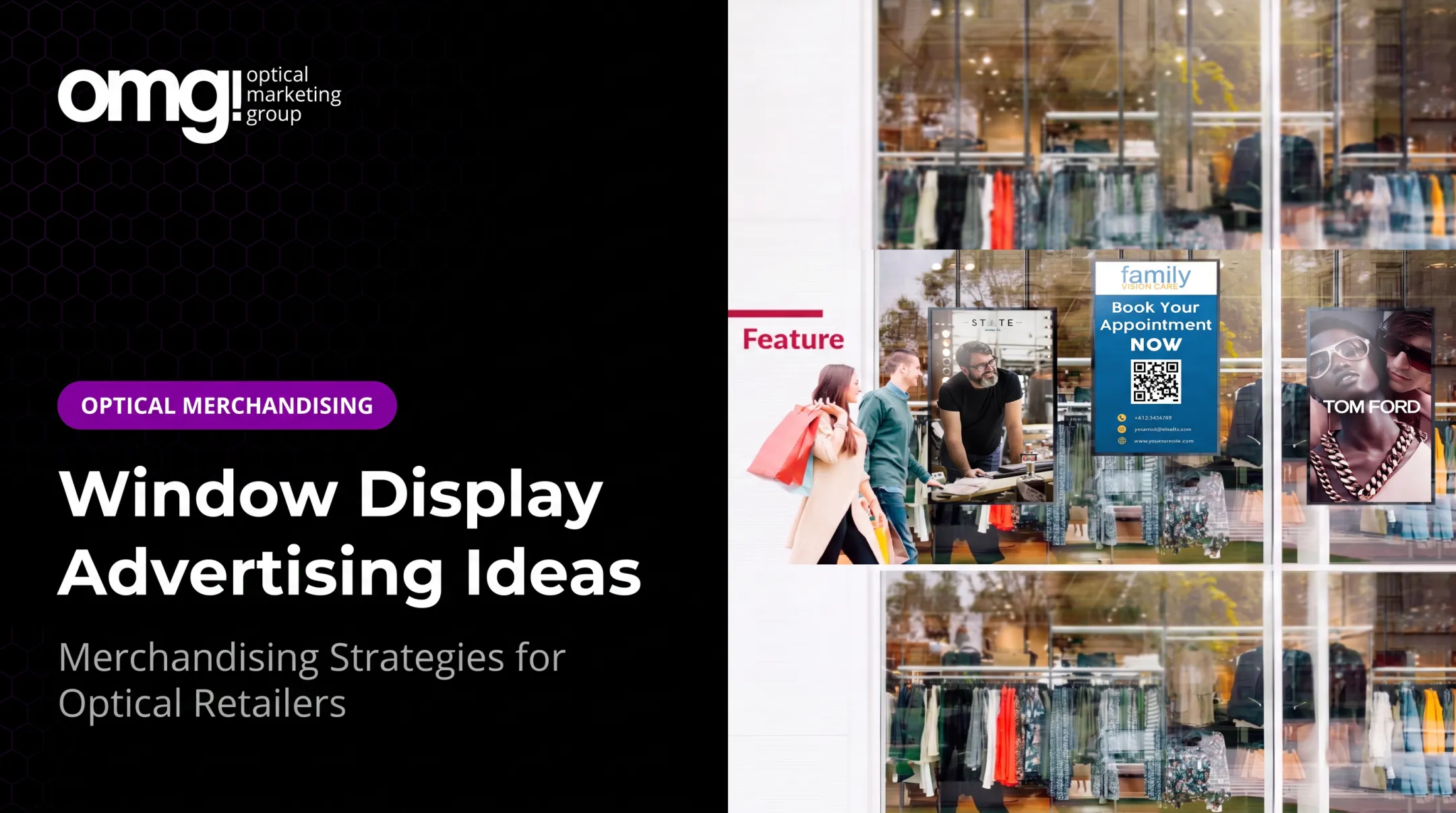
A simple visual explaining lens options, UV protection, or children's eyewear fitting makes your practice feel approachable before anyone steps inside. QR codes can extend this into appointment booking or product details, similar to the scannable code one OMG! client added during a storefront refresh.
Keep the core message readable without requiring a scan. Not every passerby will stop to pull out their phone.

How to Choose the Right Window Graphic Concept
The right idea depends on your goals, your window's physical conditions, your audience, and how your storefront connects to the optical area behind it. Use this as a checklist rather than assuming every display type fits every practice.
Start With the Business Objective
Decide what the window needs to accomplish before choosing a concept:
- Increasing general awareness in the neighborhood
- Promoting a specific frame collection or brand
- Announcing a new location or added service
- Improving curb appeal ahead of a refresh
- Supporting a seasonal or promotional campaign
- Directing foot traffic toward the entrance
Pick one primary outcome. Trying to achieve all six at once is how windows end up overcrowded.
Assess Visibility, Traffic, and Viewing Distance
Think about how people actually see your window: walking past on a sidewalk, driving by at 30 mph, or sitting at a red light across the intersection. OMG!'s New Rule #8 points out that most storefronts are seen from varying distances, often during a brief drive-by. That reality should shape how you scale the display.
Viewing speed and distance determine type size, image scale, and how much detail you can realistically include. A message that reads clearly at 10 feet can be invisible from across a parking lot.
Match the Format to the Window and Interior
Open, semi-closed, and shadowbox windows each behave differently:
| Window Type | Transparency | Best For |
|---|---|---|
| Open/full view | High | Strong, tidy dispensary merchandising |
| Semi-closed/partial | Medium | Brand storytelling with some product visibility |
| Shadowbox/closed | Low | Curated hero displays, privacy-focused practices |
Also account for reflections, glare, mullions, door swings, and sun exposure. A design that looks perfect on screen can wash out completely in afternoon light.
Design for the Intended Patient or Shopper
A premium optical boutique, a family practice, and a high-volume dispensary each call for different tone, color, and information density. A medical ophthalmology office with an optical dispensary, for example, often needs warmer visuals to soften a clinical setting.
Use inclusive imagery and language that welcomes patients without implying a particular age, style, or appearance is required to belong.
Plan for Change and Measurement
Decide upfront what stays permanent (your logo and core brand pattern) versus what rotates (campaign panels or QR-linked promotions). Then track something concrete: window-specific QR scans, mentions of the display at check-in, or shifts in walk-in traffic.
Don't invent results. If you don't have a benchmark yet, your first campaign becomes the benchmark for the next one.
Design Principles for Effective Window Graphics
A beautiful display can still fail if it's hard to read, poorly lit, or disconnected from the practice inside it. These principles are the foundation for every idea above.
Create One Clear Focal Point
Every effective window has a single thing the eye lands on first: a hero frame, a face, or a bold illuminated message. Supporting graphics should reinforce that focal point, not compete with it through multiple headlines or products fighting for attention.
Use Typography for Fast Reading
People viewing your window from outside often have seconds, not minutes. The International Sign Association recommends letters at least one inch tall for every 25 feet of viewing distance, and advises against fancy or script lettering that slows comprehension.
If you use a 70/30 balance of graphics and text, treat it as a flexible guideline, not a fixed formula. No formal industry standard defines that ratio.
Balance Brand Color, Contrast, and Negative Space
Brand colors build recognition. Contrast keeps text legible against glass, interior lighting, and sun glare. Leave intentional empty space around your logo and hero image so the window feels curated rather than crammed.
Use Imagery That Builds Trust
Different image styles support different goals:
- Product photography works best for frame-focused hero displays
- Lifestyle photography supports "see yourself" storytelling
- Illustration or abstract patterns fit brand-forward concepts
- Educational diagrams suit lens or fit explanations
Whatever you choose, pay close attention to reflections, lens distortion, skin tones, and accurate frame detail. Low-quality eyewear imagery undercuts the credibility you're trying to build.
Integrate Lighting and Day-and-Night Viewing
A window that looks sharp at noon can disappear after dark, or vice versa. OMG!'s current trend data suggests allocating at least 30% of an optical build-out budget to lighting, which applies directly to window visibility.
Test your design from the sidewalk at different times of day, and from inside looking out. Glare, reflections, and color shifts behave differently depending on sun angle and interior lighting.

Window Graphic Formats and Production Options
Material choice should follow your design goal, not the other way around. Confirm installation and removability requirements with your provider before committing.
Decals, Clings, and Cut Vinyl
Adhesive decals, removable clings, and contour-cut vinyl are the workhorses for logos, lettering, borders, and temporary promotions. They're easy to swap for seasonal campaigns, but repositioning can be limited once applied, and removal quality depends on the film and how long it's been up.
OMG!'s signage and graphics production typically runs 7–10 business days for larger orders and 14–16 for smaller ones.
Perforated, Frosted, and Privacy-Oriented Films
Perforated film covers large areas while letting staff see out from inside. According to Contra Vision's FAQ, that one-way privacy effect depends on the outside being brighter than the inside, meaning it can fade or disappear once interior lights are on after dark.
Frosted or translucent films work differently, controlling privacy through light diffusion rather than brightness contrast. Either way, final visibility depends on lighting conditions and installation quality, not just the product name on the spec sheet.
Backlit, Digital, and Interactive Graphics
Translucent backlit panels add depth without electronics. Digital screens, like OMG!'s HD Series window-facing signage, reach up to 5,000 nits for visibility in direct sunlight and automatically adjust brightness between day and night.
If you add a QR code:
- Keep text legible on its own
- Provide a non-digital takeaway for people who won't scan
- Avoid motion or color as the only way information is conveyed
A screen that only works for people who stop and interact isn't doing its job for everyone walking by.

Common Mistakes to Avoid
Use this as a quick quality check before finalizing a new display or refreshing an existing one.
Too Much Information or Too Many Products
Several patterns reduce comprehension from outside:
- Long service lists
- Multiple calls to action
- Crowded frame assortments
OMG!'s New Rule #8 points out that individual frames are small enough to get lost entirely in a busy window. Pick one message and one next step, then move everything else to your website, a QR destination, or in-store signage.
Ignoring the View Behind the Graphic
A sharp graphic loses its impact if it's framed by exposed wires, empty fixtures, or harsh reflections. One OMG! storefront refresh case found a "before" window where dense signage and glare made the entire display look cluttered, even though the graphics themselves were fine.
Review your design from several angles outside, and coordinate it with what's actually visible in the dispensary.
Designing Once Without a Maintenance or Refresh Plan
Fading, peeling edges, outdated promotions, and dead QR codes undo good design work. Manufacturer guidance from 3M recommends cleaning vinyl signage at least annually, and more often in high-pollution areas.
Assign someone to own inspections, cleaning, and content updates. Practices working with OMG! Optical Marketing Group often fold window reviews into a regular merchandising refresh rather than treating the display as a one-time project.
Frequently Asked Questions
What is a window display?
A window display is the visual presentation placed in or behind storefront glass to attract attention, communicate a brand or offer, and encourage people to come in. It can include physical products, printed graphics, lighting, or digital screens.
What is the 70/30 rule in graphic design?
It's a flexible composition guideline used to create visual hierarchy by giving one element more emphasis than another. The exact ratio isn't a fixed industry standard and should adapt to your message, window, and brand.
What should a window display graphic include?
A clear focal point, recognizable branding, readable supporting text, imagery appropriate to your practice, and one relevant action, such as booking an appointment or stepping inside.
How do you make a window display attractive?
Strong visual hierarchy, intentional negative space, good contrast, and appropriate lighting all matter more than decoration. High-quality imagery and a concept matched to your actual patient base pull more weight than trends.
Should window graphics block the view into an optical practice?
It depends on your privacy needs, how your interior is merchandised, and your campaign goals. Open, partial-view, perforated, frosted, and fully opaque approaches all work in different situations, so test sightlines under real daylight and nighttime conditions before committing.