
Effective wayfinding design answers these questions before patients have to ask them. It uses space, signage, lighting, landmarks, and brand elements together so people understand where they are and what to do next. This article breaks down the difference between wayfinding and signage, the core design principles, the four sign types every practice needs, and how to apply all of it to an optical environment, plus how to plan, implement, and improve the system over time.
Key Takeaways
- Wayfinding is a full navigation system; signage is just one piece of it
- Strong optical wayfinding aids orientation, privacy, accessibility, and product discovery together
- Directional, ID, info, and regulatory signs need shared type, color, and placement
- Build systems around real patient decision points, then test before production
What Is Wayfinding Design and How Is It Different From Signage?
Wayfinding describes the entire process of helping someone orient themselves, pick a route, track their progress, and recognize when they've arrived. Signage is just one tool used to accomplish that.
SEGD, the professional association for experience designers, defines wayfinding as problem-solving: an interdisciplinary approach that combines information design, graphic design, and industrial design to solve navigation problems.
Signs, maps, physical markers, and nomenclature are the visible output. Discovery, user research, and information hierarchy happen long before anything gets printed.
Here's what that looks like inside an optical practice:
- A sign reading "Optical" identifies a destination, but it doesn't guarantee patients can find it
- A complete wayfinding system makes the optical area visible from reception, marks a clear path, confirms arrival, and separates patient routes from staff corridors
- Lighting, sightlines, and furniture placement do as much navigational work as the signs themselves
Five practical principles tie this together: clarity, consistency, hierarchy, confirmation, and accessibility. The next section walks through each one with optical-specific examples.
Five Principles of Effective Wayfinding Design
These aren't a formally standardized checklist from any single governing body, but they reflect widely used concepts in professional wayfinding practice.
- Clarity: Use plain language, familiar icons, and readable type sized for the viewing distance. A sign that says "Eyewear Pickup" works better than one that says "Dispensing Services Completion Area"
- Consistency: Apply the same terminology, arrow style, color palette, and mounting height everywhere. If "Pre-Test" appears on one sign, don't switch to "Screening" on the next
- Hierarchy: Show only what's relevant at each decision point. SEGD calls this progressive disclosure: patients see broad categories first, then more specific choices as they move deeper into the space
- Confirmation: Repeat destination names along the route and at arrival. A patient walking toward "Optical" should see that word again once they get there, not a different label
- Accessibility: Meet ADA requirements for tactile signs, contrast, and clear approach space so every patient can navigate independently

Accessibility and Inclusion
Compliance details matter most here. Verify current requirements before a project goes to production.
The US Access Board specifies that permanent room identification (restrooms, exam rooms, and staff areas) generally requires tactile characters raised at least 1/32 inch, paired with Grade 2 Braille. Mount these between 48 and 60 inches above the floor.
Directories, temporary signs, and signs posted for seven days or less are typically exempt from these tactile requirements.
Other accessibility basics worth building into any practice signage plan:
- Non-glare finishes with strong light-on-dark or dark-on-light contrast
- Clear floor space near tactile signs so someone can approach and read them comfortably
- Legible type at a size appropriate to how far away someone will be standing
None of this needs to feel clinical. Clean, simple signage in a practice's brand colors and materials can meet these standards while still looking curated rather than institutional.
The Four Main Types of Wayfinding Signs
Every optical practice needs some combination of these four categories, even if a single sign sometimes does double duty.
| Sign Type | Purpose | Optical Practice Example |
|---|---|---|
| Directional | Points toward a destination | Arrow sign at a hallway split pointing to "Optical" and "Exam Rooms" |
| Identification | Confirms arrival at a specific space | Door sign reading "Exam 2" or "Laboratory" |
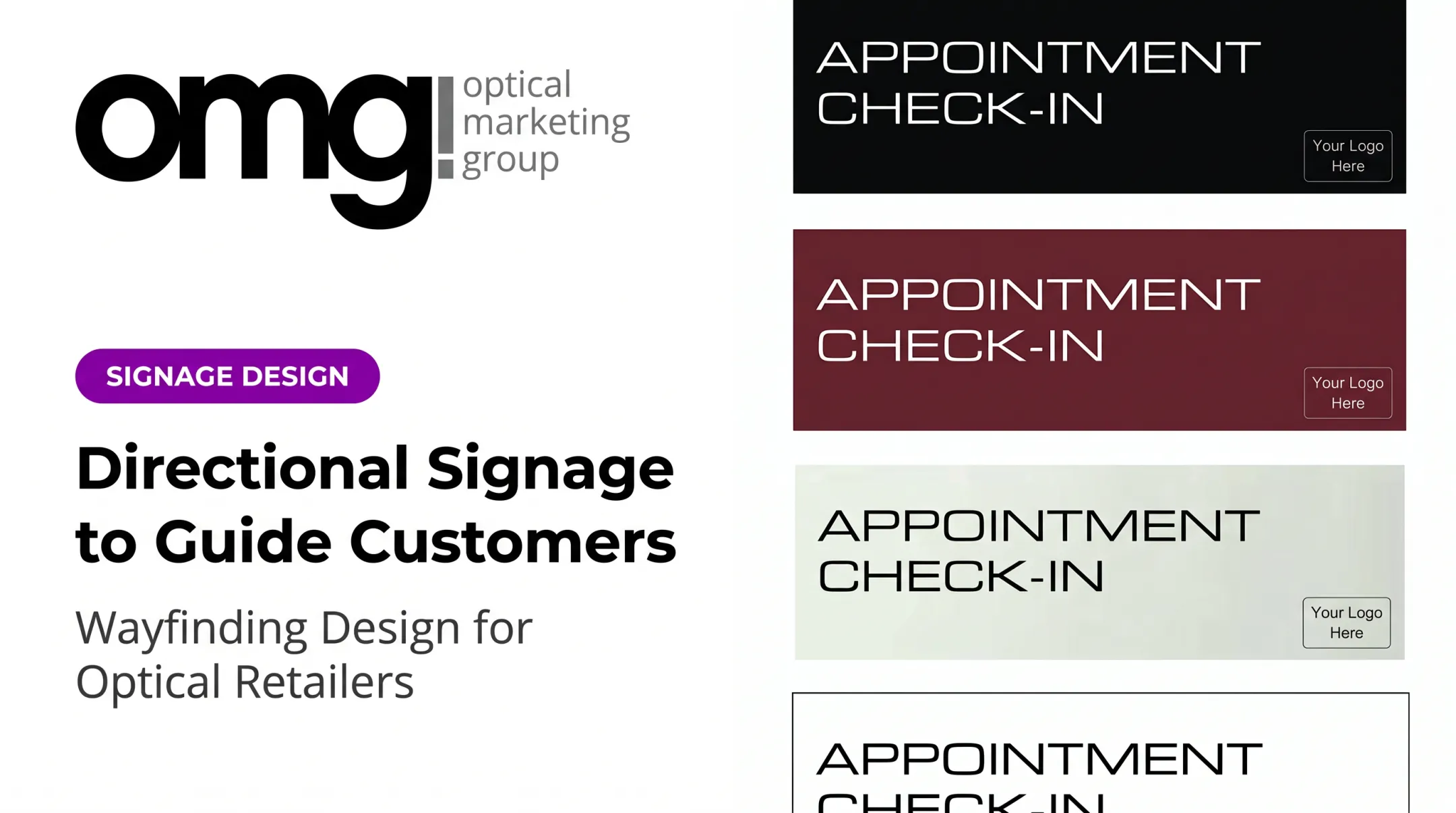
| Informational | Explains hours, process, or categories | Sign noting "Appointment Check-In" or grouping frames by "Performance" or "Fashion" |
| Regulatory | Sets boundaries or safety rules | "Staff Only," "Emergency Exit," or a privacy notice near consultation rooms |
A few practical notes on how these play out day-to-day:
- Door signage often handles identification alone. A standard 6" x 3" acrylic door sign might read "Exam Room," "Pre-Test," "Laboratory," or simply "Private"
- Department signage, typically a larger 18" x 6" panel, often blends identification and informational roles by labeling zones like "Appointment Check-In" or "Eyewear Pickup and Repair"
- Lifestyle or category signage sorts frame displays into groups such as Performance, Fashion, Luxury, or Sale so patients can browse without asking staff
Combining too many messages onto a single sign backfires. A directory that lists every department alongside hours, pricing notes, and a safety disclaimer becomes something nobody reads. Keep each sign focused on one job, even when it serves two roles.
How to Apply Wayfinding Design to an Optical Practice
Good wayfinding starts with mapping the actual patient journey, not an idealized version of it.
Map the Patient Journey
Walk the real path: parking, entry, reception, pre-testing, exam rooms, optical browsing, dispensing, checkout, exit. At each stage, ask where patients hesitate, turn the wrong way, or stand around looking for someone to ask.
- The first few seconds matter most. Entry, check-in point, and reception desk should be obvious without competing promotional signage fighting for attention
- Transitions between clinical and retail zones need clear markers, not abrupt handoffs. A patient leaving an exam room should see frame displays without feeling steered into a sales pitch
- Staff-only areas, lab space, and consultation rooms need clear separation from patient routes while still looking like part of a cohesive brand, not an afterthought

Blend Clinical and Retail Zones
This is where optical practices differ from typical medical offices. A dispensary is a retail environment layered inside a clinical space, not a waiting room that happens to hold frames.
- Independent optometry offices often need fewer sign types but more personality in each one
- High-volume practices and multi-location groups need repeatable standards so a patient visiting any location recognizes the same visual language
- Ophthalmology practices with attached optical dispensaries face a specific challenge: making the retail side feel distinct from the clinical side without a jarring transition
OMG! Optical Marketing Group works through this overlap directly. The team integrates branded signage with fixture layouts, space planning, digital displays, and merchandising so wayfinding is planned with the full practice environment, not bolted on after construction wraps up.
Planning and Implementing a Wayfinding Signage System
A signage system that works gets planned, not assembled sign-by-sign as problems come up.
- Audit the space: Review architectural plans, lighting, sightlines, furniture placement, and existing signs. Note where patients or staff currently need extra help
- Build a sign schedule: Assign each sign a type, message, destination, mounting condition, and exact placement. A shared reference system keeps designers, fabricators, and installers aligned
- Set graphic standards: Lock in typography, color, iconography, and finishes. This matters more than it sounds; without it, a future renovation or a second location ends up with mismatched signage
- Validate before production: Walk the route as a first-time visitor would. Test legibility with older adults and people with low vision in mind, since real patients won't all be moving at the same pace or with the same eyesight

OMG!'s own process reflects this sequence: a free Patient Experience Assessment and Project Planner upfront, followed by pre-construction and construction drawings, production, and installation coordination. It's one example of how a multidisciplinary signage project can stay organized instead of becoming a scramble of separate vendors.
How to Evaluate and Improve Wayfinding Over Time
Wayfinding isn't a one-time install. SEGD's evaluation framework recommends examining how users, architecture, and graphics interact throughout a space, not just checking boxes at launch.
Practical ways to spot problems:
- Watch where patients stop, backtrack, or ask directions more than once
- Collect staff feedback on which questions they answer repeatedly
- Track indicators the practice already has, such as check-in delays or time staff spend escorting patients
Update signage whenever departments, room functions, frame categories, or floor plans change. Digital displays need someone assigned to keep content current so messaging does not go stale.
A simple audit: walk the route as a first-time patient would and check:
- Does each sign appear before the decision point it supports?
- Does it use the same language as the sign before it?
- Does it confirm the destination once you arrive?
Frequently Asked Questions
What is a wayfinding system?
A wayfinding system is the coordinated use of spatial design, signage, graphics, landmarks, and lighting that helps people orient themselves and reach a destination. Signage is one component within that larger system, not the whole thing.
What does a wayfinding designer do?
A wayfinding designer studies how people move through a space, maps out decision points, and develops sign types and graphic standards to match. They typically coordinate with architectural and interior teams and support production or installation.
What are the five principles of wayfinding?
Clarity, consistency, hierarchy, confirmation, and accessibility are commonly cited principles, though exact terminology varies across design frameworks and professional organizations.
What are the four main types of wayfinding signs?
Directional signs point the way, identification signs confirm arrival, informational signs provide context like hours or categories, and regulatory signs set boundaries like "Staff Only" or exit routes.
What is wayfinding in graphic design?
In graphic design, wayfinding applies typography, color, symbols, and visual hierarchy to help people understand and navigate a physical environment. It's the visual execution layer of a broader wayfinding strategy.
What is another word for "wayfinding"?
Related terms include navigation, orientation, and environmental graphic design. None of these are exact synonyms, since wayfinding describes the full system rather than signage alone.