
That decision rests heavily on what they see and feel in the space. Many practices struggle with a familiar tension: looking clinical enough to be trusted, yet relaxed enough to be shopped without pressure.
One Houston practice, Bellaire Family Eye Care, reported a 31% increase in optical revenue after enlarging its dispensary and upgrading displays and lighting, according to a case study published in Review of Optometric Business. This guide covers display formats, decor, lighting, layout, and planning for a new build or a refresh.
Key Takeaways
- Displays should guide movement and highlight priority frames, not just store inventory
- Decor and lighting need to support the brand while keeping frames the visual focus
- Plan for accessibility, cleaning, staff workflow, and room to grow before buying fixtures
- Signage and digital content work best as one connected merchandising system
Choosing a Design Direction for an Optical Space
Before picking a single fixture, decide what experience the practice wants to deliver. Patient demographics, frame price points, and brand personality all shape that answer.
A pediatric-heavy practice needs something different from a boutique selling premium European frames. Think about:
- Patient demographics: families, seniors, or fashion-focused younger adults
- Assortment and price position: value frames, mid-tier, or designer collections
- Brand personality: clinical and precise, or warm and residential
- Clinical-to-retail balance: how much of the space should feel like a medical office versus a boutique
Comparing Design Directions
Different directions pull different materials and layouts:
| Design Direction | Materials & Feel | Works Well For |
|---|---|---|
| Clean & contemporary | Glass, white laminate, minimal cabinetry | Tech-forward, younger patient base |
| Warm & residential | Wood tones, upholstery, soft lighting | Family practices, long patient tenure |
| Upscale & minimal | Matte finishes, generous spacing | Premium frame collections |
| Eclectic & independent | Mixed materials, local art, personality | Boutique opticals, urban locations |
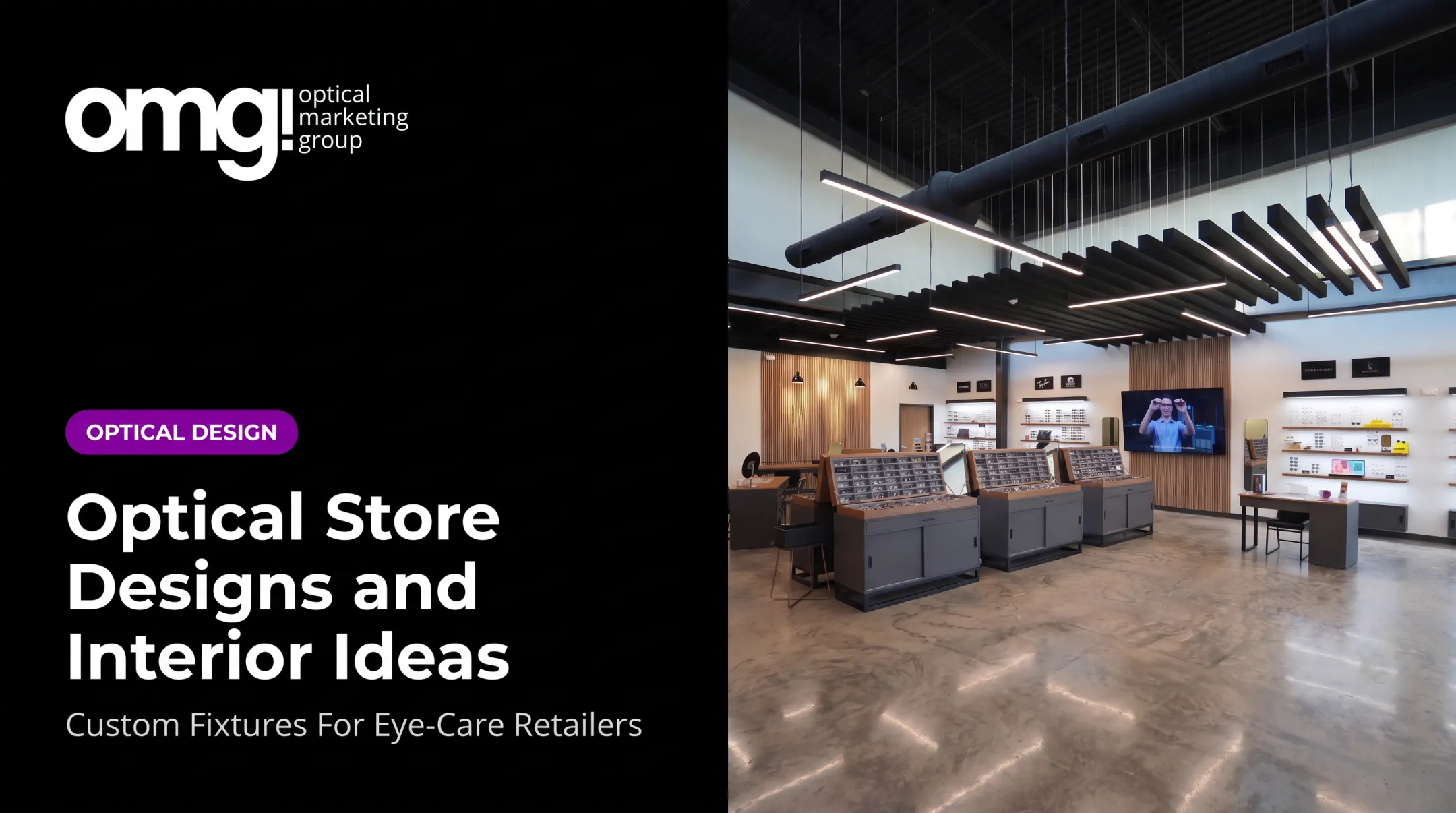
Once a direction is chosen, build a visual system around it: a restrained color palette, repeated materials, consistent hardware finishes, and one or two signature motifs.
OMG! Optical Marketing Group's approach leans toward a contemporary, tech-forward look drawn from two decades of work with independent practices and multi-location chains, but the real goal, regardless of style, is consistency. A space with five different wood tones and three unrelated fixture styles reads as decorated, not curated.
Optical Display Ideas That Support Browsing and Merchandising
Fixtures do more than hold frames. They direct attention, create pacing, and determine whether browsing feels effortless or exhausting.
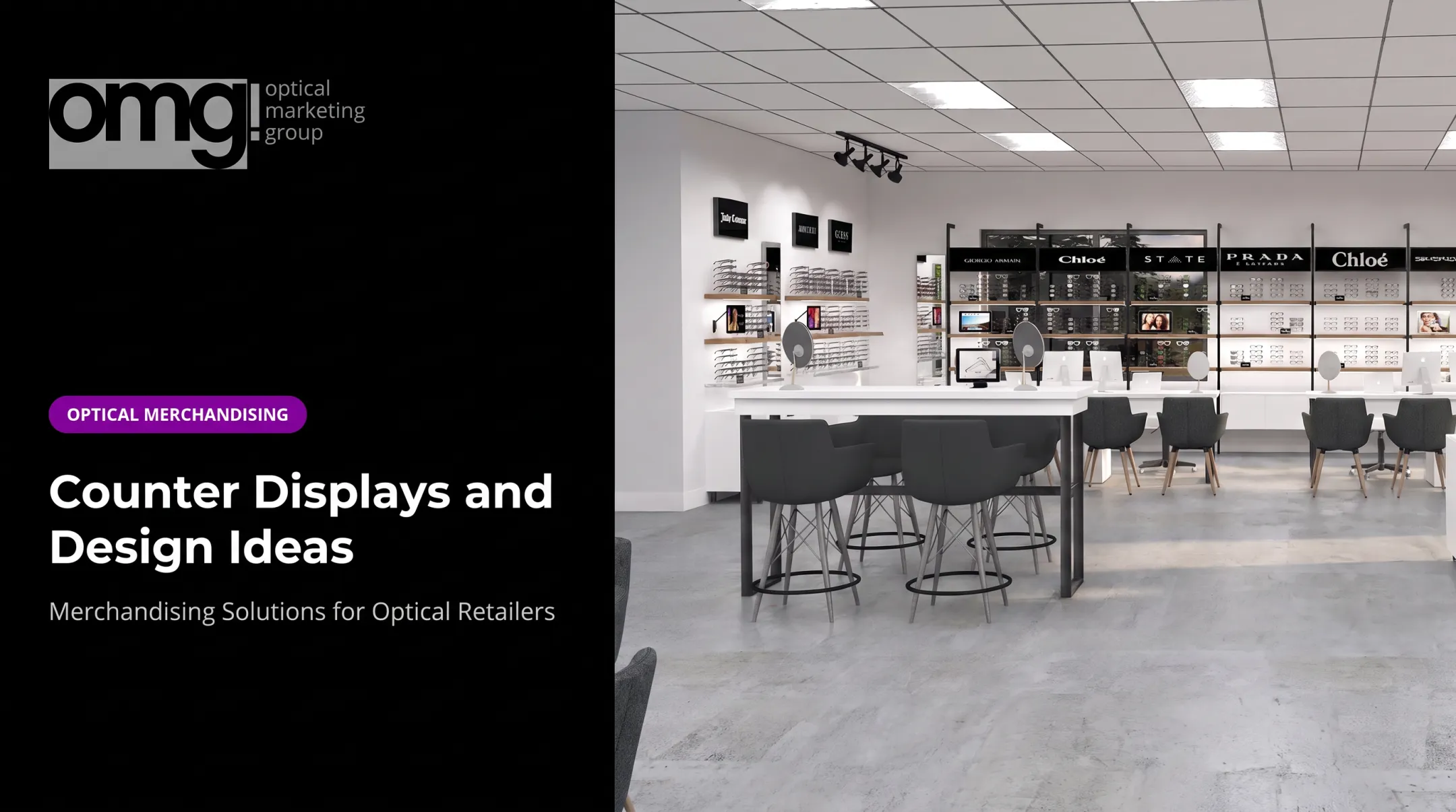
Wall-Mounted Shelving and Modular Frame Displays
Wall systems preserve floor space while using vertical real estate efficiently. Illuminated options like Logan Lit Floating Shelves use diffused LED lighting and hidden mounting hardware in sizes from 24 to 72 inches, which helps frames stay the focal point rather than the hardware itself.
A few practical rules:
- Keep shelves at reachable heights for most adult patients
- Group frames by collection or style, not randomly
- Leave breathing room between groupings: a wall packed edge-to-edge looks cluttered, not abundant
Industry guidance from Eyecare Business recommends plain, neutral backdrops and avoiding window-facing frame boards, since glare and backlighting wash out color and detail.
Freestanding Tables, Islands, and Tiered Fixtures
Lower fixtures invite hands-on browsing in a way wall displays can't. Pieces like the 25-Inch Communal Table, with recessed tray compartments and a central tablet display, create a natural gathering point without blocking sightlines.
When placing freestanding fixtures:
- Keep them clear of the path between reception and the fitting area
- Maintain wheelchair-accessible clearance along main circulation routes
- Avoid placing tables directly in front of wall displays, which blocks visibility from both directions
Accessible routes generally need 36 inches of clear width, per the ADA Standards (a useful benchmark when planning aisle spacing, though self-service shelving itself is exempt from the standard reach-range rules).
Hero Displays and Focal-Point Presentations
Not every frame deserves equal visual weight. Reserve one prominent spot — often near the entrance or along the main sightline — for new arrivals, premium frames, or a seasonal story.
The Talmadge Waterfall Display, an angled 48-frame unit with velvet trays, works well here: a smaller, curated selection with focused lighting says more than a wall of identical options. Pair it with concise signage rather than a paragraph of copy.
Countertop, Rotating, and Compact Displays
Near checkout or consultation areas, smaller fixtures handle impulse-friendly items and frequently rotated collections. Tree stands and countertop units fall into this category: compact, easy to refresh, and ideal for sunglasses or accessories that need frequent turnover.
Check for:
- Stability on the counter surface
- Security for higher-value frames
- Easy cleaning access
- Whether the fixture actually invites handling, rather than just storing stock
Digital and Interactive Displays
Screens can support product education and brand storytelling, but only when content stays relevant and current. A static screen looping the same promotion for six months becomes visual noise fast.
OMG!'s Contentlinq digital subscription is one example of how hardware and managed content work together. It offers cloud-based asset management, brand playlists, and the ability to upload custom content, with updates pushed automatically. The Smart Interactive Eyewear Display, which pairs 40 to 65 frame slots with built-in digital playlists and analytics, shows how physical and digital merchandising can share one fixture.

Decor, Lighting, and Layout Principles for a Better Patient Experience
Build the Layout Around Patient Flow
Map the full journey: entrance, reception, browsing, frame selection, fitting, checkout, exit. At each point, ask where patients should pause, discover something, or find help.
Keep the front desk visible from most of the floor. Avoid dead-end aisles and bottlenecks near the fitting stations. Nothing kills browsing momentum like a line forming in a narrow walkway. Quieter consultation zones should sit apart from the busiest retail traffic.
Use Lighting to Reveal Frames Accurately
Lighting shapes how colors, materials, and even patient confidence come across. OMG!'s internal merchandising guidance recommends allocating roughly 30% of a build-out budget to lighting, since it affects both how merchandise looks and how the space feels overall.
Layered lighting includes:
- Ambient light for comfortable overall navigation
- Task light at fitting and checkout stations
- Accent light on hero displays and wall shelving
Color accuracy matters more in an optical than almost any other retail category, since patients are judging frame color against their own skin tone.
The IES lighting standard for retail spaces addresses illuminance and color-rendering quality. Review it with a lighting designer rather than guessing at fixture specs. Avoid placements that cast reflections into mirrors or harsh shadows across a patient's face during fitting.
Select Decor and Materials That Support the Brand
Flooring, wall finishes, and furniture should reinforce the brand without competing with the eyewear. Neutral backdrops make colorful frames pop; a busy patterned wall does the opposite.
Consider:
- Durability and cleaning requirements for high-traffic flooring
- Acoustic treatments such as ceiling panels and carpeted zones near consultation areas
- Mirrors sized and placed for fitting, not just decoration
- Limited accent colors tied to the brand palette, rather than scattered throughout
Make Signage Part of the Merchandising Experience
Signage is often the most overlooked merchandising tool in an optical. Internal benchmarking suggests fewer than 5% of optical retailers have a complete, consistent signage program throughout their facility.
That program should cover exterior ID, directional signs, collection labels, and brand-story graphics as one system rather than scattered afterthoughts.
Good signage:
- Uses readable typography sized for the viewing distance
- Keeps copy concise: a headline and a few words, not a paragraph
- Appears where patients naturally pause, not on every surface
- Matches the brand treatment used elsewhere in the space
Add Personality Without Creating Clutter
Seasonal decor, local art, or themed vignettes can add warmth in small doses. Build in a rotation plan and dedicated storage so these pieces don't just accumulate.
Negative space does real work here. A few well-placed focal points, consistent spacing between fixtures, and resisting the urge to fill every empty wall will make a modest space feel upscale rather than sparse or overstuffed.
Planning the Project and Avoiding Common Optical Design Mistakes
Match the Design Approach to the Project Type
A cold-start build has different needs than a quick signage refresh. Broadly:
- Cold-start or relocation: full space planning from scratch, including exam lane and lab square footage
- Full remodel: comprehensive interior, fixtures, lighting, and construction drawings
- Brand refresh: updated signage, finishes, and key fixtures without structural changes
- Fixture or signage update: the lowest-disruption option, often completed in days, not months
Before committing to any path, build a checklist covering measurements, inventory categories, electrical needs, lighting locations, and room for future expansion.
Budget for the Complete Display System
A common mistake is budgeting fixture by fixture instead of planning the whole system. Account for the full scope:
- Design and construction drawings
- Custom fixtures, lighting, and signage
- Technology, delivery, and installation
- A contingency buffer
As a reference point, OMG!'s full optical interior design and buildout projects typically run $62,000 to $155,000+, depending on scope and square footage. A lower-disruption practice refresh can start around $995 for design services credited toward implementation.

Costs vary significantly by region and contractor, so treat any figure as a planning benchmark, not a quote.
Avoid Displays That Function Only as Storage
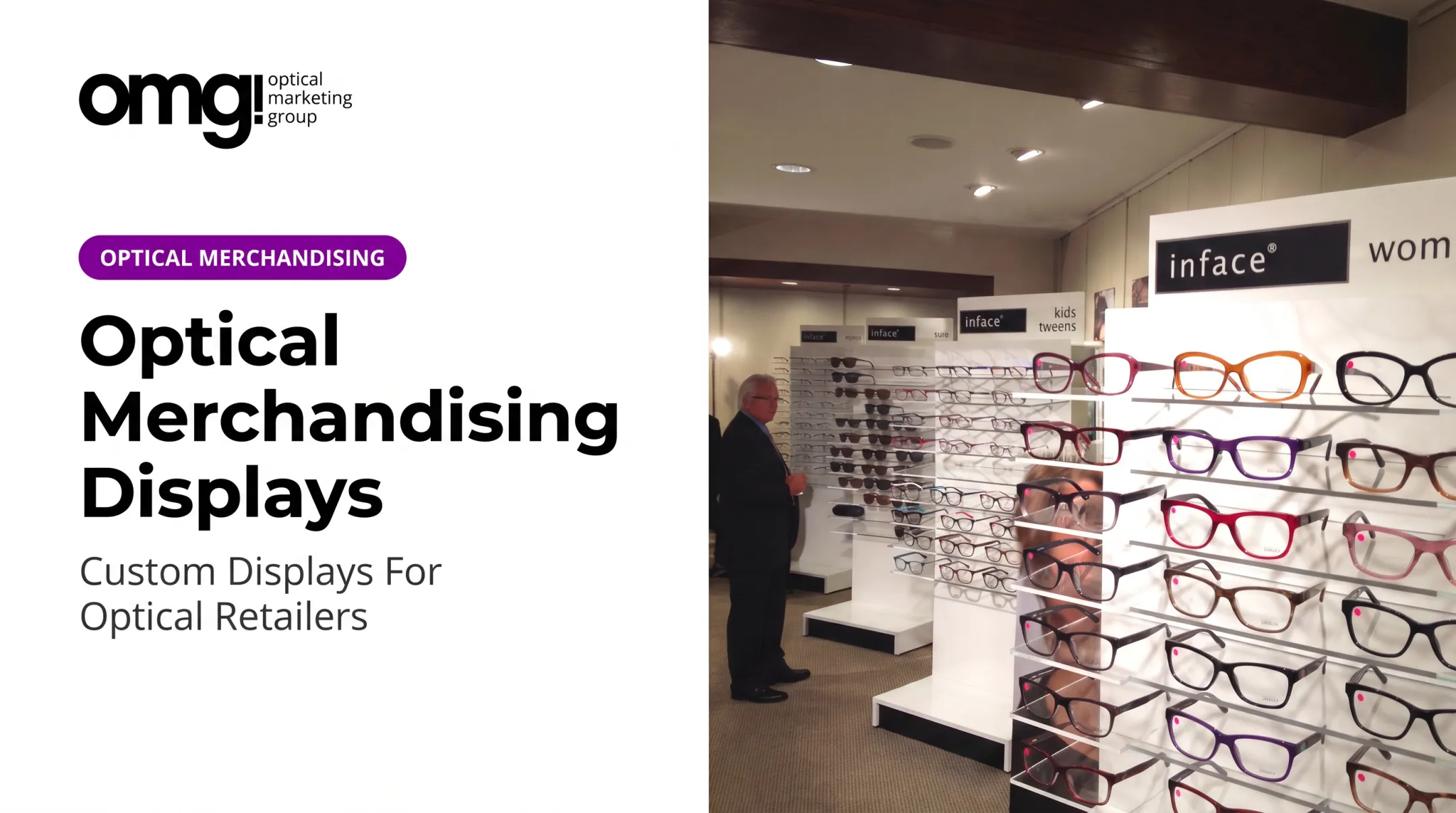
There's a real difference between high-density frame storage and intentional merchandising. A wall holding 80 frames at identical spacing is storage, not a curated display. Frame boards themselves have fallen out of favor; many designers now favor glass shelving with minimal cabinetry for a cleaner, less overwhelming presentation.
After installation, review:
- Which displays get picked up and tried on versus ignored
- Staff feedback on what patients ask about most
- Sales performance by product category and fixture location
Work with Professionals Who Understand Optical Environments
Patient flow, merchandising, branding, lighting, and construction documentation all interact. Treating them as separate purchases (a fixture here, a sign there) usually produces a disjointed space.
OMG! Optical Marketing Group, a Solana Beach, California-based studio serving eyecare practices and optical brands across the U.S. and Canada, runs projects through a six-phase process:
- Discovery and space planning
- Pre-construction drawings
- Interior design
- Construction drawings
- Production
- Installation support
That structure keeps fixtures, graphics, signage, and layout working as one coordinated system rather than a pile of individually purchased parts.
Conclusion: Create an Optical Experience, Not Just a Display Wall
A successful optical space combines visual appeal with discoverability, comfort, brand storytelling, and a layout that actually works for staff and patients alike. None of that happens by accident, and none of it requires choosing between "clinical" and "inviting."
Start with an honest audit: walk the current space and note where patients linger, where they bottleneck, which displays collect dust, and where the lighting makes frames look flat instead of flattering. That audit, not a fixture catalog, is the real starting point for any redesign or refresh.
Frequently Asked Questions
What makes a good optical display?
A good display is visible, reachable, and organized into clear product groupings with lighting that shows true frame color. It should also hold up to daily handling and reinforce the practice's overall brand, not just hold inventory.
How should glasses be arranged in an optical shop?
Frames can be grouped by collection, price tier, style, or customer need (children's, sunglasses, premium lines) as long as each grouping has clear separation and enough spacing for comfortable browsing.
What type of lighting is best for an optical display?
Layered lighting works best: ambient light for navigation, task light at fitting stations, and focused accent light on displays with accurate color rendering. Check current commercial lighting guidance, since glare and heat near frames matter too.
How can an optical shop look stylish without feeling cluttered?
Lean on negative space, a restrained color palette, consistent fixture finishes, and a small number of focal displays. Rotate seasonal decor rather than permanently adding new pieces every few months.
Are custom optical displays worth the investment?
Custom displays make sense for unusual layouts, strong brand requirements, multi-location consistency, or specialty collections that off-the-shelf fixtures can't accommodate well. For simpler spaces, modular systems often deliver similar results at a lower cost.
How often should optical displays and decor be updated?
Routine merchandising (rearranging frames, refreshing signage) should happen regularly as product lines change. A larger design refresh is usually warranted every several years, or sooner if patient feedback or sales data point to underperforming areas.