
Why Optometry Office Design Matters
Patients judge your practice long before the exam starts. The entrance, reception desk, seating, and frame lighting all shape whether patients trust you and stick around to browse eyewear.
Many practice owners struggle with offices that feel clinical in all the wrong places and cluttered in all the wrong others. A dated frame board, dim lighting, or a confusing checkout line can undercut the clinical quality happening in the exam chair.
Good optometry office decor balances clinical credibility with retail comfort. This guide walks through patient-journey planning, room-by-room ideas, visual style, eyewear merchandising, and how to budget the whole project realistically.
Key Takeaways
- Treat the office as one connected patient experience, not five separately decorated rooms
- Apply branding, color, lighting, and signage consistently so the space feels planned, not pieced together
- Design reception, waiting, exam, and optical areas around circulation, privacy, and accessibility first
- Match your project size (refresh, remodel, or full build) to your actual goals and budget
Design the Patient Journey Before Choosing Decor
Before you pick a single paint swatch, walk the path your patients actually take: parking lot or sidewalk, entrance, check-in, waiting, pre-testing, exam, optical browsing, checkout, departure. Note every point where someone might hesitate, feel boxed in, lose sight of a staff member, or get confused about where to go next.

What to look for during this walk-through:
- Does the entrance clearly show where reception is, without an obstructed or overwhelming first view?
- Do clinical and retail paths cross in ways that create congestion for wheelchairs, strollers, or staff carrying equipment?
- Do check-in, checkout, and dispensing overlap enough to compromise privacy during billing conversations?
- Are there natural moments (a display, a flooring change, a lighting shift) that could guide patients toward the optical without pressuring them?
Older guidance on practice layout has long recommended a defined entrance with immediate greeting and minimal backtracking. Overheard conversations at a shared check-in/checkout counter remain a recurring complaint from patients and staff alike.
Get input before finalizing anything. Ask your optometrists, opticians, front-desk team, and technicians to walk through the space as if they were first-time patients. Have them write down where they got confused, where seating felt wrong, or where noise carried too far.
Accessibility belongs in this early planning stage, not bolted on at the end. Service counters, accessible routes, door clearances, and signage all have specific requirements under DOJ's 2010 ADA Standards, which remain the current reference for covered alterations.
Rather than guessing at dimensions, pull the specific provisions for counters, routes, and doorways that apply to your project, and loop in an accessibility professional for anything ambiguous.
Plan Each Area for Comfort, Flow, and Function
Once the journey is mapped, design decisions for each room get much easier. Here's how to approach the major areas.
Reception and Entrance
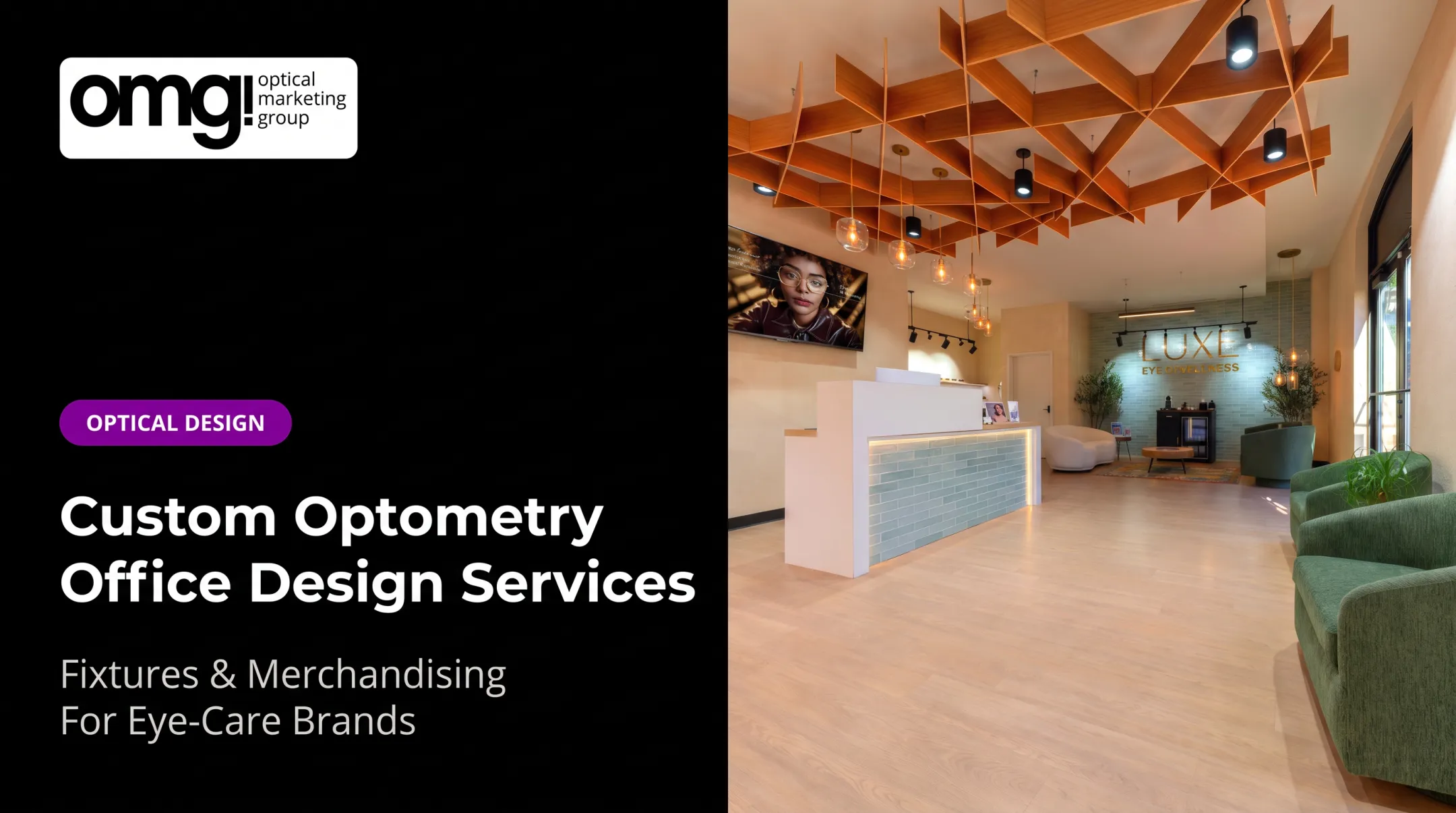
Your reception desk should be visible the moment someone walks in. Plan enough counter space for organized storage, and enough privacy that check-in and checkout conversations don't carry across the waiting room.
A counter-height desk with built-in storage keeps the surface clean while supplies stay out of sight.
Outside, clean windows, legible exterior signage, and a controlled sightline into the space do more brand work than people expect. Patients decide what kind of practice they're entering before they ever reach the door.
Waiting Room
Mix seating types without blocking circulation paths:
- Individual chairs
- A loveseat
- Space for a wheelchair or stroller
Balance calming artwork, a little greenery, and quiet entertainment against practical concerns like cleaning, allergies, and noise.
Layered lighting (ambient plus accent) and warmer materials like wood-look finishes or upholstered seating help the area feel less sterile without sacrificing a professional look.
One approach gaining traction: skip the separate waiting room entirely and integrate comfortable lounge seating directly into the optical area, so patients start browsing frames before they're even called back for their exam.
Exam and Pre-Testing Rooms
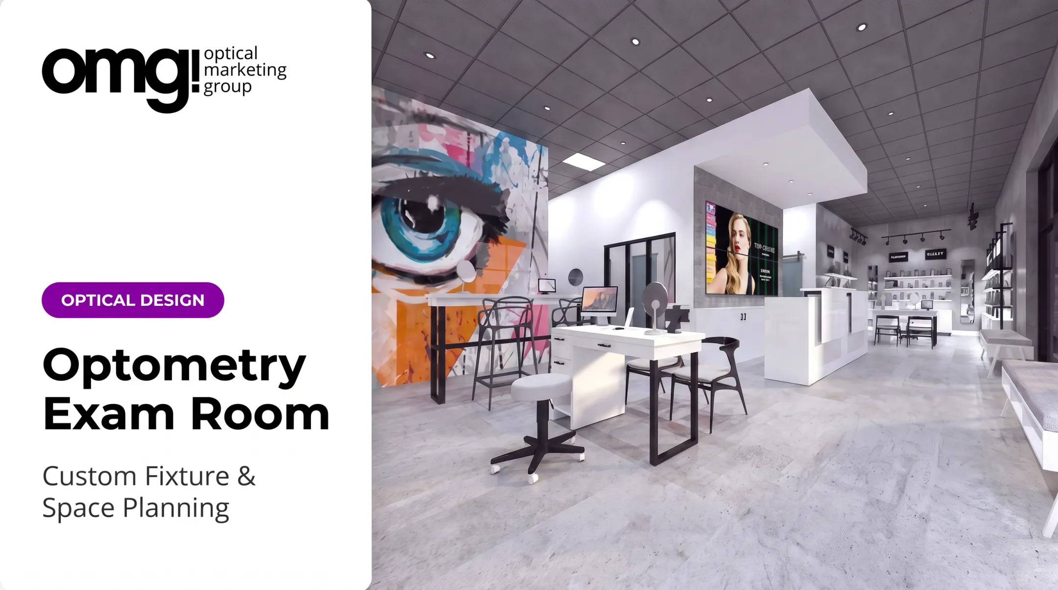
Here, function comes before decor. Settle the functional basics first:
- Equipment placement and staff reach
- Companion seating
- An uncluttered work surface Once those are settled, restrained wall art or simple eye-health graphics can support conversation without competing for attention during testing.
Optical and Contact Lens Area
The optical should feel like a retail space that happens to be connected to a clinic. Prioritize:
- Clear frame categories patients can scan quickly
- Enough room for comfortable browsing
- Mirrors and task lighting placed where patients will actually use them
Contact lens counters need their own setup: proximity to related products, privacy for instruction, and any sink or storage the workflow requires.
Exterior, Corridors, and Overlooked Touchpoints
Hallways, restroom approaches, window displays, and pickup counters are brand touchpoints too. Walk the space at different times of day to check glare, signage visibility, and whether congestion builds up anywhere unexpected.
Build a Cohesive Visual and Optical Merchandising Concept
Define Your Design Direction First
Before choosing paint or fixtures, pick three to five words that describe the practice you want patients to feel they've entered: calm, modern, premium, playful, community-focused. Let those words, not a generic medical-office template, drive every material and color decision that follows.
Use Color, Materials, and Lighting Strategically
There's no universal "calming" color for healthcare spaces. A widely cited review from the Center for Health Design found insufficient evidence linking specific colors to specific moods, and noted that patient preferences vary too much for a one-size-fits-all palette. Test your choices under your actual lighting before committing.
Lighting matters more than most owners budget for. Bill Gerber, OMG! Optical Marketing Group's founder, has pointed out that roughly 30% of a build-out budget may reasonably go toward lighting, since it directly affects how flattering and accurate frames look when patients try them on. Ambient, task, accent, and display lighting each do a different job. Don't rely on one type to cover all four.
Reduce Visual Clutter While Keeping Personality
Keep the space intentional:
- Limit competing posters and product messages
- Use closed storage for supplies
- Designate a few clear focal points instead of spreading attention thin
- Rotate seasonal displays on a planned system so old promos don't pile up
Turn Eyewear Displays Into Part of the Design
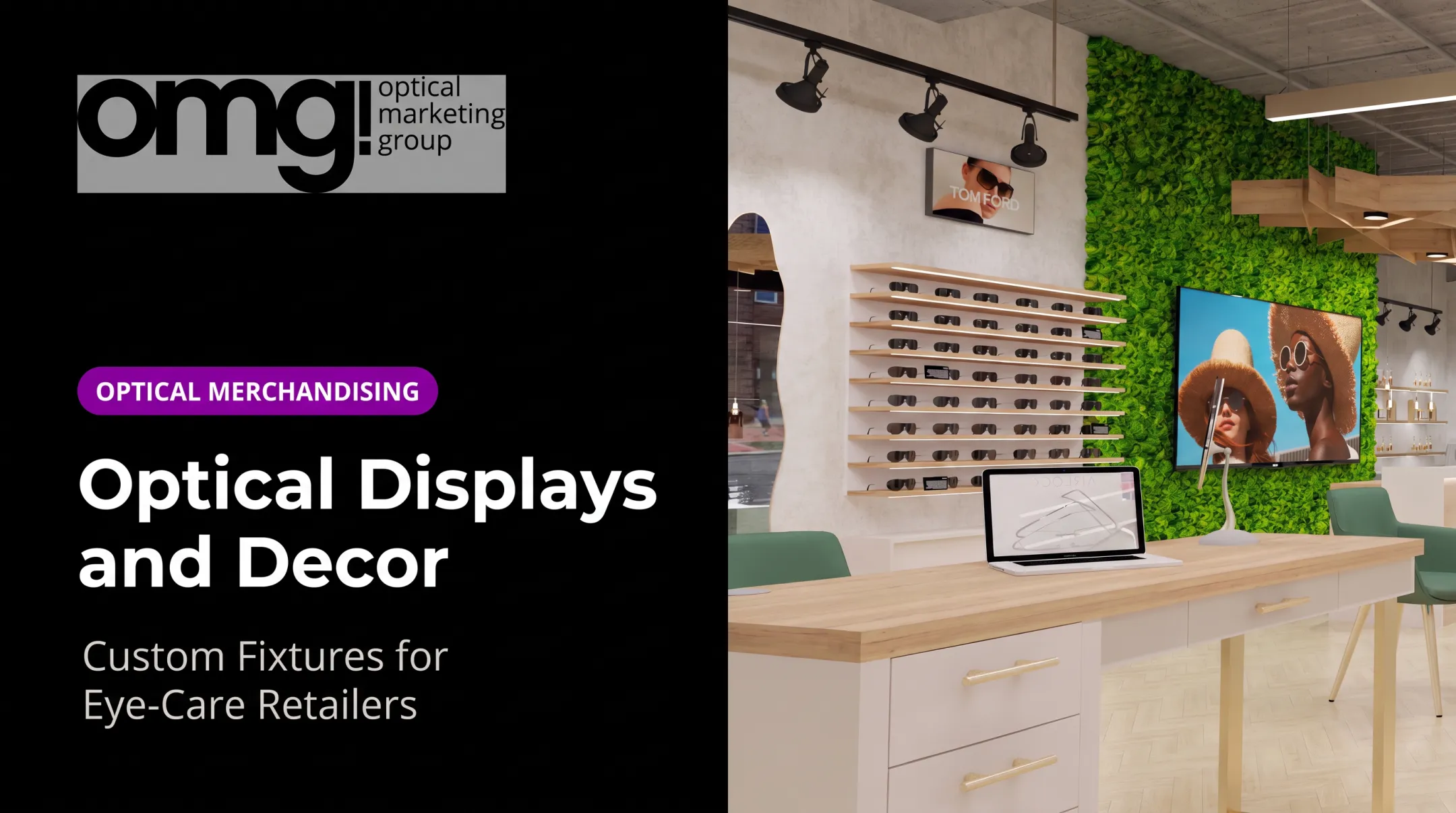
Organize frames by a logic patients understand (use, fit, style, or price range) without labels that feel restrictive. Display height, spacing, nearby mirrors, and lighting all affect whether someone browses independently or waits awkwardly for help.
Urban Optics in College Station, Texas, rebuilt around a horseshoe layout with an integrated waiting area, a 98-inch video wall, and interactive displays that let patients start browsing before their appointment. Their reported capture rate moved from 42% to 72% after the redesign.

Custom displays, branded signage, and digital screens can all tie into one coordinated look rather than feeling bolted on separately. This is where studios like OMG! Optical Marketing Group work, combining practice design, graphics, fixtures, merchandising, and installation support into a single plan instead of a pile of disconnected purchases.
Optometry Office Decor Ideas for Different Practice Audiences
Your patient base should shape your design choices more than general trends do.
- Family-focused practices can add playful color, educational graphics, and a durable kids' corner , without making the space feel like it was designed only for children
- Boutique or premium practices benefit from curated displays, refined materials, generous negative space, and hospitality touches that echo high-end retail
- Community-oriented practices often lean into local artwork, natural materials, and brand storytelling that reflects neighborhood identity rather than a corporate feel
- Multi-location groups need flexible furniture, repeatable fixture packages, and a consistent brand system that scales without feeling identical at every site
Whatever direction you choose, every material still needs to be durable, cleanable, and safe for the full range of patients who walk through the door : from toddlers to patients using mobility devices.
Budget-Friendly Refreshes Versus Full Office Remodeling
Not every improvement requires construction. Sort your project into three tiers:
- Low-cost: Decluttering, repainting, new bulbs, updated artwork, better signage, and rearranged frame displays
- Moderate: New seating, reception finishes, display fixtures, window graphics, and refreshed lighting
- Construction-level: Floor-plan changes, electrical or lighting rework, built-in cabinetry, partitions, and custom fixtures
Before spending anything, write a short project brief covering:
- Goals and the patient or staff problems you're solving
- Must-haves versus nice-to-haves
- Budget range and who signs off on decisions
For moderate projects, a practice refresh can update lighting, signage, and layout in as little as three to four weeks without major structural work.
For larger projects, bring in an optical design specialist, architect, or accessibility professional early. Verify their scope, drawings, and change-order process before signing anything.
OMG!'s Patient Experience Assessment and six-phase design-to-delivery process help practices coordinate planning, design, production, and installation under one roof instead of juggling separate vendors.

Pre-Launch Checklist and Ways to Evaluate the Finished Space
Before opening the doors, walk through with a checklist covering:
- Entrance visibility and reception recognition from the doorway
- Seating comfort and circulation width, including accessible routes
- Lighting levels and glare at frame displays
- Signage legibility from where patients actually stand
- Staff reach and storage access behind the scenes
Test the space with real scenarios, not just staff opinions. Have an older patient, a parent with a child, and someone using a mobility device walk through, along with a staff member moving equipment between rooms.
After launch, track results against your own baseline: appointment-stage delays, recurring navigation questions, optical browsing behavior, and sales metrics.
A historical industry report once cited a 10% median rate of patients buying more than one pair during an exam visit. That figure is dated and should not be treated as a current benchmark or a guaranteed remodeling outcome. Measure your own numbers instead.
Finally, build a maintenance plan. Lighting, upholstery, plants, and signage all need periodic attention, or the "finished" look fades within a year.
Create an Office Patients Want to Enter and Explore
The strongest optometry office designs connect aesthetics with patient comfort, accessibility, clinical efficiency, and a retail experience that feels natural rather than forced. None of that happens by decorating one room at a time.
Start small:
- Document your current patient journey
- Identify the three most disruptive problems
- Decide whether you need a low-cost refresh, a phased remodel, or a full-service design plan
When a coordinated solution makes sense, OMG! Optical Marketing Group supports practices with integrated design, custom optical displays, branded signage, and project delivery from planning through installation.
Frequently Asked Questions
How do you decorate an optometry office?
Start with a cohesive brand palette, comfortable seating, and clear wayfinding, then layer in lighting and uncluttered surfaces. Keep patient flow and accessible circulation in mind before adding decorative details, and make sure optical displays stay easy to browse.
What are the best colors for an optometry office?
There's no single universal palette — the right choice depends on your brand, patient population, and existing lighting. Test calming base colors with one or two intentional accents rather than copying another practice's scheme.
How can I make a small optometry office look bigger?
Declutter aggressively, keep sightlines open, and stick to lighter, consistent colors throughout. Vertical displays, appropriately scaled furniture, and layered lighting all help a tight footprint feel more open.
How should eyewear displays be arranged in an optometry office?
Group frames into categories patients understand, with accessible heights and enough spacing between displays. Add flattering display lighting, nearby mirrors, and comfortable browsing room, with secure fixtures and clear signage.
What should be considered when designing an accessible optometry office?
Review accessible routes, doorways, counters, exam areas, and signage against current ADA and local building requirements. Have a qualified accessibility professional check your plans before construction begins.
How much does it cost to decorate or remodel an optometry office?
Costs vary widely based on location, square footage, existing conditions, and scope. Separate your budget into refresh, renovation, and new-build categories, and get detailed estimates for each before committing to a plan.