
Introduction
Walk into a cluttered, dimly lit optical shop and you feel it immediately: something's off. The frames might be excellent, but the space doesn't say so.
An optical store has to do two jobs at once. It needs to function as a healthcare environment patients trust, and as a retail space that invites browsing. Get the balance wrong, and you lose sales or credibility, sometimes both.
The stakes are real. In The Vision Council's Q1 2024 survey of over 12,000 U.S. adults, 86% of people who recently bought eyewear purchased it in person. The physical store still carries the sale.
This guide covers brand-led interiors, customer flow, displays, lighting, and the planning questions that come up when you open a new practice or refresh an existing one.
Key Takeaways
- Let your target patient and brand identity drive every material, color, and display choice.
- Map a clear journey from window to checkout, covering browsing, consultation, dispensing, and collection.
- Pair curated feature displays with accessible everyday inventory.
- Treat lighting, signage, and storage as operational decisions, not decoration.
- Test layouts before construction, measuring real patient behavior instead of guessing.
Build the Design Around Your Optical Brand and Customer
Before picking a single finish or fixture, decide who you're designing for. A luxury boutique, a family-focused practice, a medical dispensary, and a high-volume chain store all need different interiors, even if the square footage is identical.
Define the Audience First
Ask yourself what customer feeling the space should create. Is it quiet confidence? Playful energy? Clinical reassurance? That answer shapes everything downstream, including:
- Color palette and material choices
- Furniture style and finish
- Signage tone and typography
- Staff presentation and interaction style
Translate Brand Into Physical Details
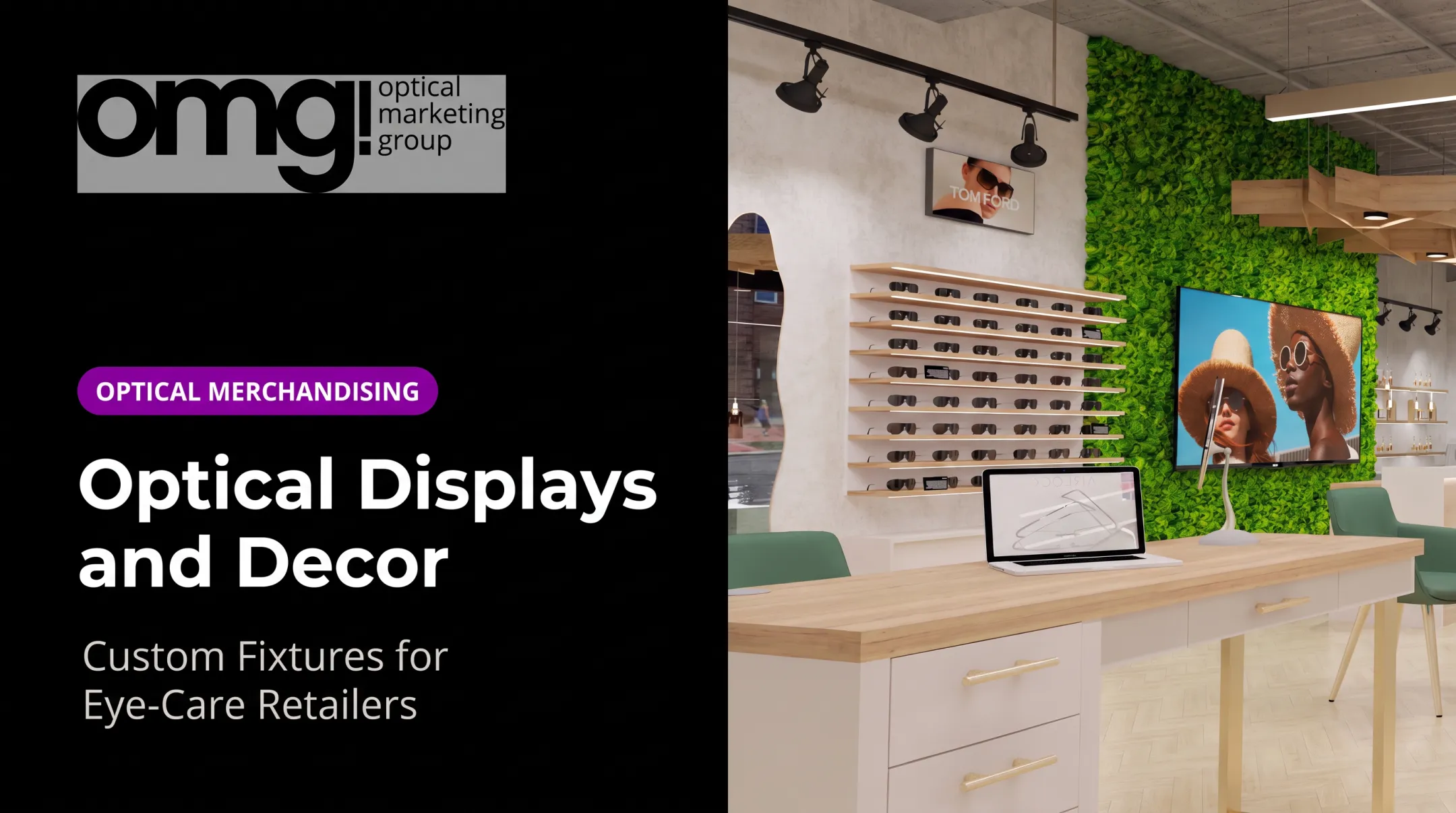
Bella Eye Care's showroom demonstrates this well. Its design pairs white illuminated shelving with a large fashion video screen and dedicated panels for Celine, Dior, Fendi, and Salvatore Ferragamo—signaling luxury before a shopper tries on a single frame. Contrast that with Dalton Family Eyecare, where updated signage and displays made multiple-pair prescription eyewear more appealing without losing the practice's approachable, family-oriented feel. Owner Kena Dale described the finished space as feeling like a true optical boutique. The common thread: neither space feels like a cold waiting room or an unstructured fashion store. Both balance clinical credibility with retail warmth. How the two approaches differ:
- Bella Eye Care — illuminated brand panels and fashion media aimed at luxury shoppers
- Dalton Family Eyecare — refreshed displays and signage that support multiple-pair sales while staying family-friendly A simple design brief helps here. Before choosing fixtures, write down:
- The primary frame categories you'll carry
- Your service model (self-guided browsing vs. staff-assisted styling)
- Price positioning
- The specific behaviours you want the space to encourage, such as lingering at a feature wall or sitting down for a styling consultation Once the brief is set, signage is one of the fastest ways to lock in that positioning. Use it in two layers:
- Area and department signs — Men's, Women's, Kids', and Reception
- Lifestyle signs — Performance, Fashion, Luxury, and Sale, so patients can self-select before staff approach When Giannotti Vision Care redesigned its optical area, Dr. Anthony Giannotti called the result "out of the box" for the category. Patients paused at the threshold, and staff reported feeling re-energized by the new environment.
Plan an Optical Store Layout Around Customer Flow and Staff Efficiency
Layout is where design meets operations. A beautiful fixture in the wrong spot creates a bottleneck. A well-placed mirror speeds up every fitting that happens near it.
Map the Complete Patient Journey
Start outside the door and walk the full path a patient takes:
- Exterior visibility – what's visible from the sidewalk or parking lot
- Entry and first impression – the threshold moment
- Browsing – independent exploration of frames
- Consultation – staff-assisted selection
- Dispensing and fitting – measurements, adjustments, mirror checks
- Payment and collection – checkout and pickup

Each stage needs its own zone:
- Window or threshold area
- Hero-product display for new arrivals
- Everyday browsing space
- Children's section, if relevant
- Dispensing tables and reception
- Private consultation rooms
Bill Gerber, founder of OMG! Optical Marketing Group, has linked frame capture rates directly to this flow. Maximizing traffic patterns and removing physical barriers encourages earlier engagement with the optical offering.
Keep Sightlines Open
Avoid dead ends and cramped aisles. The entrance should feel visually open from the street, which is why front-window presentations matter so much: they need to work for someone glancing in from a passing car, not just someone standing three feet away.
Keep key products visible from multiple points in the store. Position staff so they can monitor the floor without hovering.
Separate Retail From Clinical Functions
Noisy or busy retail zones shouldn't bleed into private consultation rooms. At the same time, the transition from exam to eyewear selection should feel seamless, not like walking into a different business. New Rule #9 from OMG!'s retailing framework recommends eliminating hard barriers between the optical area and the waiting room altogether, replacing them with comfortable lounge seating that encourages pre-appointment browsing.
Build in Accessibility From the Start
Accessible circulation isn't optional. Under the 2010 ADA Standards for Accessible Design, plan for these common minimums:
- 36 inches clear width on walking surfaces (limited exceptions to 32 inches)
- 30 by 48 inches clear floor space where required
- 60-inch-diameter turning space where that accommodation applies
These figures are not interchangeable, so match each rule to the right part of your floor plan.
Before committing to construction, test the layout with a scaled floor plan or a full customer-journey walkthrough. Confirm every zone has a clear purpose—and that staff can restock, clean, and retrieve frames without interrupting patients mid-browse.
Use Displays and Visual Merchandising to Make Frames Easier to Explore
Displays do two competing jobs: showing enough inventory to give patients real choice, while keeping the space from feeling overwhelming.
Match the Format to the Function
Different display types solve different problems:
| Display Type | Best Use |
|---|---|
| Wall-mounted modular systems (such as Del Mar or Cedros) | Full-wall brand presentation, adjustable for seasonal change |
| Freestanding towers | High-capacity merchandising in open floor areas |
| Countertop risers and trays | Highlighting premium or featured lines |
| Illuminated shadow boxes | Single-collection focal points |
| Drawer-based cabinets | Concealed backstock, guided selling |
| The Del Mar system, for example, uses slim vertical poles to display frames in floor-to-ceiling windows without blocking natural light or sightlines into the store, so you gain density without losing open sightlines. |
Group With Purpose, Not Just Rows
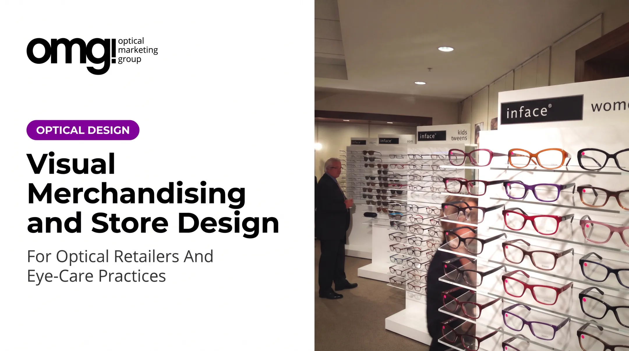
New Rule #5 in OMG!'s retailing framework treats traditional frame boards as a relic of 1950s and 60s merchandising. Frames lined up "like soldiers" hide individual detail and create a wall of sameness. Glass shelving with minimal cabinetry replaces that approach so each frame's design can stand out. Spacing matters more than people expect. A practical shelf layout uses 14-inch on-center spacing, with the bottom shelf 36 inches from the finished floor. Those measurements keep sightlines clean without wasting vertical space.
Create Focal Points Without Clutter
Illuminated feature boxes work well for new arrivals or premium collections. A three-box shadow display with cool-white LED lighting, for instance, turns a handful of frames into a clear visual anchor rather than one more row among many. For higher-capacity merchandising, waterfall-style displays holding dozens of frames across multiple drawers with velvet grid trays keep volume high while still feeling organized.

Maintain the Display, Not Just Build It
A display only works if it stays current:
- Replace missing frames immediately
- Straighten and clean shelves and mirrors weekly
- Rotate featured products on a set schedule
- Update pricing and product information
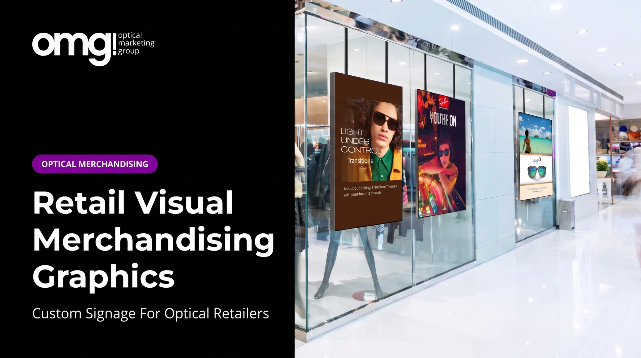
- Review which zones draw attention, then adjust Storytelling signage ties the floor together. Brand and lifestyle signs answer the questions patients already ask silently: who a collection is for, what makes a lens treatment different, and how a frame fits daily life—without turning the dispensary into a wall of text.
Use Lighting, Materials, and Atmosphere to Improve the In-Store Experience
Lighting is the single highest-leverage design decision in an optical store, and it's often the most underfunded. Current industry guidance recommends allocating at least 30% of a build-out budget to lighting alone.
Layer Three Types of Light
Optical spaces need all three working together:
- Ambient lighting for general visibility across the floor
- Task lighting at dispensing tables and fitting stations, where precision matters
- Accent lighting on hero displays, signage, and architectural features
Illuminated wood shelving and lit shadow boxes are common ways to add accent lighting without a full electrical overhaul.
Get the Technical Details Right
Color accuracy isn't a minor detail when patients are evaluating frame finishes and lens tints. The Illuminating Engineering Society's ANSI/IES RP-2-20 standard for lighting retail spaces addresses illuminance levels, uniformity, colour rendering, glare, and feature and accent lighting specifically for retail environments. It's a useful technical reference when briefing an electrician or lighting designer, rather than relying on guesswork.
It's a useful technical reference when briefing an electrician or lighting designer, rather than relying on guesswork. Practice-design teams such as OMG! Optical Marketing Group often fold these specs into fixture and layout plans so color stays true at the frame wall and the fitting table.
Round Out the Sensory Experience
Lighting works alongside other material choices:
- Durable, easy-to-clean flooring for high-traffic dispensing areas
- Comfortable seating at consultation and fitting zones
- Acoustic control to keep sound from bouncing around hard surfaces
- Full-length mirrors positioned for natural viewing angles
- Subtle, brand-consistent scent and music suited to the patient base
Test From the Patient's Seat
Theory only goes so far. Sit at the dispensing table and check for lens reflections, shadows across the face, or harsh contrast. Stand at the mirror where patients will actually try on frames. If the lighting makes a face look washed out or a frame color look wrong, fix it before opening day, not after the complaints start.

Make the Store Practical to Build, Operate, and Refresh
Good design means nothing if it can't actually get built within your budget, lease terms, and timeline.
Decisions to Settle Early
Before choosing finishes, nail down:
- Available floor area and lease or construction constraints
- Total budget, including a realistic lighting allocation
- Electrical and data requirements for digital signage or displays
- Storage capacity for backstock and seasonal inventory
- Signage approvals and accessibility compliance
- Installation timing and future flexibility for remodels
Choose the Right Scope
Not every project needs a full gut renovation. Most projects fall into one of three scopes:
| Project Type | What It Involves | Typical Cost / Timeline |
|---|---|---|
| Full interior design & buildout | Complete space planning, fixtures, signage, construction drawings | Often $62,000–$155,000+ depending on scope |
| Practice refresh | Lighting, merchandising, signage, and digital display updates without structural work | Around 3 weeks |
| Merchandising assessment | Before-and-after visualizations and an estimate before committing to a remodel | 5–10 business days |
A lower-cost assessment, around $995, maps recommended changes before you commit to a larger project. That fee is typically credited toward final implementation.

Measure What Actually Changes
Define success before the redesign starts, not after. Useful measures include:
- Customer feedback
- Time spent in key browsing zones
- Staff movement patterns
- Optical capture rate (share of patients who fill their prescription at the same practice)
Skip invented metrics and unverified industry averages. Track your own baseline, then compare after the project wraps.
OMG! Optical Marketing Group runs a six-phase process for this kind of project:
- Discovery and a complimentary space plan
- Pre-construction drawings
- Interior design
- Construction drawings
- Production
- Final delivery with installation support
A Patient Experience Assessment or online Project Planner can pinpoint bottlenecks before a single fixture gets ordered.
Conclusion: Create an Optical Space That Serves Patients and Supports Retail
Effective optical store design aligns brand identity, patient comfort, clinical trust, product discovery, staff workflow, and the business goals you need to hit. The newest Instagram interior rarely covers that full set.
Start with a simple walkthrough of your current space:
- Walk the floor the way a first-time patient would
- Photograph spots that feel cluttered or confusing
- Ask front-desk staff where patients get stuck
- Turn those notes into a prioritized design brief
Use that brief before you bring in outside design or build-out support. When you need help with space planning, fixtures, or merchandising, OMG! Optical Marketing Group works with practices across the U.S. and Canada to turn that brief into a space that serves patients and supports retail.
Frequently Asked Questions
What are some good ideas for starting an optical business?
Research your target audience, confirm location and regulatory requirements, and define your optical service strategy early. Plan staffing, inventory, and the retail space itself before opening day, since the physical environment shapes first impressions from day one.
How should an optical store be designed for a small space?
Prioritize clear sightlines, wall-mounted or modular displays, and multi-purpose furniture that doubles up on function. Concealed storage and strong lighting help a compact footprint feel organized rather than cramped.
What should be included in an optical store layout?
A complete layout needs window and entrance visibility, defined browsing zones, dispensing tables, mirrors, fitting space, reception, storage, and accessible circulation. Private consultation areas matter too, especially where clinical and retail functions overlap.
What type of lighting is best for an optical store?
Layer ambient, task, and accent lighting rather than relying on one type. Accurate color rendering and glare control matter most at mirrors and dispensing tables, where patients actually evaluate frame color and fit.
How can optical store displays increase customer engagement?
Curated groupings, clear focal displays, and purposeful signage help patients navigate without feeling overwhelmed. Balance self-guided browsing with staff-assisted selection, and rotate featured collections so the space feels current.