
Introduction: Why In-Store Marketing Displays Matter in Optical Retail
An optical dispensary is never just a retail floor. It's also where patients process a diagnosis, a prescription, and a purchase decision, often within the same 20-minute visit.
That dual role makes visibility and navigation critical. What patients notice, and what they skip past, shapes which frames they try on and which products staff get to discuss.
In-store marketing displays, whether a lit frame wall or a countertop lens-education sign, guide that attention. They organize collections, explain technology, and give staff a natural entry point into a conversation about a second pair of glasses.
This guide covers the display types that work in an optical setting, how to design and place them, and how to maintain and measure a display program without turning the dispensary into a showroom of competing messages.
Key Takeaways
- Displays should support the patient journey, not crowd the dispensary with competing messages
- Match display type and placement to one clear goal: attention, education, organization, or cross-selling
- Branding consistency, readable signage, and proper lighting matter as much as the fixture itself
- Track performance through staff feedback, product engagement, and capture or multiple-pair data
- Refresh displays regularly; a static dispensary starts to feel invisible to repeat patients
What Are In-Store Marketing Displays?
In-store marketing displays are branded physical or digital elements placed inside a retail environment to attract attention, communicate information, organize products, and shape the shopping experience. In an optical practice, that could mean a lit frame tower, a countertop lens-comparison tray, or a screen looping brand content near the waiting area.
The distinction from basic storage matters. A frameboard that simply holds inventory is storage. Add a collection sign, consistent spacing, and a lifestyle grouping, and it becomes a merchandising tool with a communication purpose, whether that's highlighting a new designer line or directing patients toward a sunwear section.
Done well, displays support optical practices by:
- Improving early browsing before the exam even starts
- Making the dispensary easier to navigate without staff hand-holding
- Creating more natural openings for opticians to start product conversations
- Presenting the practice as one cohesive, intentional brand rather than a collection of vendor posters
Permanent, Modular, or Campaign-Based
Displays can be permanent fixtures, modular systems that reconfigure as collections rotate, seasonal campaigns, or fully digital. OMG! Optical Marketing Group's modular systems, such as the Del Mar line built for limited-wall or window-heavy spaces, give practices flexibility instead of a one-size-fits-all fixture.
The choice depends on the practice's layout, brand positioning, and how often the product mix changes. A boutique with frequent trunk shows needs different infrastructure than a high-volume practice with a stable core collection.
As 20/20's merchandising feature puts it, visual merchandising is "the art of displaying merchandise to enhance its sales appeal," and that appeal depends on close inspection. Eyewear, like jewelry, rewards displays that pull shoppers within arm's reach rather than keeping them at a distance.

What Are the Main Types of In-Store Marketing Displays?
Optical retail generally relies on five display categories, each suited to a different moment in the patient's visit.
| Display Type | Optical Example | Best Use |
|---|---|---|
| Window/entrance | Illuminated storefront with seasonal frame feature | Curb appeal, first impression |
| Floor/freestanding | Center island with drawer storage and upright frame panels | Organizing collections in high-traffic zones |
| Wall/shelving | Illuminated shelving grouped by brand or lifestyle | Browsing and category navigation |
| Countertop/POP | Frame trees, lens-comparison trays near dispensing tables | Staff-assisted conversations |
| Digital | Freestanding touch display or window-facing TV | Education, brand storytelling, promotions |
Window and entrance displays set the first impression before a patient even opens the door. Keep these simple: one seasonal message or featured collection, with enough openness that passersby can still see into the shop.
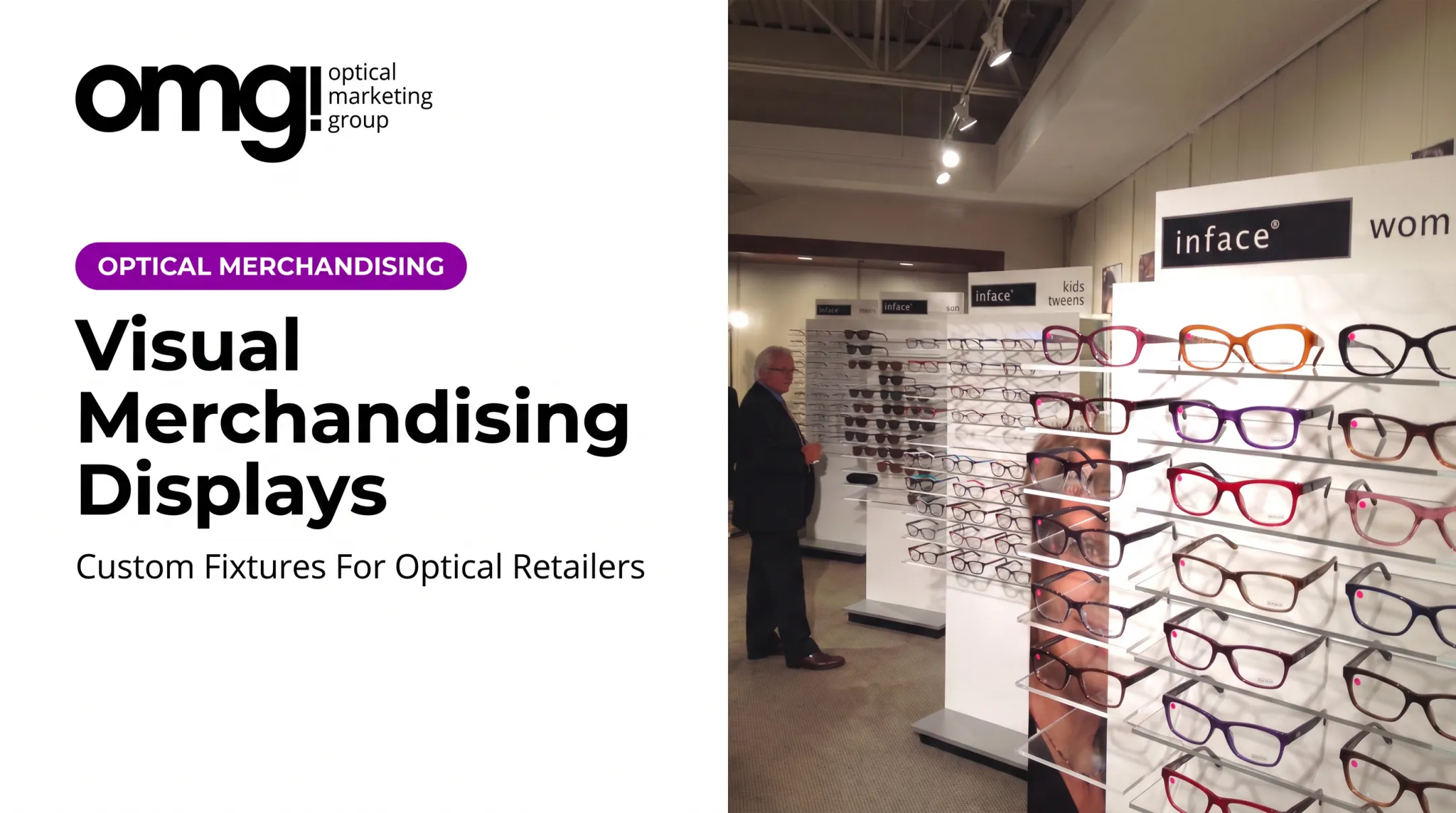
Floor and freestanding displays, such as towers or branded island units, create focal points without blocking circulation. A center island with perimeter eyeglass racks works well for a core collection that needs visibility from multiple angles.
Wall and shelving displays use vertical space efficiently. Consistent spacing, grouping by collection or lifestyle, and category signage (men's, sun, kids) all reduce the overwhelm of dozens of similar frames sitting side by side.
Countertop and point-of-purchase displays live near consultation and checkout. Think frame trees, lens-education trays, or a promotional sign capping multi-pair savings at three clear options rather than a wall of fine print.
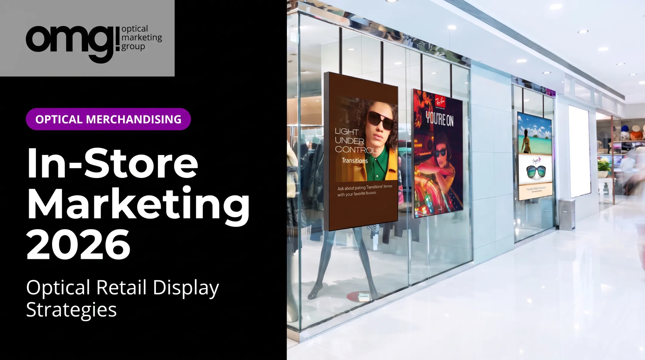
Digital displays add motion and content depth: brand videos, lens simulations, or rotating promotions. A single campaign might combine a window TV, a branded frame wall, a lens-education screen, and a countertop callout, all under one visual identity rather than five competing messages.
How to Design and Place Displays in an Optical Practice
Good placement starts with mapping the patient journey, not the display itself. Walk the path from entry to reception, exam, optical browsing, consultation, fitting, and checkout, and note where sightlines naturally land.
Match Placement to Objective
- Awareness: prominent sightlines near the entrance or main traffic aisle
- Education: eye-level locations patients pass while browsing
- Comparison: consultation and dispensing tables, where staff are present
- Cross-sell or follow-up: checkout and fitting zones for accessories or care products
Optical trade guidance from 20/20's shop refresh tips recommends keeping frames in a 4-5 foot eye-level zone, with a secondary 3-4 foot touch zone for products patients handle directly. Treat this as practical merchandising advice, not a fixed rule, but it's a useful starting point for any frameboard layout.
Build a Clear Visual Hierarchy
Every display should carry one primary message. Resist the urge to cram a collection name, a promotion, and a lens upsell onto the same sign. Use:
- Readable typography sized for a 3-5 foot viewing distance
- Strong product imagery over dense text blocks
- Intentional white space instead of wall-to-wall merchandise
- A clear next step, such as "browse," "ask," or "compare"
Coordinate lighting, color, and materials with the broader interior so displays feel built into the space rather than bolted on afterward. And protect circulation: a beautiful tower display loses all its value if it blocks a wheelchair path or crowds a consultation chair.
Finally, test before committing. Try alternative groupings for a few weeks, ask opticians what patients actually comment on, and adjust before locking in a permanent layout.

How to Plan, Maintain, and Measure a Display Program
A display program starts with an objective, not a fixture catalog. Are you trying to improve frame discovery, introduce a new lens category, or simply make a dated dispensary feel current? That answer drives every material and placement decision that follows.
Match Materials to the Job
- Permanent fixtures for core collections that rarely change
- Modular systems for practices that rotate product frequently
- Lightweight, swappable graphics for seasonal or campaign messaging
Also factor in cleaning needs, lighting exposure, and whether the piece needs to support product weight or move between locations.
Build in Upkeep From the Start
A display plan without a maintenance plan fails within months. Build in installation responsibility, stock replenishment, content updates for screens, and a cleaning schedule.
Digital displays need their own content cadence: message frequency, screen placement, and a process for pulling outdated promotions before they become stale backdrop noise.
One mixed-methods study of community pharmacy screens found volunteers rated screen-based messaging an average of 9 out of 10 for impact, versus 3.5 out of 10 for paper materials, according to a 2024 pharmacy study. The same researchers flagged poorly positioned screens, mounted above normal sightlines, as a real failure mode worth avoiding.
Track Multiple Signals, Not Just One
Useful indicators include:
- Product engagement and questions patients ask near a display
- Requests for a featured product or collection
- Multiple-pair activity and campaign-specific sales
- Staff feedback on which displays actually start conversations
Practices planning a redesign can use OMG! Optical Marketing Group's Patient Experience Assessment and online Project Planner to spot weak points before committing to fixtures. Its six-phase design-to-delivery process, from discovery through production and installation, keeps space planning, graphics, and digital signage coordinated rather than ordered piecemeal.
Jeff Fultz of Kirman Eye, an OMG! client, reported that sales and multiple-pair purchases kept climbing after updating signage and displays, a result he attributed partly to the new in-store presentation.
A practical checklist:
- Clarify the goal for each display
- Audit the current space and patient flow
- Choose the format that fits the goal
- Create one clear message per display
- Confirm accessibility and circulation
- Plan installation and ongoing upkeep
- Launch and gather staff feedback
- Review performance against the original goal
Conclusion: Turn Optical Space Into a More Engaging Experience
Effective in-store displays combine clear communication, thoughtful placement, and consistent upkeep. None of that requires filling every wall and countertop.
A few purposeful displays, placed with the patient's actual path through the dispensary in mind, do more to guide discovery than a dozen competing signs ever will. Walk your own space as a first-time patient would, find the one spot where navigation or storytelling breaks down, and start there.
Frequently Asked Questions
What does "in-store marketing" mean?
In-store marketing uses physical or digital tools inside a retail space to attract attention, communicate value, and support purchase decisions. In an optical dispensary, that might be a branded frame wall paired with lens-education signage near consultation tables.
What are the 5 types of displays with examples?
Window/entrance (illuminated storefront), floor/freestanding (center island fixture), wall/shelving (lit frame wall), countertop/POP (frame trees at checkout), and digital (touchscreen lens demos). Most practices combine two or three formats rather than relying on just one.
How can in-store displays improve an optical practice?
Displays improve product visibility, patient navigation, and frame discovery while giving opticians natural openings to discuss lenses or a second pair. They also reinforce a cohesive brand instead of a patchwork of vendor posters.
Where should displays be placed in an optical dispensary?
Placement should follow sightlines and traffic flow: awareness messaging near the entrance, education at eye level along browsing paths, comparison tools at consultation tables, and accessories or follow-up messaging near checkout.
Should an optical practice use digital displays?
Digital displays work well for education, brand storytelling, and rotating promotions in high-visibility areas like windows or waiting zones. They need relevant, regularly updated content; a screen showing the same loop for months becomes invisible background noise.