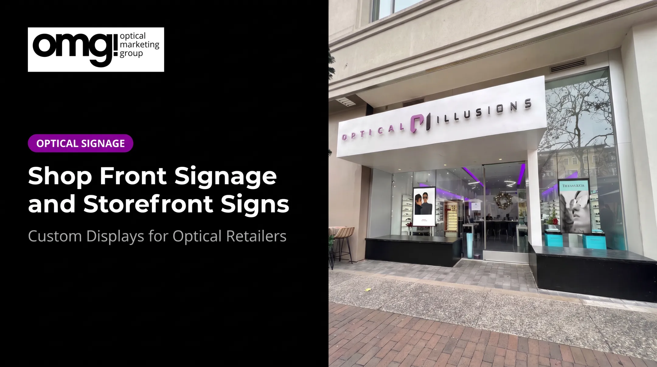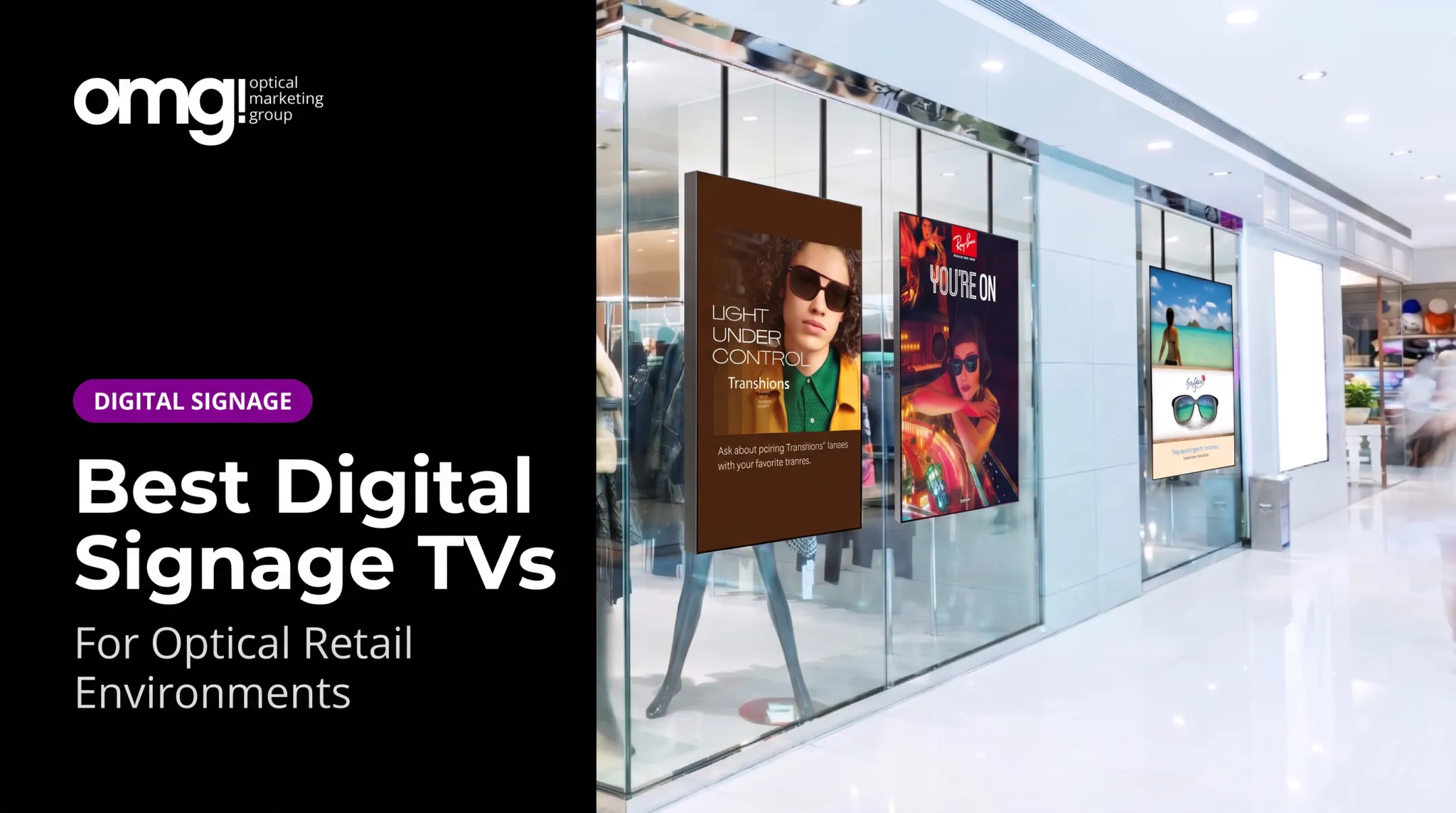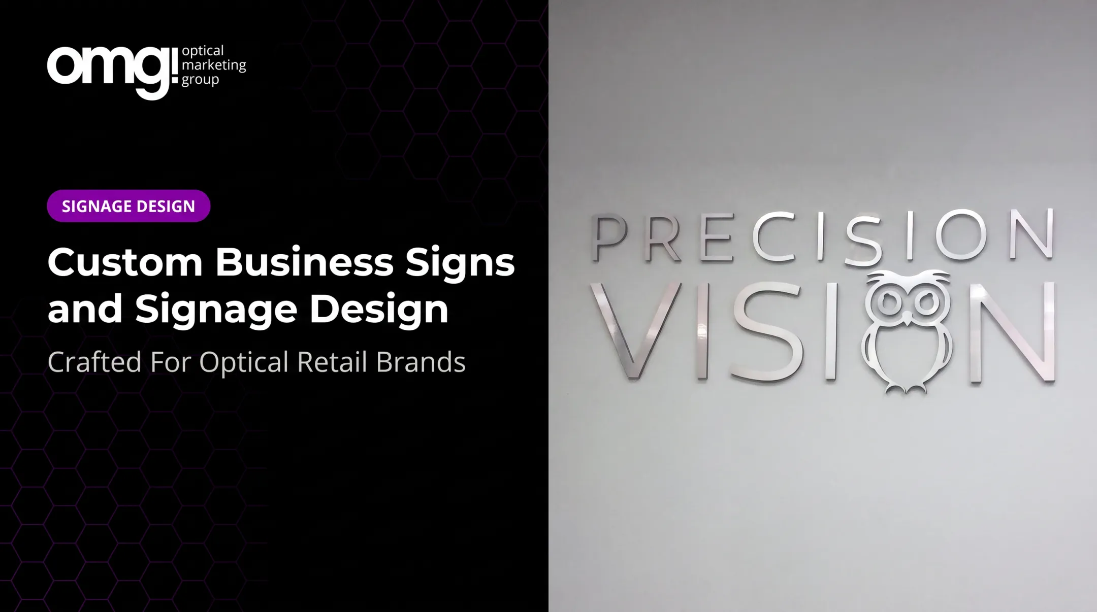

Good signage does more than announce a name. It helps people notice a location, understand what's inside, find their way around, and decide what to do next. This guide walks through the strongest examples across exterior branding, interior displays, wayfinding systems, product discovery signage, and digital screens, with a specific look at how optical and eyecare practices can put these ideas to work.
Key Takeaways
- Match signage to its purpose, placement, viewing distance, audience, and expected lifespan
- Pair clear messaging with consistent branding, legible type, suitable materials, and intentional lighting
- Use exterior signage to build recognition, then let wayfinding guide people once they're inside
- Keep digital signage content current and concise, with a plan for removing outdated messages
- Coordinate signage, displays, and digital touchpoints into one retail experience, not isolated pieces
Overview of Business Signage in the US Market
Business signage covers every exterior, interior, directional, informational, promotional, and digital sign a company uses to identify itself, guide visitors, share information, or influence a decision. That's a wide net, but each category supports a specific business goal:
- Curb appeal that pulls attention from the street or parking lot
- Brand differentiation that separates a business from nearby competitors
- Wayfinding that moves people through a space without confusion
- Product discovery that lets customers browse without waiting for staff
- Accessibility and compliance that keeps spaces usable for everyone
- Operational efficiency that reduces repetitive questions at the front desk
Not every sign is built the same way, either. Formats differ in durability and how often content changes:
- Permanent signage resists weather and stays in place for years
- Temporary promotional signage comes down after a short run
- Digital signage uses screens or message centers to update content on demand
Each format brings different decisions around materials, maintenance, and installation.
The best signage systems don't operate in isolation. They work in sequence: an exterior sign earns a first glance, an entrance sign offers a welcome, wayfinding carries people through the building, and point-of-purchase displays support the decision once they've arrived.

The examples below are grouped by that purpose, not ranked by material or appearance alone.
Best Business Signage Examples
Each example that follows was chosen for a clear business purpose, strong visibility, placement that matches how people actually move through a space, brand consistency, and a direct connection to the customer or staff experience.
Exterior Dimensional or Illuminated Logo Signage
Dimensional letters, fabricated logos, illuminated panels, and halo-lit signs are among the strongest choices for storefronts, offices, medical practices, and retail entrances. Raised letterforms create depth and shadow that flat signage can't replicate.
Illumination keeps a building identifiable after dark or in overcast conditions, and a properly scaled logo makes a location easier to spot from the street or a parking lot.
| Factor | Typical approach |
|---|---|
| Placement | Above entrance, on a monument, or facing primary traffic flow |
| Materials | Aluminum, acrylic, or fabricated metal letters |
| Lighting | Front-lit, backlit halo, or internally illuminated channel letters |
| Maintenance | Periodic cleaning; LED components need occasional replacement |
| Brand impression | Polished, established, easy to locate |
URBAN EYES offers a solid real-world reference: large spaced lettering sits above the entrance, an Oliver Peoples eyewear graphic fills the right window, and the address number stays clearly visible beside the door. Nothing competes for attention, and the facade still reads clearly from across the street.
For eyecare practices, OMG! builds this same approach through cut letter logo signs and custom backlit Duratrans panels. A well-scaled, illuminated logo above the entrance can create genuine curb appeal without crowding the building's facade, which matters for practices sharing a strip center with several other tenants.
Interior Branded Wall and Lobby Signage
Once someone walks through the door, interior signage takes over the job of making an impression. Lobby logos, mission statement signs, branded feature walls, acrylic panels, and dimensional metal lettering all establish identity in the first few seconds after entry.
Getting this right depends on a handful of design decisions:
- Viewing distance: how far away will most people stand when reading it?
- Negative space: does the layout breathe, or feel crowded?
- Contrast and typography: can it be read quickly, even in motion?
- Audience: is the message for patients, customers, employees, or all three?
In an optical setting, this is often where a clinical space starts feeling like retail. OMG!'s Featured Brands sign, a $199.95 acrylic panel displaying up to eight brand logos, works well behind a dispensary counter to signal product variety at a glance.
The company's VIP+ Premium Branding Solution pairs that with large-format 17-by-17-inch Communique panels carrying a practice logo or mission statement, built using an acrylic face-mount process with satin-aluminum standoffs.
Premier Eye Care's Cottage Grove, Minnesota project is a good example of this working end to end. The redesign tied personalized branding, wayfinding, lighting, and furnishings together so the interior felt like a natural extension of the exterior identity, not an afterthought.
Wayfinding, Identification, and Informational Signage
Wayfinding signage is a different job from branding. It answers practical questions: where do I go, what is this room, am I in the right place, and what do I need to know before I get there. These four purposes, directional, identification, confirmational, and informational, often get lumped together, but mixing them up on a single sign creates confusion.
Common examples include:
- Entrance markers and "you are here" maps
- Room and department labels
- Arrows placed at actual decision points, not after them
- Parking and accessible-route signage
- Check-in instructions and accessible restroom or exit markers
Placement matters more than most businesses expect. A directional sign installed after the point where someone needs to turn is useless. Icons should be recognizable, color coding should stay consistent across the building, and contrast needs to hold up under the space's actual lighting.
Federal accessibility rules add specific requirements for permanent interior signs. Under the 2010 ADA Standards, visual characters generally need a minimum height of 5/8 inch at viewing distances under 72 inches, with contrast that's either light-on-dark or dark-on-light and a non-glare finish.
Tactile character baselines for permanent room identification signs typically sit between 48 and 60 inches above the floor. These are federal minimums, and local jurisdictions can add their own requirements, so confirm current rules with a qualified sign professional before finalizing a layout.
Avoid these common mistakes:
- Overcrowded layouts with too many messages competing for attention
- Conflicting arrows or inconsistent terminology between signs
- Signs blocked by displays, fixtures, or foot traffic
OMG!'s wayfinding line includes customizable door and department signs, along with the stand-offs and ceiling hanging kits needed to install them cleanly, priced from $12.95 for door signs up to $89.95 for department panels.
Product Discovery and Point-of-Purchase Signage
Once someone is browsing rather than just passing through, signage shifts jobs again. Shelf markers, category headers, frame-brand displays, promotional panels, counter signs, and window graphics all help shoppers compare options without flagging down staff.
This type of signage has to work with the physical space around it:
- Lighting needs to highlight the product, not wash out the sign
- Fixture height determines whether a sign reads at eye level or gets missed entirely
- Copy length has to match how long someone actually pauses at that spot
A documented case from Insignia Systems illustrates the upside when this is done well. For a canned-goods manufacturer competing against a product shoppers viewed as interchangeable, Insignia Systems' shelf-banner program at Walmart reported a 6.6% sales lift. That's a single supplier case without disclosed test-and-control methodology, so it's best treated as a directional example rather than a universal benchmark.
In optical retail, this plays out at the dispensary. OMG! builds this layer through lifestyle signage ($34.95) sorted into categories like Performance, Fashion, and Luxury, plus brand story panels sized for frame boards and shelf displays.
Deedee McMulin of City Optometry in San Francisco described the effect of updated window graphics directly: people would "stop and stare then walk in," asking about the specific frames pictured, which led the practice to keep those styles in stock. Griebenow Eyecare took a related approach by integrating its waiting area with pre-exam browsing space, a layout change tied to an increased capture rate.
Digital, Interactive, and Changeable Business Signage
Digital signage covers window displays, promotional screens, queue management, educational content, product videos, QR-code integration, and real-time announcements. It earns its keep when messages change often, multiple audiences need different content, a business runs several locations, or motion and video genuinely add value over a static panel.
Before installing a screen, plan for:
- Placement, brightness, and expected viewing distance
- Power access and mounting requirements
- Who owns and updates the content, and how often
- A process for pulling down outdated promotions
Academic field research on digital signage's impact is mixed. Some studies find it increases the likelihood of purchasing a featured product, while others find no statistically significant change in spending, depending on product placement and store conditions. That inconsistency is a useful reminder: digital signage adds flexibility, but it also adds a maintenance and content-management workload that static signage doesn't require.
OMG! approaches this through Contentlinq, a cloud-based digital asset manager that pushes branded and custom optical content to screens, including a 55-inch window-facing display built for 2,500 cd/m² brightness so it stays visible in direct sunlight.
Subscriptions run from roughly $18 to $20 per device monthly, or $199 for unlimited devices at one location. Pairing that with a QR code on a window graphic turns a passerby's glance into a scheduled appointment, which is a measurable step that static signage alone can't offer.

How We Chose the Best Business Signage Examples
We evaluated these examples on business purpose rather than visual novelty. The shortlist favored signs that scored well on:
- Visibility and clarity at real viewing distances
- Customer experience and brand fit
- Durability and ease of maintenance
Questions worth asking for any sign:
- What's the viewing distance, and will people see it walking, driving, waiting, or browsing?
- What are the traffic patterns and lighting conditions at that exact spot?
- Is the message short enough to read in the time someone actually has?
- Will the sign need indoor or outdoor-rated materials, and how often will it need cleaning or replacement?
- Does the budget allow for the production method chosen, and can the message be updated later?
Common mistakes to watch for:
- Overcrowded layouts that try to say too much at once
- Weak contrast or overly decorative fonts that slow reading
- Inconsistent brand elements between exterior and interior signage
- Insufficient lighting that makes an otherwise good sign disappear at night
- Signage that isn't coordinated with nearby fixtures or architecture
Before committing to a final design, validate it. Scaled mock-ups, stakeholder feedback, and an on-site walkthrough catch problems that renderings miss.
Where possible, watch how customers actually interact with the sign after installation rather than relying on gut feel alone.

Conclusion
The best business signage is purposeful. It helps someone notice a location, understand what's offered, navigate the space, browse with confidence, or remember the visit afterward. It also reinforces the brand experience the business intends to deliver.
Rather than picking individual signs in isolation, look at the full system working together across the customer's path through the space:
- Exterior identity
- Interior branding
- Wayfinding
- Product discovery
- Digital content
For eyecare providers planning a new practice, relocation, refresh, or optical merchandising update, OMG!'s Patient Experience Assessment and Project Planner are built to coordinate design, signage, fixtures, and merchandising into one plan instead of several disconnected decisions.
Frequently Asked Questions
Can you give me some examples of signage?
Common examples include exterior business signs, dimensional lettering, lobby signs, wayfinding signs, window graphics, POP displays, plaques, and digital signage. Each serves a different role, from outdoor recognition to indoor guidance and sales support.
What are the modern signage trends?
Current trends include restrained typography, dimensional branding, LED lighting, digital displays, QR codes, accessible wayfinding, and sustainable materials. Many businesses also design signage for discovery-driven, browsable retail experiences.
What are the three main types of signage?
A practical framework splits signage into three categories: identification and branding, wayfinding and information, and promotional or digital. Most businesses use all three together.
What does signage mean?
Signage is the planned use of signs, graphics, symbols, text, and displays to identify, inform, guide, promote, or regulate activity within a space. It covers everything from a storefront logo to a floor decal directing foot traffic.
How do I make signage look professional?
Start with a clear objective, readable typography, and strong contrast. Keep copy limited, stay consistent with brand elements, choose appropriate scale and quality materials, light it intentionally, and have it installed by a professional.
What color signage gets the most attention?
There's no single best color. Attention depends on contrast, context, lighting, brand identity, and viewing distance. Choose a high-contrast palette that fits your brand and test legibility on site.