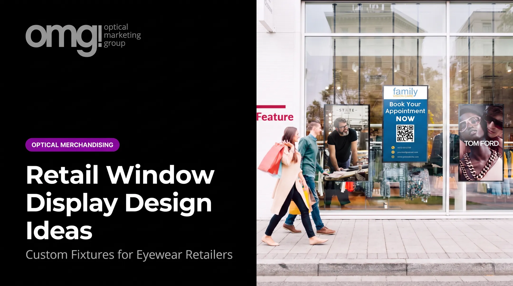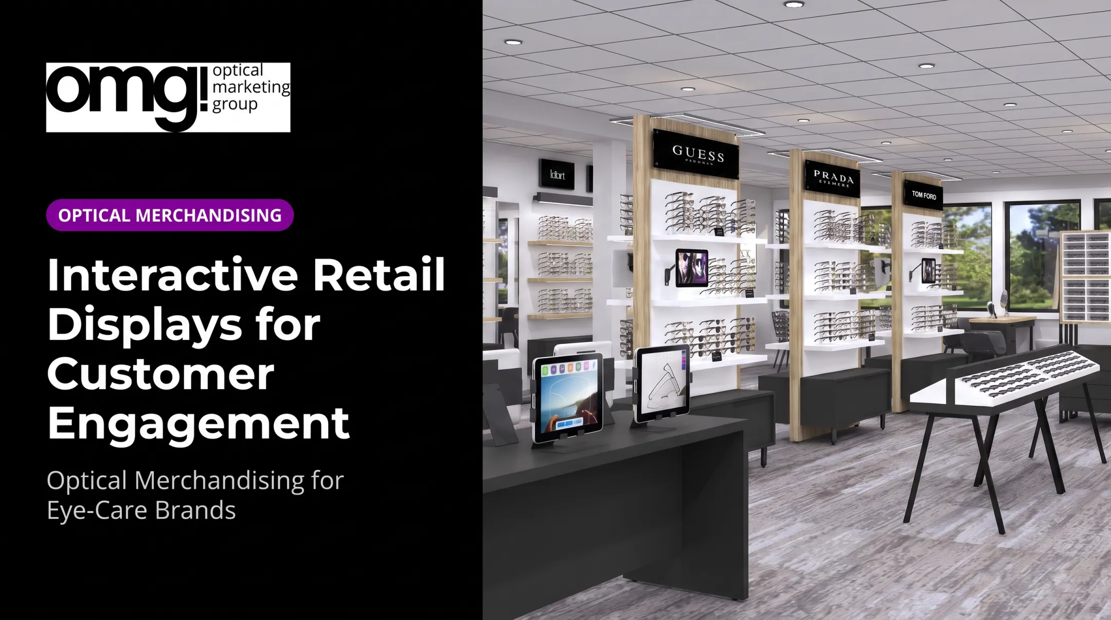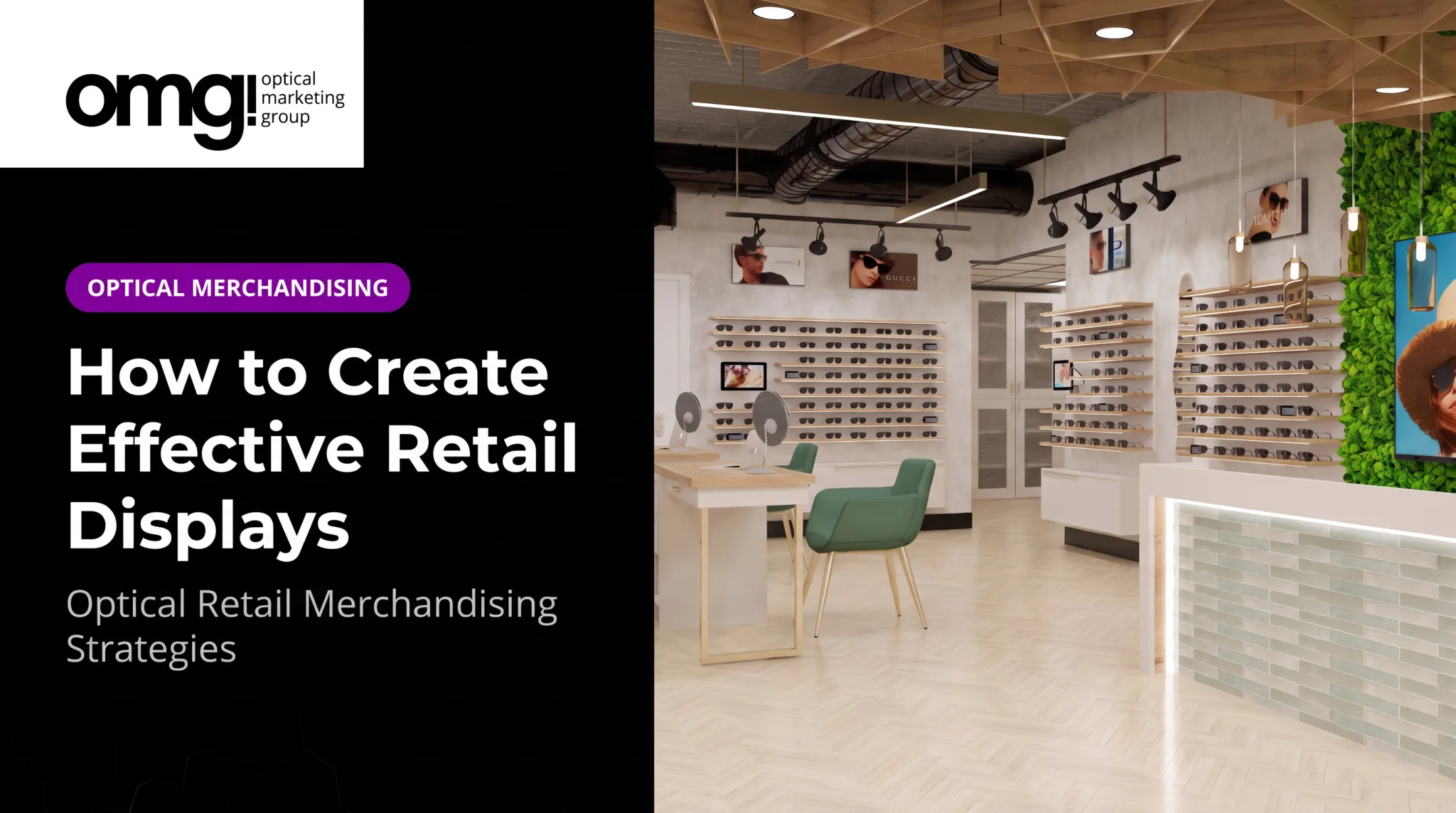

Good display design blends visual merchandising, traffic flow, lighting, signage, and a bit of storytelling. Get the mix wrong and shoppers walk past untouched inventory. In a POPAI shopper study, window posters consistently captured more shopper attention than any other in-store display element, proof that even simple, well-placed messaging works harder than clutter.
Optical retail adds another layer. Frame displays have to support casual browsing while fitting naturally into a patient's broader care journey, from check-in to consultation. This guide covers general retail display ideas and optical-specific applications side by side.
Key Takeaways
- Give every display a single job: attract attention, organize product, explain a benefit, or prompt interaction
- Design around customer movement and eye level instead of filling every inch of available space
- Pair cohesive branding with useful signage, flattering lighting, and fixtures you can update quickly
- Connect frames, lenses, lifestyle categories, and consultation areas into one intuitive optical journey
What Makes a Good Retail Display?
Build a Clear Focal Point and Hierarchy
Every strong display leads the eye somewhere specific. VMSD's 2025 report describes this as focal-point architecture, using visual hierarchy to guide attention instead of letting a shopper's eye bounce around aimlessly.
Negative space matters just as much as what you put on display. Empty space around a product signals that it's worth a second look. Three frames on a shelf built for ten reads as curated; ten frames crammed into a space built for three reads as cluttered.
Let Color, Materials, and Lighting Do the Work
These three elements shape how customers perceive value before they even touch a product:
- Warm wood feels approachable and works well for everyday, family-friendly collections
- Refined metal or glass signals a premium tier, ideal for designer frames or limited releases
- Controlled accent lighting draws the eye to hero products without washing out the rest of the display
Lighting also shifts the mood of a space. Cooler, brighter light suits a contemporary feel, while warmer tones work better for intimate, boutique-style settings.
Function Has to Match the Look
A beautiful display that's hard to restock or impossible to secure won't last. Build in:
- Easy cleaning and durable materials
- Clear restocking access for staff
- Security that keeps staff confident when customers handle product
Signage ties it together, but only when it's simple. One primary message, readable type, and benefit-led language outperform a sign trying to say five things at once.
Before choosing fixtures or finishes, define the display's actual objective. Is it introducing a new collection, simplifying comparison, or supporting cross-sells? Design follows that answer, not the other way around.
Retail Display Design Ideas to Try
Here are eight concepts worth testing, whether you're refreshing a boutique or redesigning an optical dispensary:
Window display with a single story – Pick one seasonal, lifestyle, or brand narrative and build the whole window around it. OMG!'s branded window project for Johnston Murphy used the simple message "a kick of COLOR" paired with bold vertical stripes to pull foot traffic in from the sidewalk.
Hero-product spotlight – Isolate your bestseller with breathing room, contrast, and accent lighting instead of surrounding it with competing items. A fixture like the Vista Feature Box, with its recessed cool-white LED lighting, exists for exactly this kind of single-product moment.
Themed or lifestyle grouping – Organize products around a use case: everyday essentials, outdoor eyewear, screen-use lenses, or style-led collections. Floor displays that split eyewear into sun, kids, and women's categories (each with matching lifestyle posters) make this instantly scannable.
Discovery wall or modular shelving – Peg systems, floating shelves, and movable fixtures let you refresh an assortment without rebuilding anything. Illuminated floating shelves that support wiring for digital add-ons give you room to grow into interactive elements later.
Education and comparison station – Pair products with material samples, feature cards, or QR codes so customers explore details at their own pace, without a staff member standing over them the whole time.
Interactive or multisensory display – Let customers touch, try on, or view content. Use technology only when it removes friction. An interactive tablet with a face shape guide or photo booth feature works because it answers a real question shoppers already have.
Branded storytelling display – Founder stories, craft details, or sustainability information give products meaning beyond price and specs.
Coordinated optical dispensary design – Custom frame fixtures, mirrors, branded signage, and digital content work best when designed together rather than bolted on piece by piece. OMG! Optical Marketing Group builds fixtures, graphics, and digital merchandising into one cohesive dispensary layout instead of treating each element as a separate purchase.

Which Display Types and Layout Work Best for Optical Retail?
Different display formats serve different jobs. Here's how they typically break down:
| Display Type | Best Use |
|---|---|
| Window | Street-level awareness and brand storytelling |
| Wall/slatwall | Organized frame browsing by category |
| Freestanding/gondola | Featured collections in open floor space |
| Countertop | Compact, high-margin accessories |
| Secure case | High-value or easily pocketed items |
| Digital screen | Rotating promotions, lens education, brand content |
| Experiential station | Hands-on comparison and try-on |
Mapping the Customer Journey
A well-laid-out optical space guides patients naturally:
- Clear sightlines from the entrance to an inviting first focal point
- Intuitive frame categories grouped by lifestyle or need
- Comfortable browsing zones with mirrors and try-on space
- A consultation or dispensing point that doesn't block circulation
Layout Principles and Accessibility
Good layouts give shoppers a readable path, adequate clearance between fixtures, and zones that work whether someone wants to browse alone or flag down help.
The 2010 ADA Standards specify a minimum clear width of 36 inches for accessible routes, with unobstructed reach ranges generally falling between 15 and 48 inches above the floor. These aren't optional details in a practice serving patients with mobility or vision needs.

The best optical spaces feel curated, not clinical. That means balancing retail presentation with the practical realities of a medical practice: comfortable seating, clear wayfinding, and a layout flexible enough to handle seasonal campaigns or new frame launches without a full remodel.
Retail Display Trends to Watch in 2026
Retail display design is shifting in a few clear directions for 2026:
- Connected, updatable displays. Digital signage that updates without rebuilding the fixture is now standard. Window-facing screens can run rotating lens education or seasonal frame stories, managed remotely across locations.
- Sustainability through durability. Modular, reusable fixtures and recyclable materials cut replacement waste over time. Ground claims in real material choices, not vague "eco-friendly" labels.
- Quieter, more intentional merchandising. Curated assortments, generous negative space, and tactile materials are replacing visual clutter in newer store designs.
- Personalization through data. Product groupings and content can adjust by location or customer need. Privacy and operational complexity still need careful handling.
Technology should complement staff interaction, not replace it. A screen explaining photochromic lens technology is useful. A screen that becomes the only source of information isn't.
How to Plan, Refresh, and Measure Your Retail Displays
Start With an Honest Audit
Walk the space and document:
- Customer paths and bottlenecks
- Underused areas and overcrowded ones
- Lighting quality and signage clarity
- Products getting too little (or too much) attention
Build a Display Brief
Define the audience and objective for each zone before touching fixtures. A solid brief covers:
- Story and featured products
- Color palette, materials, and lighting
- Budget and update schedule
OMG's $995 Optical Refresh program, for example, works from this kind of assessment before recommending signage, graphics, or display changes.
Set a Refresh Calendar
Build updates around seasons, promotions, and new arrivals. Keep the displays that are already working. Test one major focal point at a time rather than redesigning everything at once.
Measure What Actually Moved
Track sales by zone, attachment rates, QR engagement, and staff feedback. Eyecare Business research analyzing more than 82,000 monthly practice records found that only 9.5% of complete-pair patients purchase a second pair. That benchmark is worth tracking if a lifestyle-grouping display is meant to boost multiple-pair sales.

For practices planning a bigger project, OMG's Patient Experience Assessment and online Project Planner help scope a refresh before committing to a six-phase design-to-delivery process.
Before calling any display finished, ask:
- Can shoppers see the focal point?
- Do they understand the message?
- Can they reach the product?
- Can they move comfortably?
- Do they know what to do next?
Frequently Asked Questions
What makes a good retail display?
A good display has a clear focal point, purposeful product placement, and readable signage. It also needs cohesive branding, flattering lighting, and enough accessibility and ease of maintenance to hold up day to day.
What are the different types of retail displays?
Common types include window, wall, freestanding, countertop, point-of-purchase, secure case, digital, and experiential displays. Each serves a different purpose, from street-level awareness to hands-on product comparison.
What is the best layout for a retail store?
It depends on the store, assortment, and customer journey. The best layouts share clear circulation, logical zones, strong sightlines, accessible products, and comfortable space to browse independently.
What are the key retail display trends for 2026?
Connected and updatable digital displays, flexible modular fixtures, sustainable materials, curated minimalist merchandising, and data-informed personalization are shaping 2026 retail design, alongside more measurable in-store engagement.
What are the 7 principles of retail?
There's no single standardized list, and terminology varies by framework. Most versions touch on customer focus, visibility, accessibility, convenience, consistency, experience, and measurement.
What are the 5 P's of retail?
The 5 P's extend the classic marketing mix: Product, Price, Place, Promotion, and People. Displays directly support Product presentation, Place, Promotion, and the People guiding the customer experience.