
Introduction: Retail Store Layout Design That Supports Customer Experience and Sales
A retail store layout is more than shelf placement. It shapes how customers enter, where their eyes land, how they move, when they ask for help, and whether they ever reach the register.
Many retailers struggle with layouts that look fine on paper but create congestion, dead zones, or confusing paths to the products customers actually want. This matters whether you're opening a new store, relocating, running an optical dispensary, refreshing a small shop, or rolling out a format across multiple locations.
This guide covers the main layout types, a practical planning process, small-store strategies, optical-specific considerations, and how to test whether your layout is actually working once the doors open.
Key Takeaways
- A strong layout balances customer experience, product visibility, staff workflow, brand presentation, and operations.
- Choose a layout based on store size, product mix, and customer mission, not whatever format is trending.
- Plan the entrance, sightlines, circulation, service points, and checkout as one connected journey.
- Treat layout as flexible. Watch behavior, collect feedback, and adjust displays as needed.
What Is Retail Store Layout Design and Why Does It Matter?
Retail store layout is the planned arrangement of floor space: fixtures, merchandise, displays, service areas, signage, circulation paths, and checkout points. It's distinct from store design, which includes the broader visual and sensory layer: materials, lighting, color, graphics, and brand identity. Layout governs how the space functions; design governs how it feels.
A good layout coordinates five systems at once:
- Customer circulation: how shoppers physically move through the space
- Merchandising logic: which products get seen, and in what sequence
- Service delivery: where staff interact with customers
- Staff operations: restocking, cleaning, and backroom access
- Brand storytelling: how the space communicates identity
These systems aren't theoretical. A 2013 field experiment tracking customer movement with RFID found that unplanned purchases rose significantly when a promotional coupon directed shoppers farther from their usual path.
Shoppers spent $21.29 extra when the coupon pulled them off their expected route, versus $13.83 when it sat near that route, according to a Journal of Marketing study. The researchers concluded that products encountered along a shopper's path act as memory triggers, connecting exposure to purchase decisions.

That's the core argument for layout design: where you put things changes what people buy, not just how they feel while buying it.
Common Types of Retail Store Layouts
Most stores use a variation of six circulation patterns. None is universally "best"; each trades product exposure against navigation speed.
| Layout | Best for | Watch out for |
|---|---|---|
| Grid | Broad assortments needing efficient navigation (pharmacy, grocery-style) | Can feel sterile; hard to create a distinctive experience |
| Loop/racetrack | Guided discovery across many categories | Rigid route can feel trapping if customers want to grab one item and leave |
| Spine | Clear linear movement with a strong central aisle | Shoppers can move too fast and skip side displays |
| Free-flow | Curated, experience-led retail with fewer SKUs | Lower display capacity; can confuse without clear zoning |
| Boutique/shop-in-shop | Distinct product stories or brand zones within one store | Can fragment the space if zones don't feel connected |
| Hybrid | Stores serving multiple customer missions in one footprint | Requires more planning to avoid mixed signals |
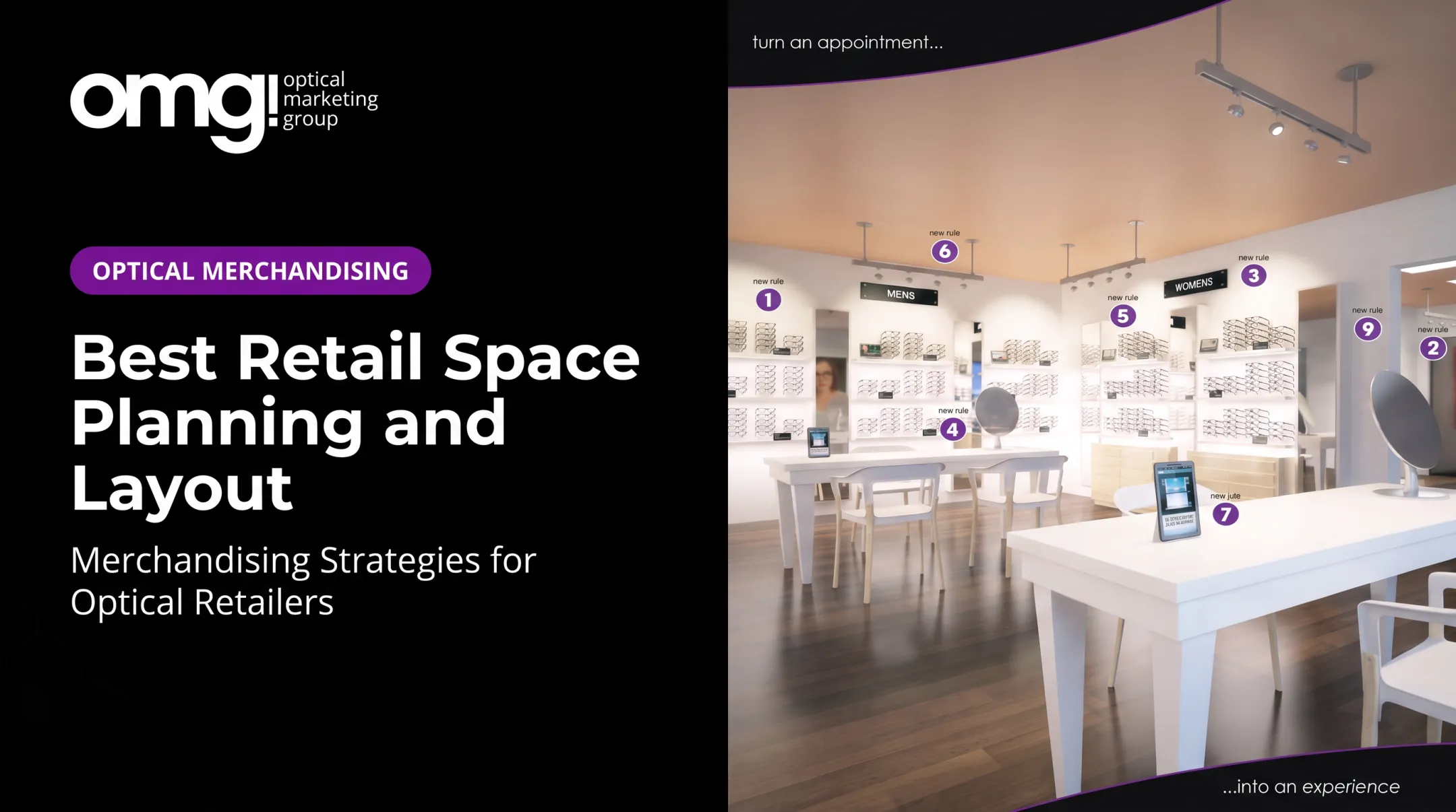
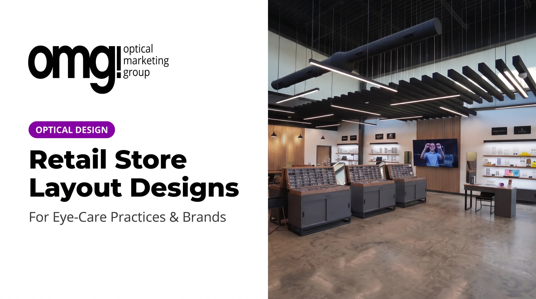
Optical retail often leans on a boutique-style approach. OMG! Optical Marketing Group builds open optical layouts using modular floor-to-ceiling post systems to create defined zones for sports eyewear, luxury frames, or kids' collections (essentially a shop-in-shop model without permanent walls).
Pick the format that matches your site and assortment. Don't force a racetrack into a 900-square-foot boutique just because a big-box retailer uses one.
How to Design a Retail Store Layout: A Practical Planning Process
Start With Discovery, Not Fixtures
Before moving a single shelf, document the space: dimensions, entrances, columns, utilities, natural light, and existing constraints. Pair that with business basics : target customers, product categories, service model, and budget.
OMG!'s own Discovery phase works this way: an initial space and fixture plan, built from the client's goals, style preferences, timeline, and structural realities, paired with a cost estimate before any construction begins. Practice Design projects typically run $62,000 to $155,000+, depending on scope and square footage. Accurate measurement upfront avoids expensive mid-project changes.
Map the Journey, Then Zone the Space
Map customer and staff journeys separately : arrival, browsing, consultation, payment, and collection for customers; stocking, cleaning, and emergency access for staff. Then divide the floor into functional zones:
- Entrance or decompression zone
- Primary circulation path
- High-traffic and discovery areas
- Service or consultation zones
- Flexible promotional space
- Storage and checkout
Each zone needs one clear job. A zone that tries to do two things usually does neither well, and it tends to create bottlenecks exactly where you need flow.
Conventional wisdom says keep the entrance empty to let shoppers "decompress." Field research involving 715 customers in a home-goods store found that merchandise placed right at the entrance increased purchases of the featured products, according to retail journal research.
The same study found that pairing an employee greeting with entrance merchandise boosted unit sales but lowered total spending compared to an employee greeting alone. More product near the door is not automatically better overall.
Build Visual Hierarchy, Then Choose Fixtures
Decide which categories, new arrivals, and high-margin products deserve the strongest visibility : power walls, focal displays near the entrance, and cross-merchandising groupings. Add "speed bumps": high-impact displays placed to slow shoppers down on a fast-moving path.
Fixtures, lighting, and signage should support that hierarchy while staying flexible:
- Combine durable foundational fixtures with movable, modular displays
- Choose materials that hold up to daily handling (glass, wood, metal)
- Keep signage systems adaptable for seasonal campaigns
Finish with a pre-opening walkthrough: test sightlines, queue capacity, staff reach, and accessibility before day one.
Optical and Small-Store Layout Design Considerations
Optical retail sits in an unusual spot: half medical visit, half retail browsing. The layout has to let patients browse frames comfortably without feeling like they're in a crowded shop or a clinical waiting room.
Mapping the Optical Journey
The patient path typically runs check-in → exam handoff → frame browsing → try-on → consultation → fitting → payment → collection. At each step, the layout should preserve:
- Clear sightlines between staff and frame displays
- Comfortable seating or consultation areas with mirrors and flattering lighting
- Enough personal space for unhurried try-ons
Bill Gerber, OMG!'s founder, points to pre-appointment browsing and a smooth exam-to-dispensary handoff as two of the biggest levers for capture rate. Urban Optics in College Station, Texas, a practice that fuses optometry and optical retail, reported capture climbing from 42% to 72% after a remodel. That remodel added an integrated waiting area for pre-exam browsing, improved lighting, comfortable seating, and a 98-inch video wall for digital engagement.

Small-Shop and Zoning Strategies
Frame zones work best organized by use case, collection, brand, style, or price range — categories patients recognize without needing a lecture. Signage should support that discovery, not replace staff guidance.
For smaller footprints, a few moves go a long way:
- Use vertical wall merchandising instead of bulky floor fixtures
- Curate the assortment rather than displaying everything at once
- Keep the entrance open and uncluttered
- Create one or two strong focal moments instead of five mediocre ones
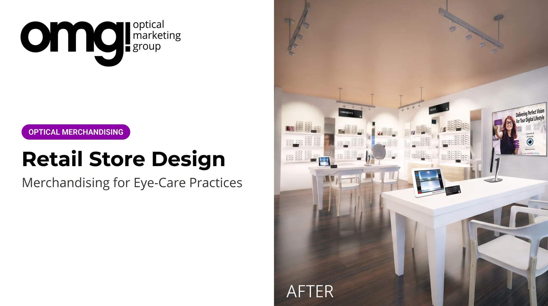
OMG! builds frame displays around open shelving, risers, and integrated backlighting rather than dense "soldier-on-the-wall" boards, a direct response to the clutter problem small optical retailers face most often. Accessible route widths and counter heights also matter here; the ADA design standards set minimum clearances for accessible routes and service counters that any dispensary layout needs to account for.
The connection between clinical and retail areas deserves its own attention: acoustics, privacy near consultation areas, and consistent branding across the handoff point. For practices evaluating these gaps, OMG!'s Patient Experience Assessment and Project Planner flag traffic-flow and staff-efficiency issues before a redesign begins.
How to Evaluate, Test, and Improve a Store Layout
Before changing anything, document a baseline: recurring customer questions, staff observations, category performance, queue complaints, and the spots where customers hesitate or backtrack.
Combine Qualitative and Quantitative Signals
- Direct observation and staff feedback
- Customer comments and reviews
- Sales or category performance data
- Appointment or service-flow timing
- Foot-traffic and dwell-time analysis, where available
If you use heat maps or video analytics, know their limits. Zone-penetration heat maps show where people walked; eye-tracking shows where attention went. They're different data sets, not interchangeable ones. Any technology that captures biometric data (like facial geometry) also carries separate privacy and consent obligations worth checking before deployment.
Test One Change at a Time
Move one focal display, adjust one consultation zone, or revise checkout placement , then watch a defined outcome before layering on the next change. This is slower, but it's the only way to know what actually moved the needle.
Bellaire Family Eye Care offers a documented example. The practice enlarged its optical space by 40%, folded the front desk into reception, moved kids' merchandise out of a busy hallway, and swapped locked sunwear cabinets for an open sunglass tower.
The reported result: a 31% increase in optical revenue and a 50% increase in plano sunwear sales, according to a Review of Optometric Business account of the renovation. It's one practice's combined remodel, not a guaranteed formula, but it shows what's possible when zoning and visibility change together.

Keep the layout flexible after launch. Schedule seasonal refreshes, recheck accessibility and safety, and confirm the customer journey you designed is still the one people experience.
Frequently Asked Questions
What is the difference between store design and store layout?
Layout focuses on spatial organization: circulation, fixtures, product placement, and function. Store design adds the visual and sensory layer (materials, lighting, color, and brand expression) built on top of that layout.
What are some good design ideas for a small shop?
Keep the entrance open, use vertical displays to maximize wall space, and curate a focused assortment instead of cramming in everything. Add one or two strong focal displays and give customers room to actually browse.
What are the main types of retail store layouts?
The main formats are grid, loop/racetrack, spine, free-flow, boutique, and hybrid. The right choice depends on your store's size, product mix, and how much guidance customers need.
How do you design a retail store layout?
Assess the space and business goals, map customer and staff journeys, choose a layout format, create functional zones, plan product placement and fixtures, then test the finished experience before and after opening.
How can you tell if a store layout is working?
Combine direct observation, staff and customer feedback, sales or category data, and queue analysis. Where appropriate, traffic or dwell-time tools can help pinpoint bottlenecks, dead zones, and displays that are actually working.