
Effective signage balances personality with practical communication. It should attract attention, express the boutique's positioning, support browsing, and make the next action obvious, whether that's "come in," "try this on," or "scan here." This article covers creative signage ideas, modern trends, design principles, placement guidance, implementation steps, and the mistakes that quietly undercut a storefront's first impression.
Key Takeaways
- Treat signage as one coordinated system from storefront to checkout, not isolated decorations
- Match each sign's message, size, contrast, and material to its purpose and viewing distance
- Pair permanent brand signage with flexible promotional or digital pieces you can update often
- Connect optical boutique signage to frame discovery, lens education, and the patient journey
Boutique Signage Ideas That Guide Customers From the Street to Checkout
Start With a Signature Storefront Sign
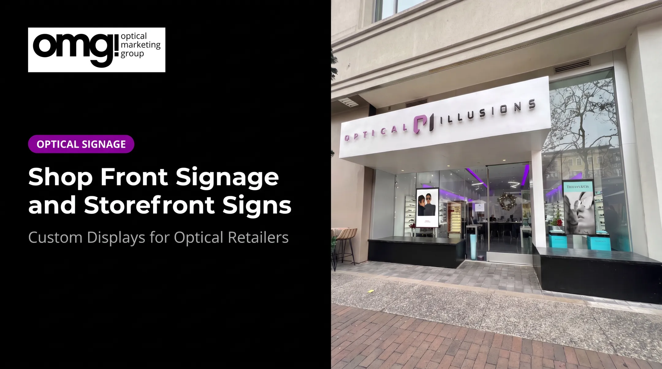
Your primary storefront sign establishes recognition before a customer reads a single word of copy. Dimensional lettering, a refined entry plaque, or a projecting blade sign all communicate identity differently depending on your building and brand.
The International Sign Association describes a dimensional letter as one cut, cast, fabricated, or molded from materials like metal or acrylic. That construction reads as intentional and permanent rather than printed or temporary.
If your storefront allows it, a blade sign extending over the sidewalk gives you a second, pedestrian-level touchpoint beyond the facade.
Turn Windows Into a Story, Not a Billboard
Windows are prime real estate, but covering every pane with graphics backfires. Use:
- Translucent film for a subtle brand texture that still lets light in
- Seasonal scenes or new-arrival messaging that rotates every few weeks
- A partial display that frames the interior instead of blocking it
A boutique that swapped dense, overlapping window graphics for a single bold image saw stronger curb appeal and clearer brand presence. Restraint often communicates more than density.
Use the Sidewalk to Earn the Entry
A-frames, chalkboards, and portable message boards work because they're timely. Keep the message to one offer, event, or appointment prompt, and make it easy to swap weekly. Directional arrows help on corner lots or multi-tenant buildings where the entrance isn't obvious from the street.
Guide Browsing Once They're Inside
Interior signage should mirror the customer journey:
- Category labels and "new arrivals"
- Staff picks and short collection stories
- Fitting-room prompts
- A clear checkout sign
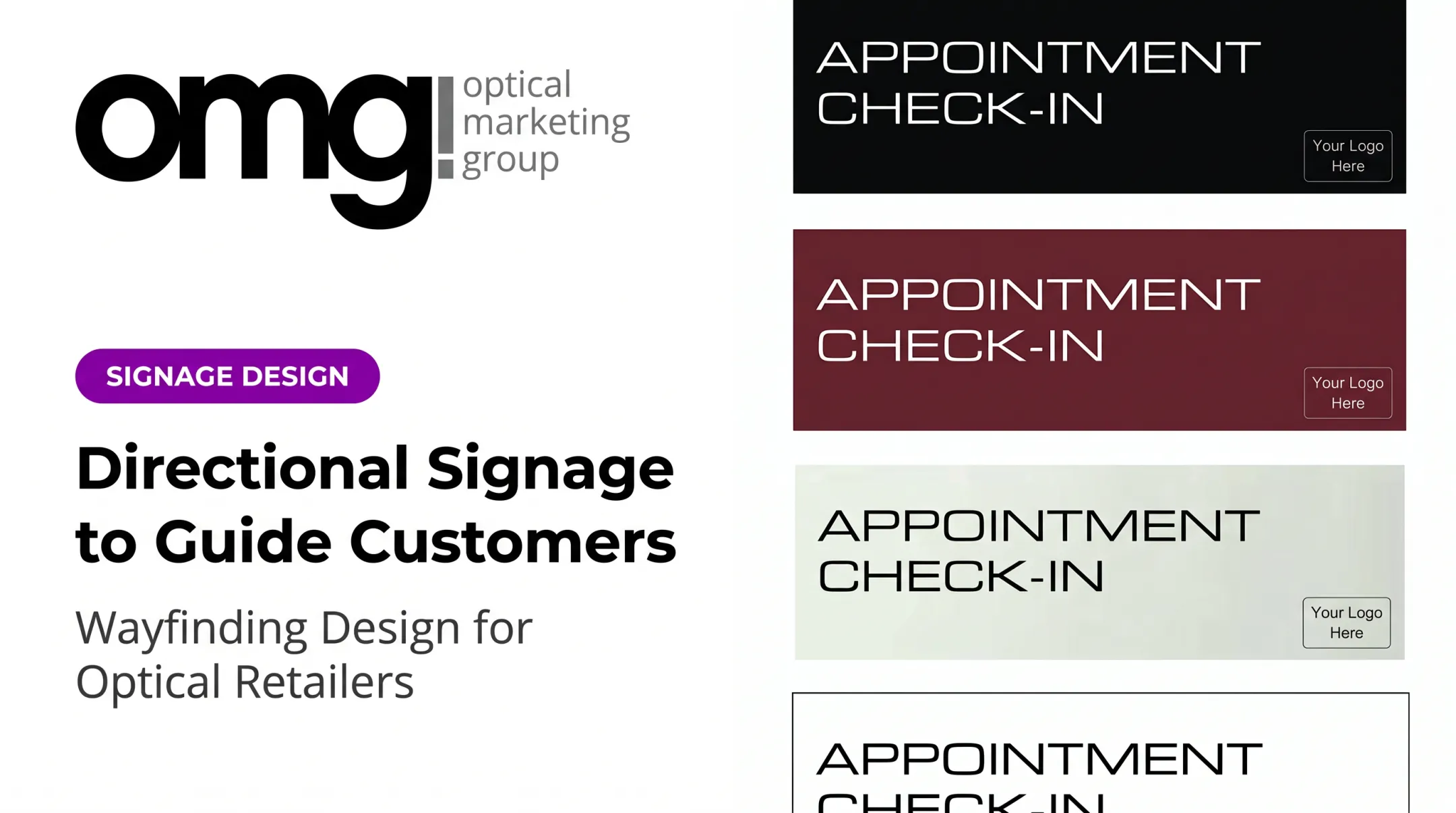
For optical boutiques, that means frame-collection intros, lens features in plain language (skip the technical specs), and signage that gently directs patients from the clinical area toward the retail side without overwhelming them.
Modern Boutique Signage Trends Worth Considering
Boutique signage is shifting toward layered systems rather than one dominant sign. A storefront today might combine permanent identity signage, tactile window graphics, small product labels, and a digital screen, each doing a different job, together reading as curated instead of cluttered.
Digital Screens With a Purpose
Digital signage now replaces static posters for rotating content: new arrivals, product education, event announcements, or seasonal campaigns. A 55-inch window-facing display, for instance, can run motion-based messaging where a static sign once sat. Managed subscriptions let staff update playlists without reprinting anything.
The screen should support the brand story, not compete with the products in the window.
Tactile and Dimensional Materials
Raised lettering, routed wood, metal, acrylic, fabric, and backlit finishes each send a different signal:
- Metal or etched acrylic communicates permanence and modern polish
- Wood reads as warm and artisan
- Fabric graphics add softness and are easy to swap seasonally
- Backlighting extends visibility after dark without changing the daytime look
QR Codes Done Right
QR codes work when they lead somewhere specific: an appointment booking page, a styling lookbook, or campaign details. A December 2023 Retail TouchPoints viewpoint notes that scan activity can vary significantly by placement, so a scan signals interest rather than a guaranteed sale.
Keep the call to action short and confirm the landing page is mobile-friendly before you print a single code.
Trends only work when they match who you are. Resist copying generic neon signs or whatever's trending on social media if it doesn't fit your boutique's actual identity. A quote, illustrated icon, or custom pattern tied to your brand will outlast a borrowed aesthetic.
How to Design Boutique Signage That Looks Attractive and Communicates Clearly
Define Positioning Before Picking Fonts
Decide whether the boutique's desired impression is luxury, contemporary, playful, artisan, minimalist, or community-focused. That single decision should drive your type choice, color palette, imagery, materials, and tone, before you touch a design template.
Keep One Message Per Sign
A common failure point: cramming store history, a product list, social handles, and a promotion onto the same sign. Apply a simple hierarchy instead:
- One primary message: the thing you most want noticed
- One supporting detail: context, if needed
- One action: only where an action is actually required
Prioritize Legibility Over Decsheets
Readable type, sufficient letter size, strong contrast, and comfortable spacing matter more than a clever font. The ADA's accessibility standards offer a useful reference point: under Table 703.5.5 of the 2010 ADA standards, a character mounted 40 to 70 inches above the floor, viewed from less than 72 inches away, needs a minimum height of 5/8 inch.

That specific rule applies to regulated signage, not every storefront wordmark. The underlying lesson still holds: size and legibility depend on mounting height and viewing distance, not a fixed ratio.
Build a Simple Style Kit
Coordinate the whole signage system with a style kit covering:
- Approved logo versions and colors
- Typeface pairings
- Iconography and finishes
- Photography style and tone of voice
- Rules for promotional messaging (so a sale sign doesn't clash with your identity signage)
Also plan for the environment itself. Daylight, nighttime illumination, window glare, weather exposure, and update frequency all affect material choice and placement. Map these factors before fabrication begins.
Choosing Signage Types, Materials and Placement for a Boutique
Three Categories, One System
Boutique signage generally falls into three buckets: exterior signage, interior signage, and promotional or informational signage. Digital signage can live across all three. A window screen is exterior-facing, a floor tablet is interior, and both can carry promotional content.
| Format | Best Purpose | Typical Placement |
|---|---|---|
| Storefront or blade sign | Recognition | Facade or projecting over sidewalk |
| Window graphics | Storytelling | Glass, pedestrian eye level |
| A-frame | Timely prompts | Sidewalk near entrance |
| Interior wayfinding | Navigation | Category zones, hallways |
| Product or price signs | Decision support | Eye level at displays |
| Digital displays | Frequently changing content | Windows, counters, walls |
Match Material to Brand and Conditions
Wood and fabric suit a warmer, artisan feel. Metal signals permanence. Acrylic gives a clean, modern finish, while vinyl graphics stay flexible for changeable messaging. Illuminated elements extend visibility after dark.
Each option trades off durability, maintenance, and cost. Acrylic typically needs mild soap, water, and a soft microfiber cloth rather than harsh solvents. Ask your fabricator to document the specific product and care requirements rather than assuming every grade of metal or wood behaves the same.
Test Placement the Way a Customer Would
Before finalizing anything, walk the actual approach:
- View signs from the street, the parking area, and the entrance
- Check visibility at different times of day, including after dark
- Look for glare, reflections, or obstructions from displays
- Confirm sidewalk signs don't block accessible pedestrian movement
That last point matters more than it seems. Public sidewalks generally require a continuous clear path, and under PROWAG guidance, that's typically 48 inches, wider than many assume when placing an A-frame. Confirm the applicable standard locally before you set one out.
Planning, Implementing and Maintaining Your Signage System
A Practical Rollout Process
- Define the business goal: recognition, foot traffic, a specific promotion
- Map the customer journey from street to checkout
- Audit existing signs and flag what's permanent versus changeable
- Select formats and materials based on purpose and exposure
- Create mock-ups: scaled printouts or window renderings work fine
- Confirm installation requirements, then schedule periodic updates

Test concepts before production. Ask staff whether a customer could understand the message in a few seconds and whether it actually supports the behavior you want.
Don't Skip the Compliance Check
Most communities require permits for new signs, and some extend that to temporary banners and A-frames too. The International Sign Association's permitting resources note that noncompliant proposals may need a variance.
Confirm requirements with your local authority before fabrication to avoid a costly redo. This covers zoning, illuminated or projecting sign approval, electrical work, and sidewalk clearances.
Common Mistakes and What Maintenance Actually Prevents
The recurring failures are predictable: too much copy, decorative type that's hard to read, inconsistent materials, signs hidden behind displays, and promotions left up weeks after they expired. Maintenance is what protects the brand experience day to day:
- Clean windows and sign faces regularly
- Inspect fasteners, lighting, and mounts
- Replace faded or damaged graphics promptly
- Secure portable signs so they don't shift or tip
- Update digital content on a defined schedule
Measure what's working without overstating what the data proves. Track directional questions from customers, QR scan activity, appointment responses, and foot-traffic patterns, then adjust message, placement, or format accordingly. Engagement numbers tell you a sign is noticed; sales data tells you whether it's converting.
How OMG! Optical Marketing Group Can Help Create a Cohesive Optical Boutique Experience
An optical boutique rarely needs just one sign. It needs an environment. Exterior identity, window storytelling, frame displays, discovery signage, digital content, lighting, and customer flow all need to work together, which is harder to coordinate piecemeal than most practices expect.
Internal data suggests fewer than 5% of optical retailers currently have proper signage throughout their facility, meaning departments, brands, and services are often genuinely hard for patients to identify. That gap is exactly where a coordinated system pays off.
OMG! Optical Marketing Group, based in Solana Beach, California, works with independent practices, optical chains, and eyewear brands across the US and Canada on exactly this kind of integrated environment. Services include:
- Custom fixtures and practice design
- Branded and promotional signage, from area/department signs to brand-story acrylics
- Digital signage hardware and content subscriptions through Contentlinq
- Merchandising and installation support
The company's six-phase design-to-delivery process covers discovery, pre-construction drawings, interior design, production, and installation. It gives practices a structured way to evaluate signage across the full patient journey: curb appeal, entry, browsing, frame selection, and checkout.

That framework treats signage as a system rather than a series of one-off purchases.
Frequently Asked Questions
What are some creative boutique signage ideas?
Dimensional storefront lettering, window storytelling graphics, A-frames for timely offers, and interior discovery labels like staff picks work well together. Optical boutiques can add custom icons and QR-enabled digital signage when each piece fits the brand and customer journey.
What are modern boutique signage trends?
Current trends include layered signage systems that combine permanent and digital elements, tactile finishes like routed wood or backlit acrylic, and QR codes linked to appointments or content. Personalization matters too, but don't chase trends at the expense of legibility.
What are the three main types of signage?
Exterior, interior, and promotional or informational signage are the three broad categories. Digital signage fits all three: a window screen faces exterior traffic, while a counter tablet serves interior or promotional needs.
How do I choose the right signage for my boutique?
Consider the sign's goal, audience, viewing distance, and how often the message changes. Then factor in brand personality, location, material durability, accessibility requirements, and local permitting rules before committing to a format.
Where should boutique signs be placed?
Place signs at the storefront, windows, entrance, sidewalk, product displays, key wayfinding points, and checkout. Test visibility from the street and at different times of day, avoid clutter, and always keep pedestrian routes clear.