
Many practices struggle with this dual identity. Exam lanes feel sterile, dispensaries feel like an afterthought, and patients walk straight from checkout to the parking lot without a second glance at the frame boards. Nearly 90% of purchase decisions happen in-store, according to OMG! Optical Marketing Group's own research on optical retail behavior — which means the physical environment carries most of the weight.
This guide breaks down two connected disciplines: visual merchandising and store design. You'll get working definitions, core design principles, merchandising techniques, and a practical path for improving a space you already have (or planning one from scratch).
Key Takeaways
- Visual merchandising presents frames, lenses, and services in ways that invite browsing and support decisions
- Store design sets the stage through layout, flow, lighting, zoning, and fixtures
- Optical spaces work best when the clinical journey flows naturally into retail browsing
- Signage and displays build brand distinction without adding visual clutter
- Small, planned updates often outperform waiting for a full remodel
What Are Visual Merchandising and Store Design?
These two terms get used interchangeably, but they describe different jobs.
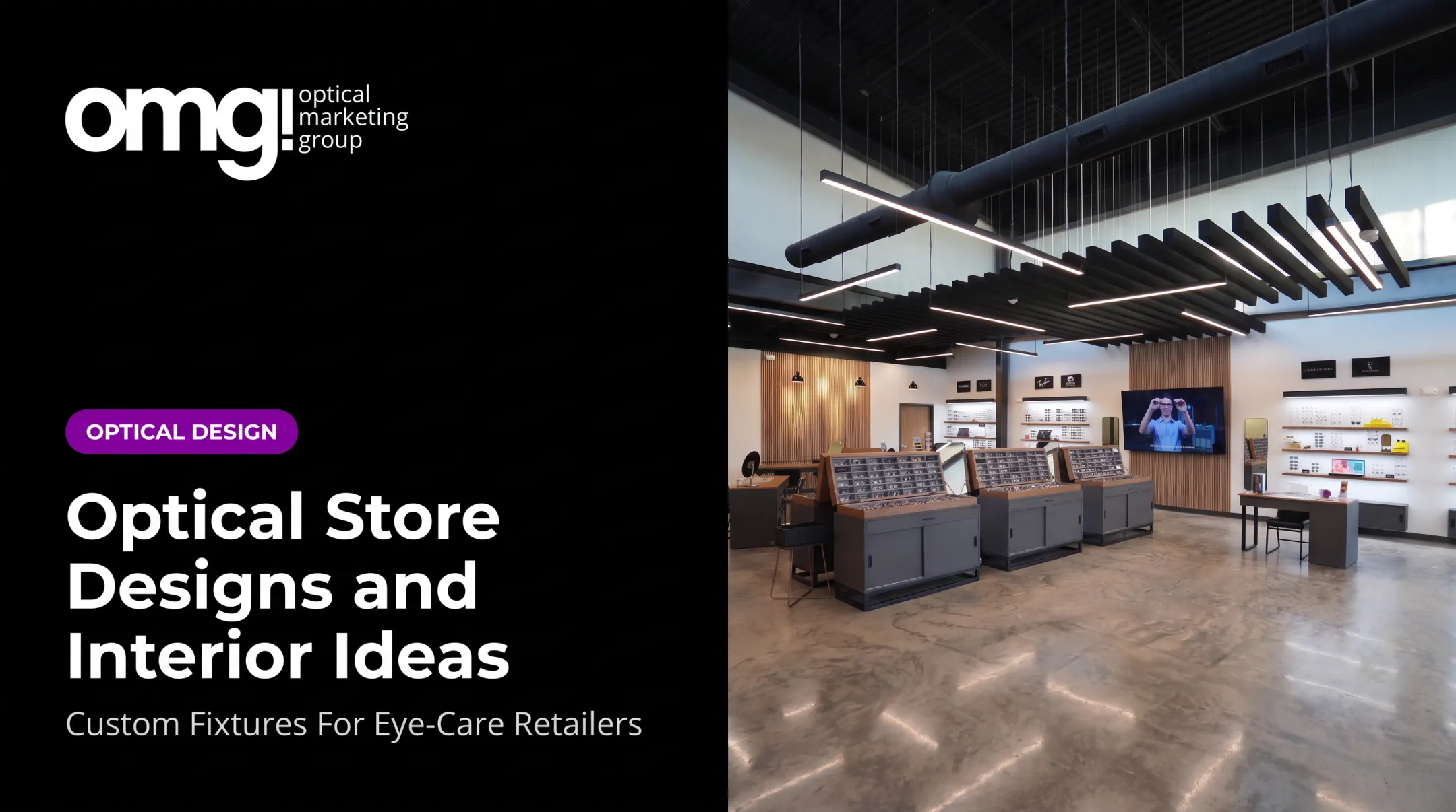
Store design is the physical container: the floor plan, patient flow, optical zones, consultation areas, materials, lighting infrastructure, and accessibility features. It determines where people walk and how the space functions operationally.
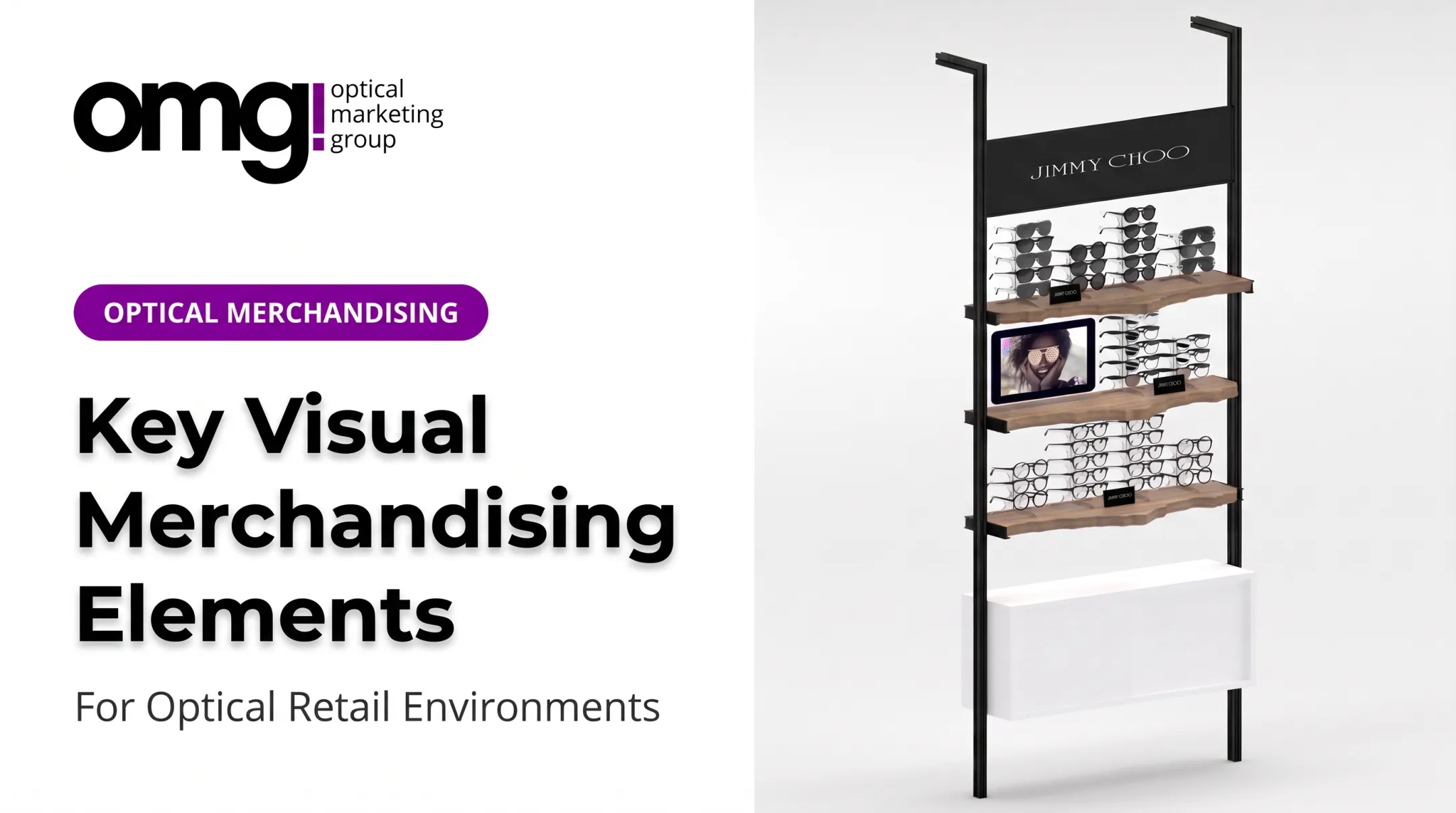
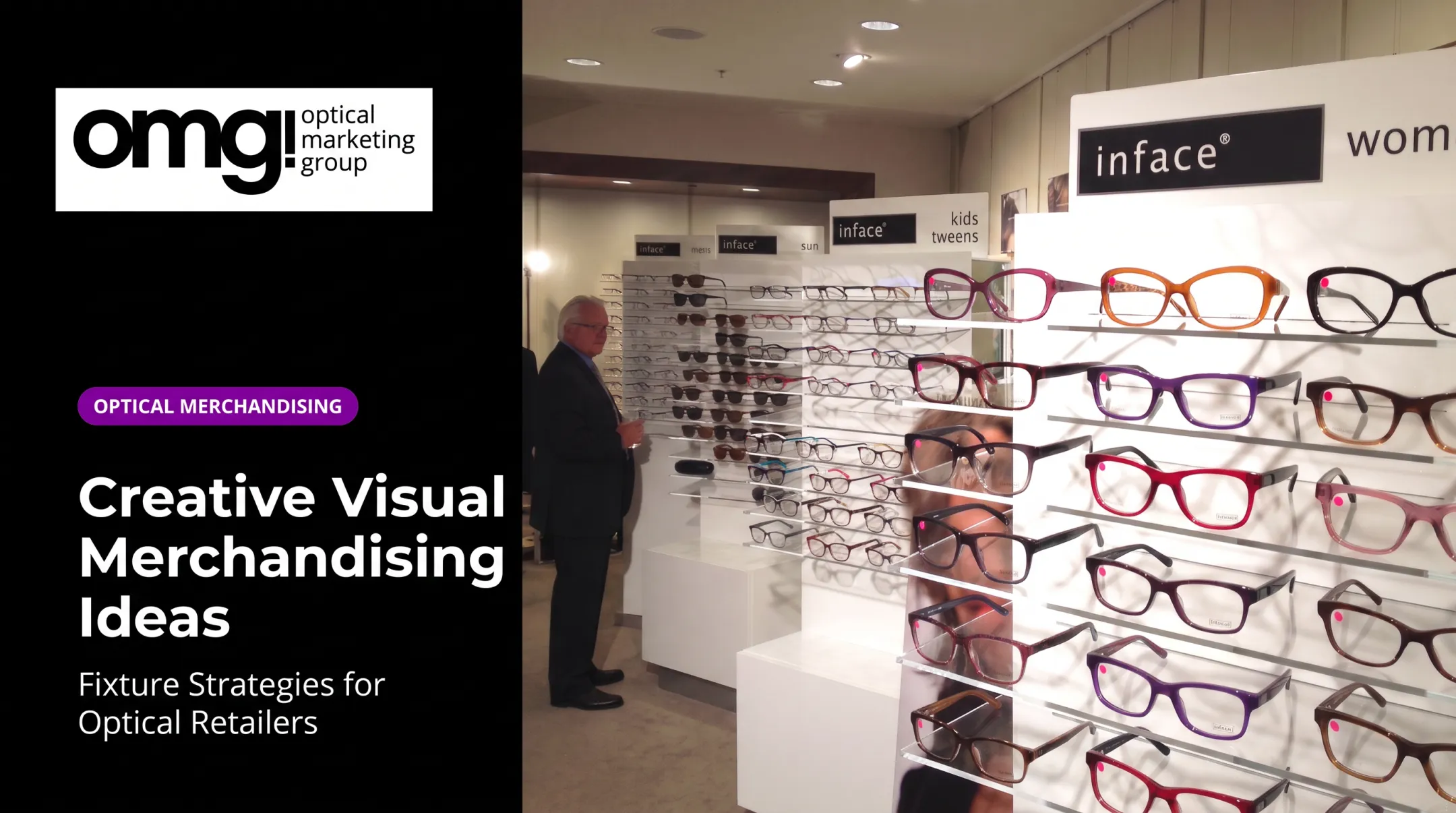
Visual merchandising is what happens inside that container: displays, signage, color, fixtures, graphics, and digital content that present products and tell a brand story. It determines what people notice and how they interpret it.
Store design builds the stage; merchandising directs what happens on it. A well-designed dispensary with no merchandising strategy is empty shelving. Sharp merchandising in a poorly planned layout gets lost in traffic jams and bad sightlines.
Why Plan Them Together
Treating these as separate finishing stages — design first, merchandising later — tends to create friction. Display cases get positioned before anyone considers lighting angles. Signage gets added after wall space is already spoken for. When both are planned from day one, they reinforce each other instead of competing for the same square footage.
Good design should support measurable goals, not just look appealing:
- Easier frame discovery for browsing patients
- Smoother handoffs between clinical and optical staff
- Stronger, more consistent brand recognition
- Natural openings for multiple-pair conversations
Applying the AIDA Sequence
Marketing's classic AIDA model — attention, interest, desire, action — dates back to 1898 and still offers a useful lens for a single display. A hero frame wall catches attention. Clear signage builds interest by answering "why this frame?" A try-on mirror and seating support desire. A staff member closes the loop with action. It's a helpful framework for evaluating a display, not a guaranteed formula for sales.

Store Design Principles for Optical Spaces
Strong optical design starts with how people move, not how shelves look.
Space Planning and Zoning
Map the full patient journey: entry, reception, exam area, frame browsing, styling, checkout, exit. Walk it yourself and note where people hesitate, backtrack, or skip the optical area entirely.
Zoning separates functions while keeping the experience visually connected:
- Clinical areas stay private and efficient
- Waiting areas integrate into the optical space rather than sitting isolated near the door
- Browsing zones stay open and unhurried
- Consultation and transaction areas stay close enough to avoid awkward walks
Eyecare Business's 2024 guide specifically warns against parking waiting areas right at the entrance. Patients tend to sit down and wait rather than browse, which kills early engagement with the dispensary.
Fixtures, Lighting, and Reachability
Fixture height and spacing affect who can actually interact with a display. A common industry reference point: shelves installed roughly 14 inches apart, with the bottom shelf around 36 inches from the finished floor, keeps merchandise reachable for most adult patients.
Lighting does three jobs at once: ambient light for wayfinding, task light for accurate color and detail on frames, and accent light for an upscale feel. IES's 2020 lighting standard covers this layered approach for general retail spaces. Treat it as a starting framework rather than an optical-specific rulebook, and verify final specs with a qualified lighting professional. Some practices now budget at least 30% of a build-out toward lighting alone.
Materials, Finishes, and the Storefront
Materials and color communicate positioning before a patient reads a single sign. Warm wood tones, layered lighting, and a restrained color palette tend to read as upscale; stark clinical finishes can feel cold, and overly busy patterns compete with the product itself.
The storefront and entry set the first impression. Exterior signage and window messaging should preview the interior story, not contradict it.
Visual Merchandising Techniques That Improve the Optical Experience
Once the environment is set, merchandising determines whether patients actually notice and understand what's in front of them.
Building Focal Points Without Overwhelm
A hero collection, new-arrival wall, or seasonal story gives the eye somewhere to land first. The risk is letting one display dominate the room. Rotate focal points on a schedule so the dispensary stays fresh without becoming visually loud.
Grouping by Need, Not Just Category
Group frames around lifestyle and need rather than arbitrary categories:
- Performance and sport eyewear for active patients
- Children's frames in a dedicated, durable zone
- Sunglasses and lens upgrades near checkout for add-on moments
- Luxury and fashion lines in their own curated section
Signage That Answers Questions
Short, consistent signage does double duty: it clarifies product benefits and invites browsing without requiring a staff member to explain everything.
OMG!'s signage lineup includes area and department signs (roughly 18" × 6") for categories such as Men's, Women's, and Kids', plus smaller lifestyle signs covering Performance, Fashion, and Sale. Less than 5% of optical retailers currently have signage consistent enough for patients to identify areas and brands on their own, based on OMG!'s internal merchandising research.
Visual Hierarchy and Breathing Room
Negative space matters as much as product density. Overcrowded boards make comparison harder, not easier. Repetition, color balance, and clear groupings help patients compare frames instead of feeling lost.
Supporting the Browsing Moment
Mirrors, seating, and consultation surfaces turn passive looking into guided decision-making. A styling table with proper lighting and a nearby mirror does more for conversion than any single display.
Digital Merchandising, Used Deliberately
Interactive tablets near displays (letting patients explore lens technology or try a virtual face-shape tool) and window-facing screens can extend the merchandising story. Before adding screens, settle the basics: who owns the content, how often it updates, and whether it genuinely improves the experience rather than just adding motion to the room.
Why Integrating Store Design and Merchandising Matters
Disconnected displays tell disconnected stories. Integration creates one continuous narrative: from curb appeal through the exam, the dispensary, and the follow-up visit.
Early collaboration between interior designers, architects, graphic designers, and operations staff prevents the conflicts that show up later:
- A light fixture that casts a shadow exactly where a mirror needed to go
- Signage ordered before wall space was finalized
- A sightline blocked by a display nobody measured properly
One frequently cited example of this coordination comes from Eye Boutique's case study in Houston. Owner Fabio Pineda replaced wall-mounted plastic frame boards with custom shelving, added backlighting and spotlighting, and trimmed the assortment to fewer, fresher products. He reports a $600 average revenue per patient and roughly 40% sunglass sales (a single practice's self-reported results, not a guaranteed outcome, but a clear illustration of how coordinated changes can reinforce each other).

Integrated design connects to broader goals most practices already track: smoother traffic flow, more efficient staff movement, stronger brand consistency, and better odds of repeat visits.
How to Apply These Ideas in a New or Existing Practice
Improvement starts with an honest audit, not a wish list.
- Document the current floor plan and photograph key sightlines from the entrance, reception, and exam-to-optical transition
- Observe patient movement for a few days: where do people pause, backtrack, or walk past the dispensary entirely?
- Collect staff feedback on friction points during handoffs and fittings
- Note display interaction : which fixtures get touched, which get ignored
From there, prioritize by project type:
- Low-disruption refreshes: signage, lighting tweaks, graphics, product regrouping
- Fixture upgrades: new shelving or displays for capacity or visibility issues
- Full redesigns: relocation, expansion, major workflow breakdowns, or a genuinely dated space
A structured self-assessment helps here. OMG!'s own merchandising assessment scores nine areas (including signage visibility, lighting quality, and whether waiting is integrated into the optical space) on a 1-to-5 scale, out of 45 total.
Lower-disruption refreshes through programs like OMG!'s Practice Refresh typically run 3 to 4 weeks without structural construction.
Keep displays current with a merchandising calendar covering new collections, seasonal campaigns, and routine maintenance. Then track what actually changed: optical-area engagement, browsing behavior, appointment-to-optical conversion, or category-level sales, measured against your own baseline, not an industry average that may not apply to your patient mix.
When to Work With an Optical Design Partner
Some projects genuinely need outside expertise:
- Opening or relocating a practice
- Renovating a dated dispensary
- Standardizing design across multiple locations
- Adding custom fixtures or digital signage
- Coordinating design with construction and installation
OMG! Optical Marketing Group works as a full-service optical design and merchandising studio, supporting practice layouts, custom fixtures, graphics, branded signage, and digital displays through an integrated design-to-delivery process.
The approach runs in six phases: discovery and space planning, pre-construction drawings, interior design, construction drawings, production, and installation.

Full interior buildouts typically range from $62,000 to $155,000 or more, depending on scope.
Before reaching out for a consultation, gather:
- Clear goals for the project
- Existing floor plans
- Brand references or inspiration
- Operational requirements and budget parameters
- A rough sense of desired scope (refresh vs. full redesign)
Conclusion
Visual merchandising makes the optical offering easier to notice and understand. Store design makes the entire patient journey more comfortable, intuitive, and consistent with the brand. Neither works particularly well without the other.
The practical next step is simple: audit the current environment, find the highest-friction touchpoint, and decide whether that calls for a focused refresh or a broader design project.
Practices planning a new space, a refresh, or a multi-location rollout can explore how OMG! Optical Marketing Group turns patient experience goals into a cohesive optical environment, from the first floor plan to final installation.
Frequently Asked Questions
What is design and merchandising?
Store design is the planning of layout, space, flow, fixtures, and environment. Visual merchandising is how products, signage, graphics, and lighting are presented within that space to attract attention and support decisions.
What is visual merchandising in an optical practice?
It's the arrangement of frames, lenses, displays, signage, and lighting to support discovery and decision-making. Done well, it communicates brand identity while helping patients compare options without staff explaining every detail.
Why is store design important for an optometry practice?
It shapes patient comfort, movement, and staff efficiency while keeping the optical area visible and accessible. It's also what connects clinical care to a comfortable retail browsing experience.
How can I improve visual merchandising without remodeling my entire optical?
Focus on regrouping frames by lifestyle, improving lighting, simplifying signage, and creating one or two focal displays. Set a refresh schedule so changes happen gradually instead of all at once.
What should an optical store layout include?
Clear entry and reception sightlines, a logical transition from clinical to optical areas, comfortable browsing and consultation space, reachable displays, and enough storage and workflow room for staff.
How often should an optical practice update its displays?
Updates should follow inventory cycles, seasonal shifts, and promotions rather than a fixed universal schedule. A simple content and maintenance calendar keeps the space from feeling static.