
Introduction
A retail store layout design is more than shelf placement and window displays. It shapes how customers enter your space, where their eyes land first, how they move from one area to the next, and whether they leave with a purchase or just a shrug.
For optical retailers, that challenge multiplies. A practice has to blend a medical environment that feels trustworthy with a retail space that invites frame browsing. Patients need to trust the exam equipment, then feel comfortable enough to spend ten minutes trying on sunglasses right after.
Many practices struggle with this balance. A dispensary can feel like a waiting room, or a retail-forward design can undercut clinical credibility. Nearly 90% of purchase decisions happen inside the store, which makes layout one of the highest-leverage decisions an eyecare business makes.
This article covers the major retail layout types, their strengths and limitations for optical environments, and how to choose the one that fits your space, patients, and goals.
Key Takeaways
- Layout design directly influences customer movement, product discovery, brand perception, and staff workflow.
- Grid, loop, free-flow, spine, herringbone, diagonal, and hybrid layouts each solve different space and merchandising problems.
- Optical practices typically need a hybrid approach connecting clinical trust with retail-style frame browsing.
- The right layout depends on your space, inventory, patient journey, staffing, and accessibility needs, not design trends.
- Review layout performance after launch using staff observations, patient feedback, and category sales data.
What Is a Retail Store Layout and Why Does It Matter?
A retail store layout design is the planned arrangement of everything a customer interacts with: the entrance, circulation paths, merchandise, fixtures, displays, service counters, checkout, signage, and the quieter spaces behind the scenes. It blends space planning, visual merchandising, customer psychology, branding, and day-to-day operations into one working system.
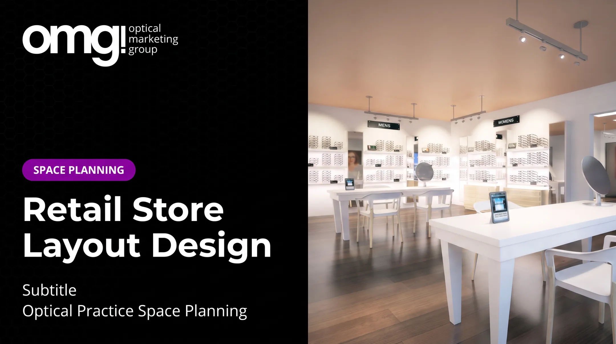
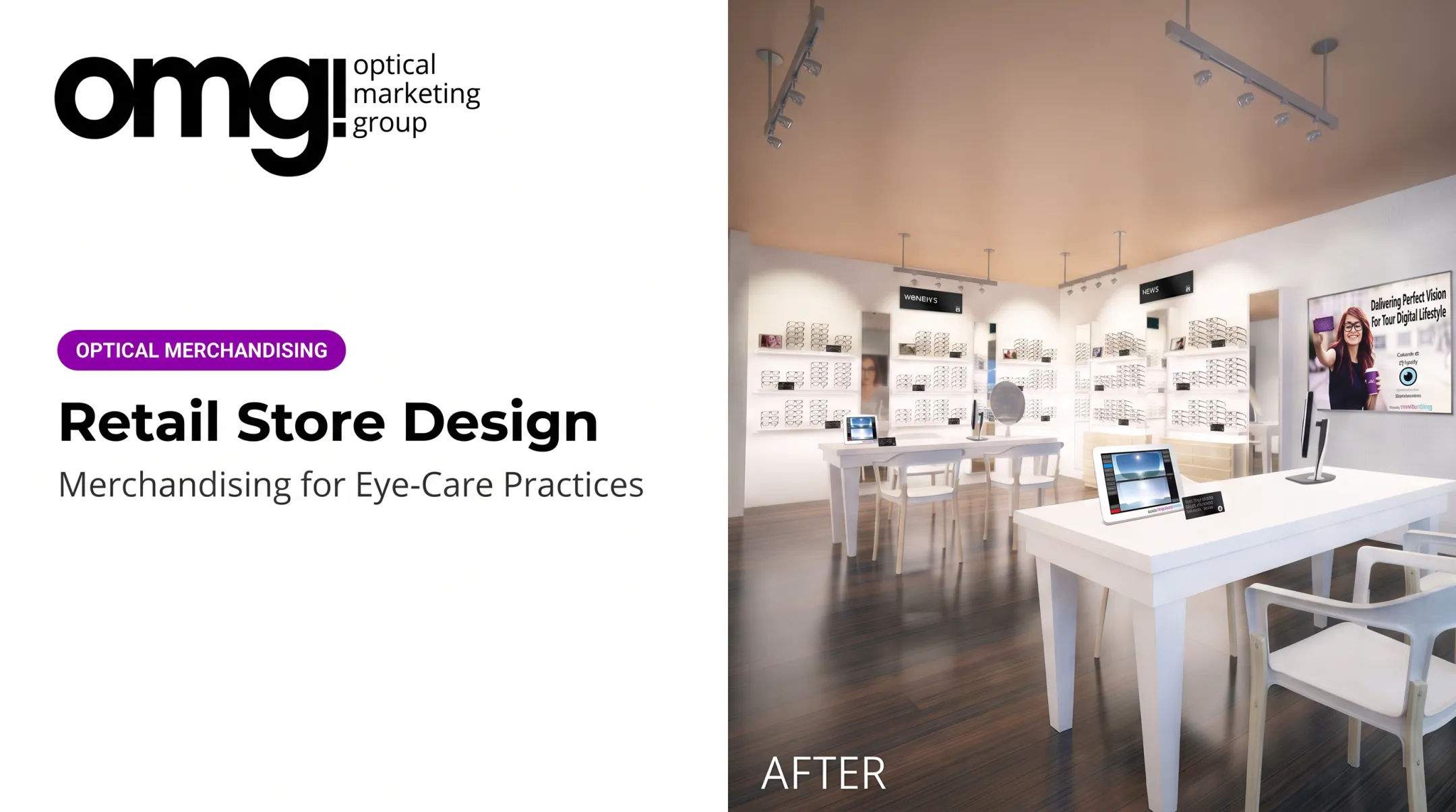
In an optical practice, that system does double duty. Frame displays, lens and eyewear categories, dispensing stations, and consultation areas all need to connect smoothly with clinical zones like exam rooms and pretesting. A patient should be able to move from check-in, to an exam, to frame browsing, without feeling like they've entered three separate businesses.
A layout that works well improves:
- Wayfinding and product visibility throughout the space
- Patient comfort during both clinical and retail moments
- Staff efficiency and sightlines for assistance
- Optical capture and opportunities for multiple-pair purchases
The Cost of a Weak Layout
When layout doesn't get enough attention, familiar problems show up:
- Crowded dispensary where frames blur together
- Unclear routes that leave patients unsure where to go
- Blocked sightlines between staff and browsing areas
- An entrance that doesn't invite anyone in
- A retail zone bolted onto a clinical waiting room instead of integrated with it
Crowding has measurable consequences. One supermarket chain found that removing floor-standing displays from aisles increased that aisle's share of weekly sales from 4.33% to 4.83%, a lift tied directly to reduced visual clutter, according to a PLOS One study. It's a grocery example, not an optical one, but the underlying principle holds: when displays compete for attention, sales suffer.
That principle matters even more for multiple-pair sales. Complete-pair patients who buy a second pair represent roughly 9.5% of patients, based on data spanning more than 2,000 US locations, according to an Eyecare Business analysis. A layout that makes second-pair browsing effortless, instead of an afterthought, gives that number room to grow.

Types of Retail Store Layout Designs
Most retail layouts fall into a handful of recognizable patterns. Few optical spaces follow one exactly. The best ones borrow elements from several, shaped around clinical requirements most retail stores never have to consider.
Grid Layout
A grid layout uses parallel aisles or repeated, orderly display runs. It's the format you'll recognize from drugstores and large multiproduct retailers: efficient, familiar, built for volume.
Strengths for optical retail:
- Organizes large frame inventories by brand, category, or price point
- Makes stock easy to audit and restock
- Gives patients a predictable, easy path to follow
Limitations:
- Can feel clinical or repetitive if frame runs are too dense
- Narrow aisles make frame try-on feel cramped
Grid works best for high-volume optical retailers or practices with clearly separated categories. Soften it with warmer lighting, a featured end-cap, and wider circulation paths to keep the efficiency without the sterile feel.
Loop or Racetrack Layout
A loop layout, sometimes called a racetrack, guides customers along a defined path that circles the retail area, exposing them to multiple zones along the way.
The benefit: strong storytelling and category exposure. A patient moves past featured frames, into core collections, past lens education materials, and toward consultation and dispensing almost without noticing the transition.
The trade-off: patients who want to reach the dispensing counter quickly, or who need a direct route for an adjustment, may find a forced path frustrating.
A loop works best when the sequence feels natural rather than mandatory, with a clear option to exit toward dispensing without circling the whole floor.
Free-Flow or Boutique Layout
Free-flow design arranges fixtures and displays openly, without rigid aisles, letting customers browse however they like. It suits curated optical boutiques and premium practices where brand storytelling and personal attention matter more than cramming in SKUs.
The risk: without clear zoning, sightlines, and signage, patients can lose track of where one category ends and another begins. Free-flow needs more staff guidance and stronger wayfinding to work well.
Spine, Herringbone, and Diagonal Layouts
Three related formats solve specific space problems:
| Layout | How it works | Best for | Trade-off |
|---|---|---|---|
| Spine | Central aisle runs front to back, zones branch off either side | Medium-sized practices with distinct clinical and retail zones | Congestion along the main route during busy hours |
| Herringbone | Main path with compact, angled branches | Long, narrow storefronts | Tighter passages, more complex fixture planning |
| Diagonal | Fixtures angled to open sightlines | Practices prioritizing staff visibility | Less efficient use of corner space |
Spine layouts are common in specialty healthcare-retail settings since they naturally separate a clinical path from a retail one. Herringbone suits the long, narrow floor plans optical practices often inherit in strip-mall or medical-plaza locations. Diagonal layouts trade some corner efficiency for clearer staff visibility across the floor.
Mixed or Hybrid Layout
A hybrid layout combines approaches: a clear spine for circulation, free-flow zones for premium frame discovery, and structured storage or dispensing areas where efficiency matters most.
This is where most optical practices land, because medical, consultation, retail, and service functions rarely share the same spatial needs. A dispensing station benefits from grid-like organization. A luxury eyewear wall benefits from boutique-style openness. Both can coexist.
Example: a practice might use a spine to connect reception to exam rooms, a loop-style path through core frame collections, and a free-flow corner for a premium sunglass brand, tied together with consistent signage and lighting so the transitions feel intentional rather than patchwork.

How to Choose and Validate the Right Layout
The right layout comes from your goals, patient journey, physical space, inventory, and staffing model, not from whichever design looks best in a magazine.
Start with the patient journey. Map how someone arrives, checks in, moves from the exam area to frame browsing, gets help trying on frames, completes dispensing, and exits. Every layout decision should make that path easier.
Assess the physical space honestly. Usable floor area, entrance placement, windows, columns, clinical room locations, emergency exits, storage, and accessibility requirements all constrain what's possible before a single fixture goes in.
Accessible routes generally need 36 inches of clear width, with specific turning and passing-space provisions for narrower sections, under the 2010 ADA Standards. Those numbers matter more than most practices realize once aisles start filling with displays.
Match the layout to your inventory. Frame categories, premium collections, children's eyewear, sunglasses, lens education, and featured brands all need different treatment. A layout built for a high-volume value practice won't suit a boutique carrying three curated designer lines.
Plan for comfort and staff visibility. Good circulation width, comfortable browsing space, accessible display heights, appropriate seating, and sightlines that let staff notice when someone needs help, without hovering, belong in the plan from day one.
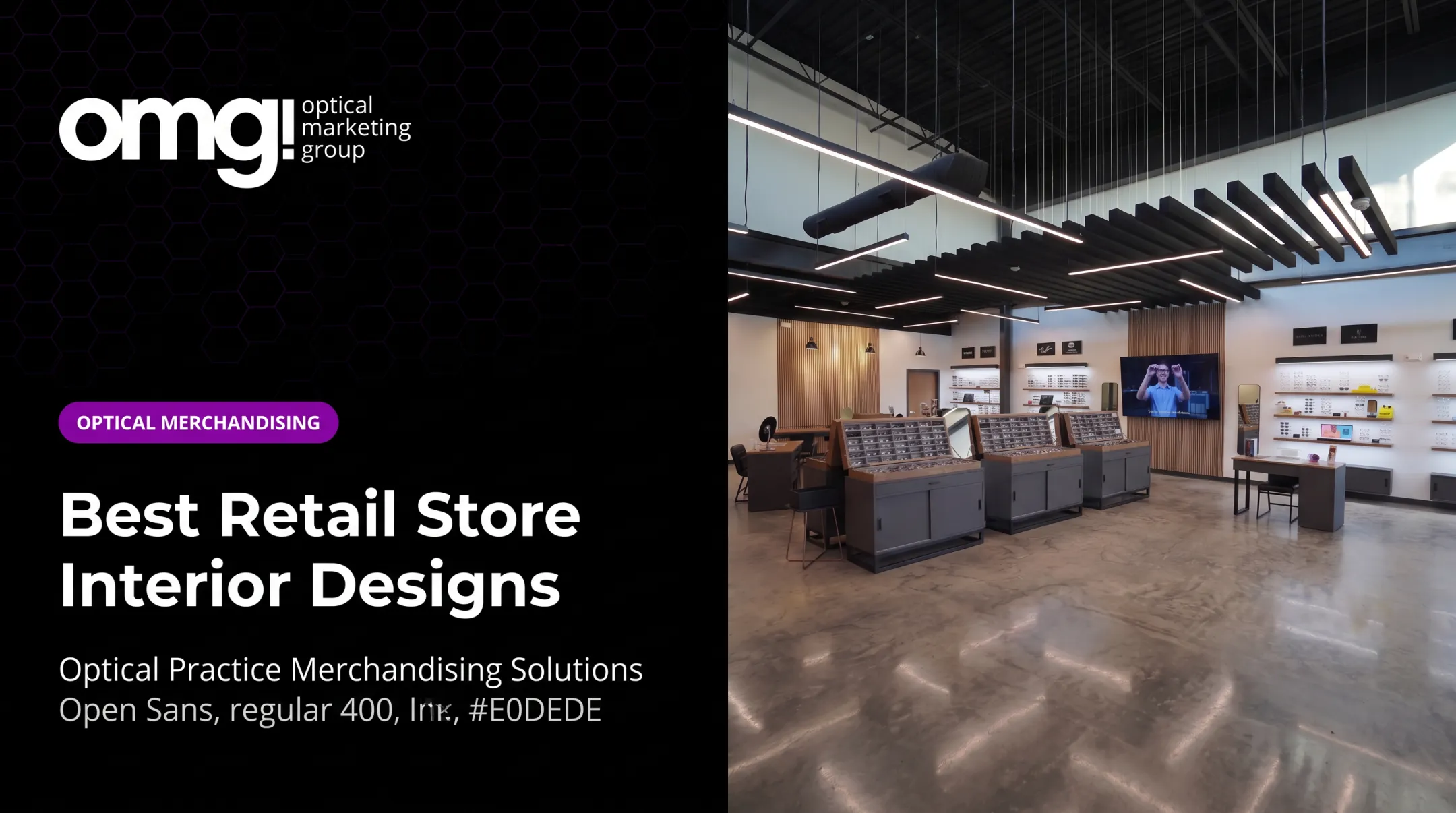
Align the layout with your brand. Lighting, materials, signage, digital displays, and how products are grouped together all signal whether a practice feels clinical, premium, family-friendly, or fashion-forward.
For practices planning a new build, relocation, expansion, or refresh, dedicated design support can shortcut a lot of trial and error. OMG! Optical Marketing Group handles space planning, custom fixtures, branded signage, merchandising, and digital displays as part of a full design-to-delivery process. That support matters when getting the layout wrong means construction costs, not just a rearranged shelf.
Before finalizing anything, stress-test the plan against common failure points:
- Overcrowded displays that make frames hard to distinguish
- An underused back area that wastes square footage
- Confusing transitions between clinical and retail zones
- Bottlenecks near checkout or dispensing
- Weak curb appeal that doesn't draw people in
- A retail space that still feels like a waiting room
Once the layout is live, review it. Staff observations, patient feedback, category-level sales data, and how smoothly patients move from appointment to dispensing all tell you whether the plan works in practice, not just on paper.

Conclusion
Retail store layout design shapes far more than how a space looks. It shapes how people move through it, how comfortable they feel, what they notice, and whether a clinical visit turns into a retail one.
No optical practice needs to pick a textbook layout and force its space into that mold. A thoughtful, flexible, patient-centered design tends to outperform any single formula. The strongest layouts are often hybrids built around how your patients move through your space.
If you're planning a new space, relocation, expansion, or refresh, OMG! Optical Marketing Group works with independent practices and multi-location eyecare retailers across the US on this kind of design. Support runs from initial space planning through custom fixtures, signage, and installation.
Getting the layout right from the start makes every other part of the patient experience easier.
Frequently Asked Questions
What are the different types of store layout in retail?
The main types are grid, loop or racetrack, free-flow or boutique, spine, herringbone, diagonal, and mixed or hybrid layouts. Each suits different combinations of space size, inventory volume, customer flow, and brand positioning.
What are the 7 principles of retail?
For store design, focus on customer priority, clear circulation, product visibility, zoning, presentation, accessibility, and operational flexibility. In optical retail, these balance clinical trust with inviting frame discovery.
What is the best layout for a retail store?
No single layout fits every store. High-volume retailers often use grid, premium boutiques prefer free-flow, and optical practices usually need a hybrid linking clinical and retail zones. Match the choice to your space, inventory, and goals.
How do I choose a retail store layout?
Start with space constraints, customer behavior, merchandise mix, traffic patterns, and brand goals. Then weigh accessibility, staff workflow, and budget, and pick a format that can adapt as inventory or services change.
How does store layout affect customer behavior?
Entrances, sightlines, pathways, display placement, signage, lighting, and checkout positioning all influence how customers browse, whether they discover products, how comfortable they feel asking for help, and ultimately whether they buy.
What is the most popular retail store layout?
Grid layouts are the most widely used format because they handle large product volumes efficiently in drugstores and supermarkets. Optical practices and boutiques often perform better with free-flow, loop, spine, or hybrid designs.