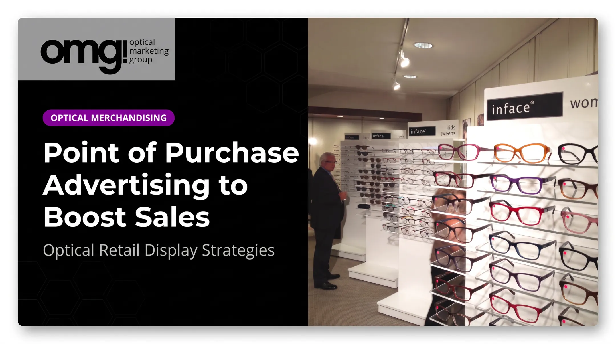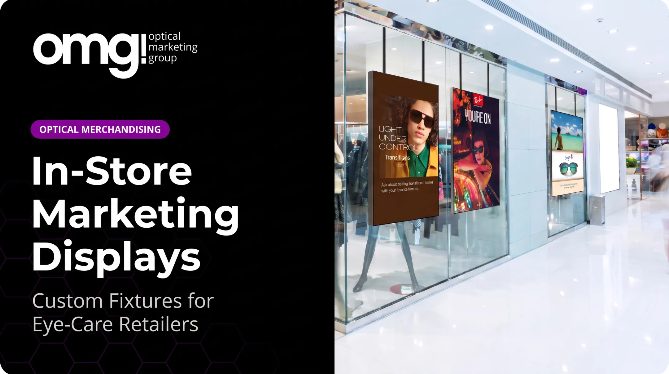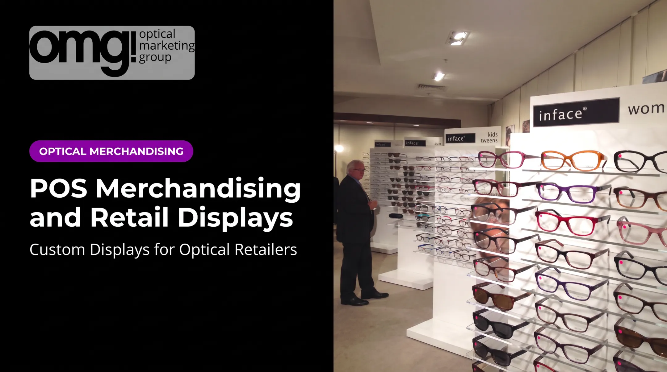

A well-placed point of purchase (POP) display does more than hold inventory. It helps patients notice, understand, and explore eyewear at the exact moment they're ready to consider it.
This article tackles the common merchandising problems optical practices face: overlooked frame categories, cluttered dispensaries, confusing product messaging, poor traffic flow, and displays that feel disconnected from the practice's brand. We'll cover display types, design principles, placement strategy, and how to measure whether your display program actually works.
Key Takeaways
- Effective POP displays combine strategic placement, concise messaging, visual hierarchy, and consistent branding
- Design displays around patient movement and discovery, not as standalone promotional add-ons
- Measure performance through sales, engagement, and staff feedback before expanding any program
- Match display format to the product and purchase journey, not just visual appeal
- Pair permanent fixtures with seasonal or digital POP elements for ongoing flexibility
What Are Point of Purchase Displays?
A point of purchase display is a dedicated product presentation placed where customers are actively deciding what to buy. It typically sits outside standard shelving, whether that's near an entrance, in a waiting area, or beside a consultation desk.
Some industry sources draw a line between POP and POS (point of sale) displays, suggesting POP covers the entire retail environment while POS concentrates near checkout. In practice, the terminology isn't fully standardized across the industry, and many associations use the terms interchangeably when describing retail displays that connect marketing with purchase decisions.
What matters more than the label is the function: a good display acts like a silent salesperson. It attracts attention, communicates a benefit, and invites a conversation without replacing staff interaction.
How Patients Actually Respond to Displays
Self-reported data backs this up outside the optical world. A Vision Monday survey found that 76% of shoppers discovered a product or brand through a display, and 63% said displays influenced their choice between similar options. That's general retail behavior, not an optical-specific figure, but it's directionally useful for understanding why display quality matters.
In an optical setting, a POP display might feature:
- New frame collections or designer lines
- Lens technology callouts (blue light, Transitions, high-index)
- Accessories like cases, cleaning kits, and straps
- Promotions, seasonal campaigns, or brand storytelling
Temporary Displays vs. Permanent Fixtures
A strong dispensary typically uses both. Permanent fixtures organize everyday browsing, while temporary POP elements add emphasis for new launches or seasonal campaigns. OMG! Optical Marketing Group's point-of-purchase offerings, for example, span frame displays, brand signs, window graphics, digital signage, and shop-in-shop installations. Practices can mix long-term fixtures with rotating promotional pieces as needed.
Types of Effective Point of Purchase Displays
Different products and locations call for different display formats. Here's how the main categories function in an optical setting.
Shelf Talkers, Tags, and Small Callouts
Shelf talkers and frame tags highlight features without overwhelming the fixture itself. Use them to call out:
- New arrivals or limited releases
- Lens technology upgrades
- Styling categories (men's, sun, kids, tweens)
Custom acrylic signage in small formats, such as 4.5" × 2.25" tags, works well here since it's compact enough to sit directly on a shelf or frame board without crowding the product.
Freestanding and Floor Displays
Freestanding units create a branded focal point for new collections or featured designers. A frame display like a waterfall-style fixture can hold dozens of pairs (one common format holds 48 frames) while keeping walking paths clear.
Keep these rules in mind:
- Preserve comfortable browsing space around the unit
- Avoid blocking sightlines to staff
- Use for high-priority categories, not everything at once
Counter, Wall, and Window Displays
Counter and tabletop displays work well for smaller items such as cleaning kits, cases, or educational cards, as long as they don't obstruct staff-to-patient conversation at the dispensing desk.
Wall-mounted and window displays, meanwhile, establish retail identity before a patient even reaches the dispensary. Illuminated feature boxes with white backing and cool-white LED lighting make frame colors pop and give rimless styles better contrast.
Digital and Interactive Displays
Digital screens and interactive kiosks now show product demonstrations, lens education, and campaign messaging. A few operational points to plan for:
- Screen placement - position for comfortable viewing distance, not just visibility
- Content updates - assign someone to refresh playlists regularly
- Accessibility - touchscreens should work for all patients
- Power requirements - confirm outlets and cabling before installation

Interactive lens selectors and freestanding touch displays are good examples. One 43-inch interactive touch display pairs a 4K touchscreen with monthly content subscriptions, letting practices update messaging without replacing hardware.
Match each format to the job it needs to do. A frame launch near the entrance, lens education beside the relevant frame wall, and accessories near the collection point each call for a different display type.
Design Principles for Effective POP Displays
Good display design starts with mapping the patient journey: what they see at the entrance, during the wait, while browsing frames, during consultation, and on their way out. Each moment is a different display opportunity.
Build a Clear Visual Hierarchy
Every display needs:
- One primary message
- A recognizable product or category
- Brief supporting copy
- An obvious next step (browse, ask, scan, compare)
Resist the urge to say everything at once.
Design for multiple viewing distances:
- Large, high-contrast headlines for across-the-room visibility
- Product-level detail for close inspection
- Interactive elements only where they add real information
Keep Products Accessible
Patients need to see, reach, compare, and return each product easily. That means:
- Enough spacing between frames to avoid a "wall of product" effect
- Comfortable fixture height for browsing, not just display
- Lighting that flatters frame color without glare
- Controlled stock levels that avoid visual clutter and disorientation
Frame boards lined wall-to-wall are a dated approach. Minimal shelving with curated selections reads as more intentional and less overwhelming to patients.

Match Branding and Stay Accessible
Colors, materials, typography, and lighting should feel like an extension of the practice's brand, not an unrelated advertisement bolted onto the wall.
Accessibility and safety also belong in the design brief:
- Readable text and clear walking routes
- Stable fixtures and secured cabling for illuminated displays
- Accessible routes to self-service shelving, with fixture flexibility under the ADA Standards
- Code-compliant electrical and lighting checked before installation
Planning and Measuring a POP Display Programme
Planning and Measuring a POP Display Program
Before design work starts, confirm the basics:
- Campaign objective, product category, and audience
- Available space, duration, and stock capacity
- Power needs and brand guidelines
Skipping this step leads to displays that look good but don't fit the space or workflow.
Test Before You Roll Out
Pilot a new display in one location before expanding practice-wide. Document the starting conditions, then keep the offer, product mix, and measurement window as consistent as possible so results are comparable.
What to Measure
Track outcomes that connect directly to the display's purpose:
- Sales of the featured product or category
- Frame-category engagement and dwell time
- Accessory attachment rate
- Patient questions or staff conversations prompted
- QR scans or digital interaction, where applicable
Optical capture data offers useful context here. Industry benchmarks show complete-pair purchase rates (frames and lenses together) running around 26% nationally, with top-quartile practices reaching above 40%, according to a GPN Technologies report.

These figures describe overall purchasing behavior, not display performance specifically, but they are a useful baseline when you evaluate whether a new display is lifting results.
If a display underperforms, don't assume POP merchandising failed. Adjust the message, height, lighting, or location first. Low performance often points to one fixable variable, not the whole concept.
Ongoing Maintenance
Keep displays working through regular upkeep:
- Replenish stock and remove outdated promotions
- Refresh digital content on a set schedule
- Clean surfaces and check lighting
- Reassess whether the display still matches current patient behavior
Applying Effective POP Displays in an Optical Practice
Independent optometry practices, ophthalmology practices with optical dispensaries, optical retailers, and multi-location groups all face the same challenge: making the shift from clinical care to retail browsing feel natural rather than jarring.
Where to Place Displays
Key decision points typically include:
- Entrance sightlines
- Waiting or reception areas
- Frame browsing zones
- Lens consultation areas
- Dispensing tables and collection points
At each location, preserve patient privacy, staff visibility, wheelchair access, and an uncluttered flow. A display that blocks a wheelchair route or crowds the dispensing counter undermines its own purpose.
Match Display Type to Goal
- Discovery displays for under-browsed frame categories
- Educational displays for lens technology conversations
- Cross-merchandising displays for cases, straps, and cleaning products
- Branded displays for recognition and repeat visits
Combining permanent fixtures with seasonal or brand-funded POP elements keeps the dispensary feeling fresh without becoming crowded or overly promotional.
OMG! Optical Marketing Group coordinates custom displays, branded signage, digital integration, and space planning as one multidisciplinary studio. That way each display fits the practice's traffic flow and overall design, not a single fixture in isolation.
Pre-Launch Checklist
Before launching any new display, ask:
- Is the featured product clear at a glance?
- Can a patient understand the message in a few seconds?
- Can patients approach it comfortably?
- Does it match the practice's brand?
- Can staff restock and maintain it easily?
- Is the intended patient action measurable?
Frequently Asked Questions
How much does a POS display cost?
Cost depends on size, materials, customization, lighting, digital components, and whether the display is temporary or permanent. Request a project-specific quote rather than relying on a generic price range.
What are point of purchase displays?
They're dedicated product or message displays placed where shoppers make purchase decisions. In an optical practice, that includes the entrance, waiting area, and dispensing table, not just checkout.
What is an example of a Point of Purchase display?
A branded freestanding frame display near the entrance, a lens education panel beside relevant frames, or an illuminated window display are all common optical examples, each designed to prompt a specific patient action.
How do you make a point of purchase display effective?
Effectiveness depends on a clear objective, relevant product selection, concise messaging, strong visibility, accessible placement, brand consistency, and reliable maintenance, paired with ongoing performance measurement.
Where should point of purchase displays be placed in an optical practice?
Entrance sightlines, waiting areas, frame browsing zones, consultation areas, dispensing tables, and collection points all work well, provided the display supports traffic flow and doesn't block access or staff interaction.