
Creative visual merchandising isn't about decorating an optical space. It's about helping patients notice frames, understand their options, and feel confident about what they're buying. For optical practices, dispensaries, and eyewear retailers, that means building a retail experience that feels inviting rather than cluttered or clinical.
This article covers specific display ideas, the design principles behind them, and how to implement and test changes without overhauling your entire space at once.
Key Takeaways
- Displays should tell one clear eyewear story per zone, not compete for attention
- Combine focal points, lighting, readable signage, negative space, and grouped collections
- Match every creative concept to your brand, patient mix, space, and staff capacity
- Track browsing behavior, engagement, and capture rates before deciding what to change next
Creative Visual Merchandising Ideas for Optical Practices
Lead With a Single Focal Story
A statement window or entry display should communicate your practice's personality within a few seconds, not showcase everything you carry. Pick one story, such as a new collection, a sunwear edit, or a seasonal color palette, and build around it.
- Statement window or entry display: Show one focused idea instead of crowding in multiple frame lines at once
- Hero display for priority collections: Give a featured brand or lens solution its own focal point with elevated positioning, spacing, and supporting graphics
OMG's Talmadge Waterfall Display is an angled unit that holds 48 frames on velvet grid trays. It works well as a hero fixture because the angled presentation draws the eye without crowding the space.
Organize Collections Around Real Life
Grouping frames by lifestyle, not just by brand, helps patients find themselves in the display faster.
- Curated collections by need: Everyday, professional, active, luxury, sustainable, or kids' styles, each with short signage that explains the appeal
- Storytelling displays: Pair frames with photography, materials, or props that suggest a lifestyle while keeping the eyewear visually central, not buried behind decoration
- Lens education made visual: Use diagrams, layered graphics, or sample lenses instead of dense technical copy, and review clinical claims before they go up
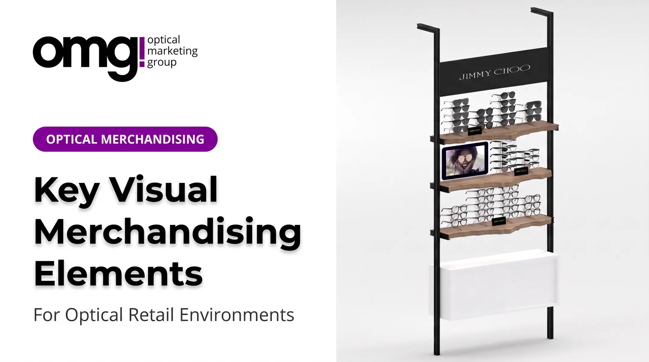
The Smart Interactive Eyewear Display pairs eyewear shelving with a built-in screen. It combines a curated frame grouping with short educational content in the same footprint.

Create Zones That Invite Exploration
Beyond the main wall, a few smaller zones can do a lot of merchandising work.
- Sunwear zone: Stronger contrast, directional lighting, and outdoor imagery set sunglasses apart while keeping circulation clear and glare off the lenses
- Mirrors and try-on stations: Place color-accurate mirrors near relevant collections and keep adjacent displays uncluttered
- Discovery display near waiting areas: Feature accessories, care products, or educational content where patients naturally pause, without turning it into a hard sell
- Digital storytelling: Use a screen for brand stories or collection videos only when it supports the physical display, not when it adds visual noise
OMG's Cliff Display, available from 24 to 72 inches with custom LED lighting, adapts well to either a sunwear wall or a smaller discovery nook, depending on size.
Principles That Make Creative Merchandising Work
Map the Journey, Then Direct Attention
Walk the path a patient actually takes, from the exterior, through reception, into frame browsing, dispensing, and checkout. At each stage, ask whether a focal point, directional sign, or clear sign could answer a question before it's asked.
Visual hierarchy does the heavy lifting here. Size, contrast, height, color, lighting, and negative space all direct the eye. One primary focal point per zone, supported by secondary displays that don't fight for attention, tends to work better than treating every wall as equally important.
Keep It Curated, Not Crowded
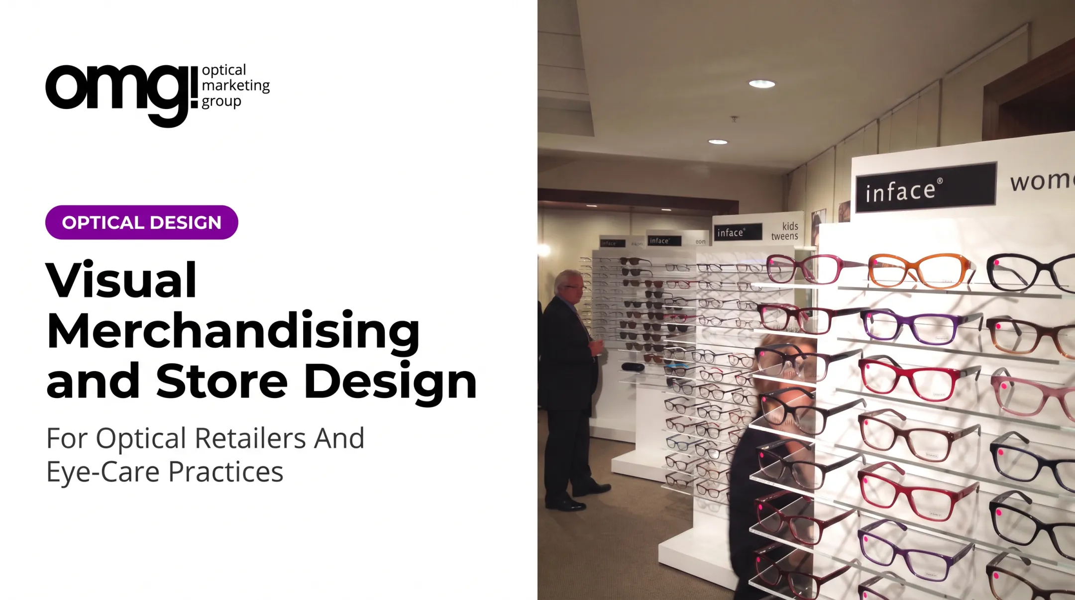
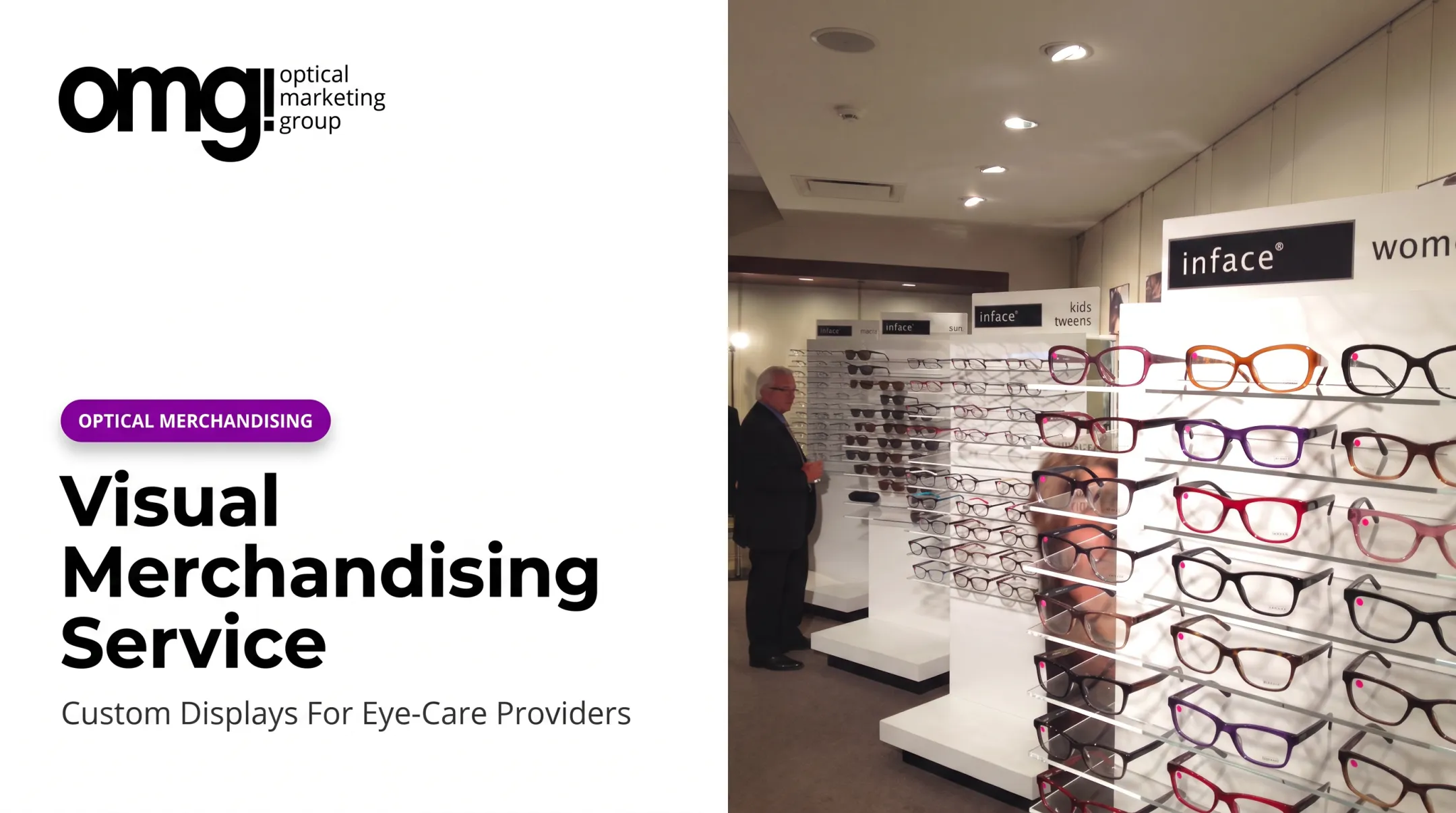
Fewer, better-spaced frames read as more premium than an overcrowded wall. OMG!'s merchandising approach favors open shelving, risers, and integrated backlighting over dense frame boards. That layout stays sharper longer and is easier to maintain.
A few habits protect that curated look:
- Replenish and align displays on a set schedule
- Remove damaged or outdated materials promptly
- Match color palette, fixture finishes, and lighting temperature to your brand position (clinical, family-friendly, or fashion-led)
Lighting deserves specific attention. UC Davis's lighting guide recommends a minimum CRI of 80 for most commercial interiors, and suggests considering CRI 90 or higher for color-critical retail merchandise. That range is what keeps frame colors looking true on the floor.
Build for Accessibility and Real Operations
Signage should use concise headlines and plain-language labels placed at the point of decision, not technical jargon. Circulation paths need to stay clear and stable for customers using mobility aids. ADA's 2010 Standards set specific benchmarks worth checking against your layout:
| Element | Requirement |
|---|---|
| Walking width | 36 in minimum |
| Clear floor space | 30 x 48 in minimum |
| Forward reach | 15 in minimum, 48 in maximum |
| Self-service shelves | On accessible route, exempt from reach rules |

Accessibility specs only stick if the design is maintainable day to day. Before you commit, factor in cleaning routines, staff time to replenish, and how often you will realistically rotate brand or promotional messaging.
Design the Optical Experience Around Discovery and Trust
Reception and exam areas should feel calm and credible. The optical area can carry more visual energy. Make that shift feel intentional rather than jarring with consistent colors, materials, and brand language across both spaces.
Position mirrors, seating, and consultation surfaces so patients can browse independently before staff step in. Simple prompts help without feeling pushy:
- "Find your shape"
- "Explore lightweight materials"
- "Compare sunwear options"
Different patients need different entry points. Adults replacing an existing pair, first-time wearers, parents shopping for children, and premium buyers all browse differently. Clear zones or adjustable displays help each group navigate on their own terms. That keeps the floor open without boxing anyone into a stereotype or creating a sales-heavy feel that doesn't belong in a healthcare setting.
Low-Cost Refreshes and Larger Design Upgrades
Not every improvement requires a construction crew. Match the investment to the actual goal, whether that's better frame discovery, a premium brand position, or less congestion at peak hours.
Low-cost changes (days, not weeks):
- Rotate frame groupings and replace faded graphics
- Add simple category labels and a seasonal focal point
- Edit overcrowded displays down to a curated selection
Mid-level improvements:
- Upgraded mirrors and new lighting layers
- Refreshed wall graphics and modular shelving
- Branded countertop displays and better consultation surfaces
Larger-scale opportunities usually come into play when a practice is relocating, expanding, or standardizing design across multiple locations. They typically include space planning, custom fixtures, integrated signage, and digital displays.
A firm like OMG! Optical Marketing Group handles coordinated design, graphics, fixtures, production, and installation under one engagement, so you are not piecing the project together separately.
Renovation outcomes vary by practice, but they show what is possible. Bellaire's renovation case reported a 31% increase in optical revenue after moving sunwear from locked cabinets to self-browsing fixtures and upgrading lighting. That result reflects the combined renovation, not any single change in isolation.
How to Implement, Test and Refresh a Visual Merchandising Plan
A good merchandising plan starts small and gets tested before it gets expensive.
- Assess the current space. Document traffic flow, display condition, lighting, signage, and staff feedback on where customers get stuck or confused.
- Write a simple brief. Define your target customer, brand personality, priority products, display zones, key messages, budget, and who owns ongoing maintenance.
- Pilot before rolling out. Test one window, wall bay, or digital content sequence first. Compare photos and staff observations against the old presentation.
- Measure outcomes. Track product engagement, browsing time, requests for featured collections, optical capture, multiple-pair sales, and patient feedback.
- Run a refresh calendar. Plan small monthly adjustments alongside bigger seasonal changes, with a checklist for cleaning, graphics, and lighting checks.
- Review and refine. Keep what works, revise what confuses patients, and document the learning so it's repeatable.
OMG! offers a free Patient Experience Assessment that scores nine areas like clutter, signage, and lighting on a 1-to-5 scale. An online Project Planner helps you scope the work before committing to a full space plan. Both are useful starting points if you're not sure where to begin.

Frequently Asked Questions
What is visual merchandising?
Visual merchandising is the strategic presentation of products, space, signage, lighting, and storytelling to shape how customers discover and experience a retail environment. In an optical setting, it applies specifically to frames, lenses, and the patient journey.
Why is visual merchandising important for an optical practice?
It builds patient confidence, makes frame browsing easier, and strengthens brand presentation. A well-designed optical can also support better flow, optical capture, and multiple-pair sales, though results vary by practice.
How can I improve visual merchandising in a small optical store?
Focus on fewer, curated collections rather than displaying everything. Add one clear focal point, good lighting, readable signage, a quality mirror, and commit to regular editing instead of letting displays sit static.
What should be included in an optical display?
A good display includes selected frames organized around one clear idea, appropriate signage, mirrors or try-on support, comfortable lighting, and enough negative space that patients aren't overwhelmed.
How often should visual merchandising displays be changed?
It depends on inventory turnover, seasonality, and campaigns. Small maintenance updates, like straightening frames or swapping graphics, should happen more often than full display overhauls.
Should an optometry practice use digital signage?
Digital signage can support patient education, brand storytelling, and flexible promotions when content stays concise and visually clear. It works best as a complement to physical displays, not a replacement for them.